简介
在之前的文章中,我们了解了很多CSS命名规范:BEM、OOCSS、SMACSS、ITCSS、AMCSS、SUITCSS:CSS命名规范简介。它们可以解决CSS样式全局生效容易引发污染和冲突的问题。但这些方案基本都是写一个前缀或后缀,通过手写命名的方式避免类名重复。但这在多人协作或引入大量外部库时,依然不能完全避免问题,还需依赖团队规范管理。那么,是否有工具可以自动做这件事,而且完全避免组件内的类名与其它组件重复?有的,这就是CSS Modules。
CSS Modules中文叫做CSS模块。默认情况下,我们定义的CSS类名标识符是全局的。使用CSS Modules之后,每个类名将变为唯一的全局名称,包含不会重复的哈希值。引入CSS文件时,我们可以拿到CSS文件导出的类名到全局名称的对应关系,从而在HTML中提供相应的类名。
对于希望共享的类名,CSS Modules也提供了方案使其全局生效。同时CSS Modules还提供了定制标识符,class组合等功能。要想实现CSS Module的功能,代码需要经过打包,而且由于不同前端框架代码的组织方式不一样,CSS Module的具体使用也有区别,我们逐一介绍一下。
纯JavaScript使用方式
首先我们抛开各种前端框架,在纯粹的JavaScript代码中演示CSS Modules的效果。这里选用Vite,首先命令行执行代码,创建工程:
npm init -y
npm add -D vite
然后在package.json的scripts中增加几个构建相关命令。dev开发模式,build生产模式构建,preview生产模式预览。
{
  "dev": "vite",
  "build": "vite build",
  "preview": "vite preview"
}
然后创建index.html,为浏览器入口文件,里面引入index.js。
<html>
  <script src="./index.js" type="module"></script>
  <body>
    <div>jsplp CSS Modules</div>
  </body>
</html>
然后创建两个CSS文件,分别是使用CSS Modules的index.module.css和没有使用的index.css:
/* index.css */
.class1 {
  color: red;
}

/* index.module.css */
.class2 {
  background-color: yellow;
}
.abcDef {
  background-color: yellow;
  .qazwsx {
    background-color: yellow;
  }
}
#id1 {
  background-color: yellow;
}
然后是index.js文件,引入这两个CSS文件,并在DOM中增加几个div元素,使用这些CSS类:
import './index.css';
import styles from './index.module.css';

console.log(styles)

const test1 = document.createElement('div');
test1.textContent = 'test1';
document.body.appendChild(test1);

const test2 = document.createElement('div');
test2.className = 'class1';
test2.textContent = 'test2';
document.body.appendChild(test2);

const test3 = document.createElement('div');
test3.className = styles.class2;
test3.textContent = 'test3';
document.body.appendChild(test3);

const test4 = document.createElement('div');
test4.className = 'class1' + " " + styles.class2;
test4.textContent = 'test4';
document.body.appendChild(test4);

/* 输出结果
{
  abcDef: "_abcDef_1wjui_7",
  class2: "_class2_1wjui_1",
  id1: "_id1_1wjui_1",
  qazwsx: "_qazwsx_1wjui_11",
}
*/
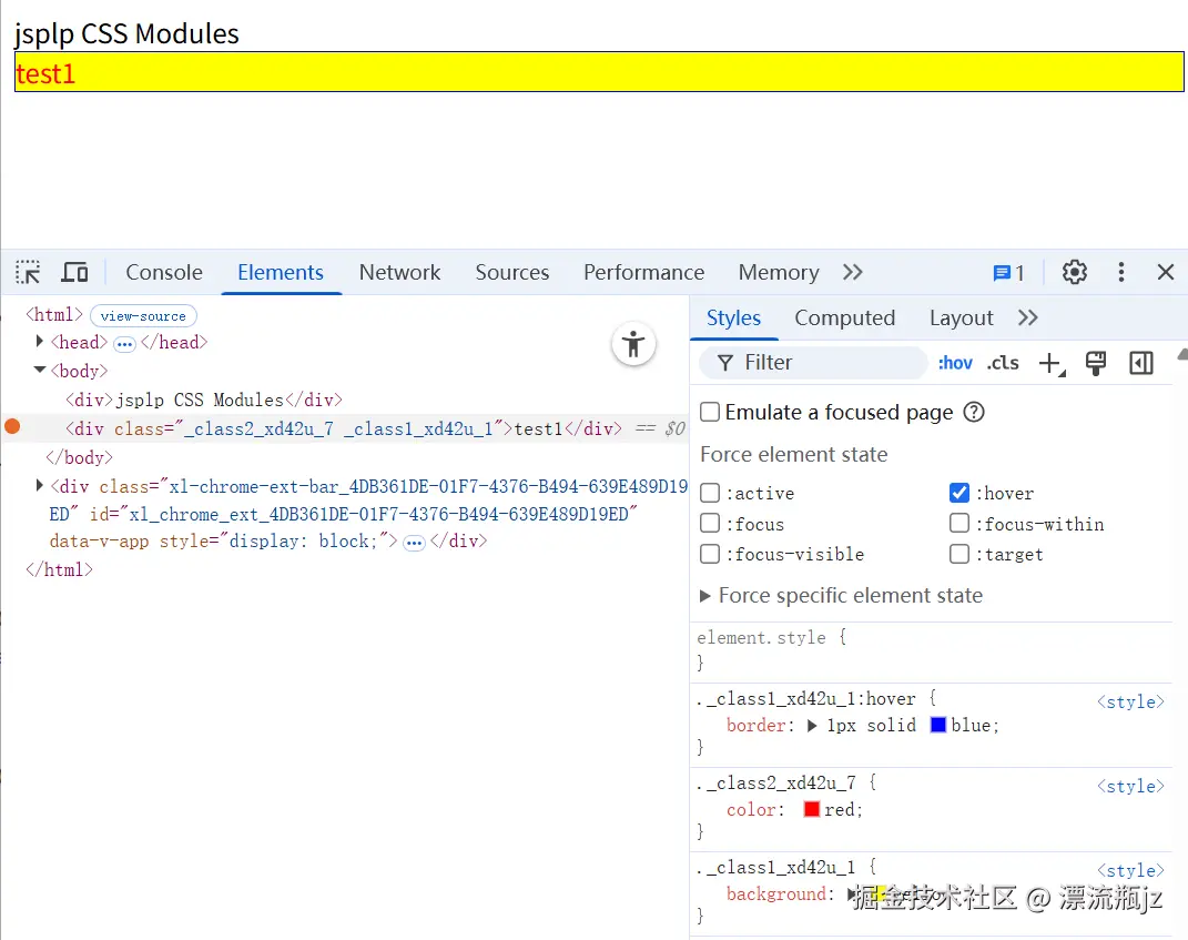
我们在index.module.css中列举了几个场景,分别是class名,嵌套class名,id名。将其引入为一个对象并输出结果,发现它是一个key为原来的标识符名称,value为包含哈希值的新标识符的对象。要使用类名时,需要将这个新标识符提供给DOM进行渲染。而对比普通CSS文件,只需要简单引入即可生效。在index.js中我们还创建了四个场景,分别是:
- test1 没有类名
- test2 普通CSS类名 class1
- test3 CSS Modules类名 class2
- test4 普通 class1 + 模块的 class2
因为新标识符实际上也是个字符串,因此可以和普通类名结合使用,中间加个空格即可。当然也可以使用classnames等辅助工具组合类名。执行 npm run dev,看一下效果:
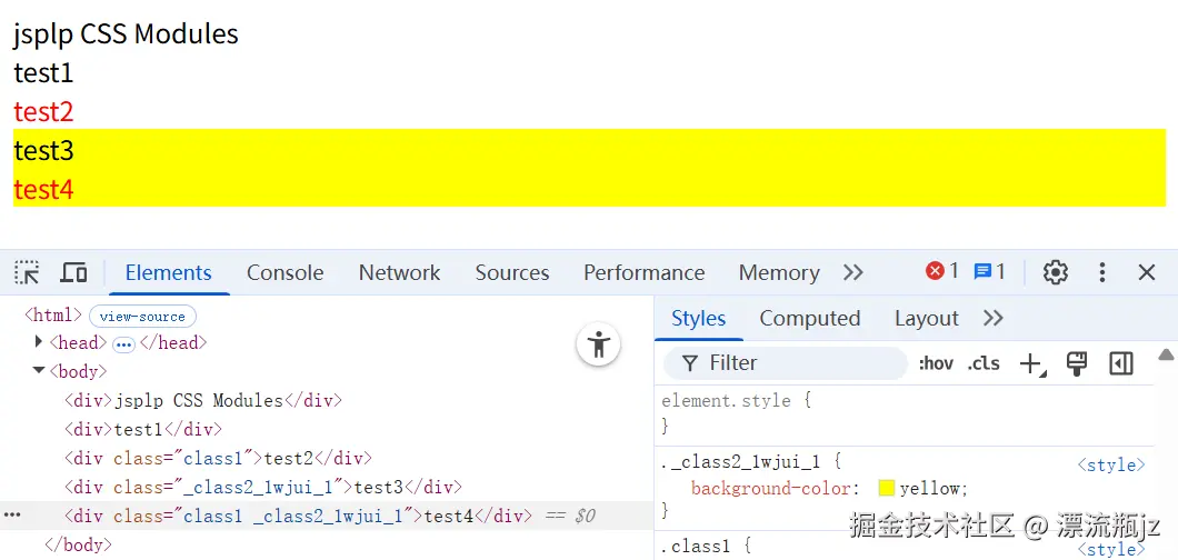
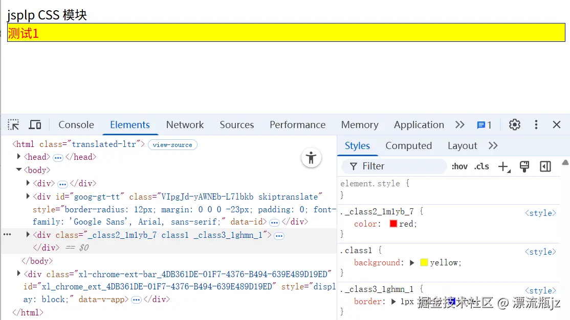
通过浏览器可以看到,CSS Modules类名不仅成功作为CSS类名,而且还能和对应的CSS文件里面的规则对应上。test4这种结合class属性也可以生效。我们再执行npm run build,看一下打包后的文件内容:
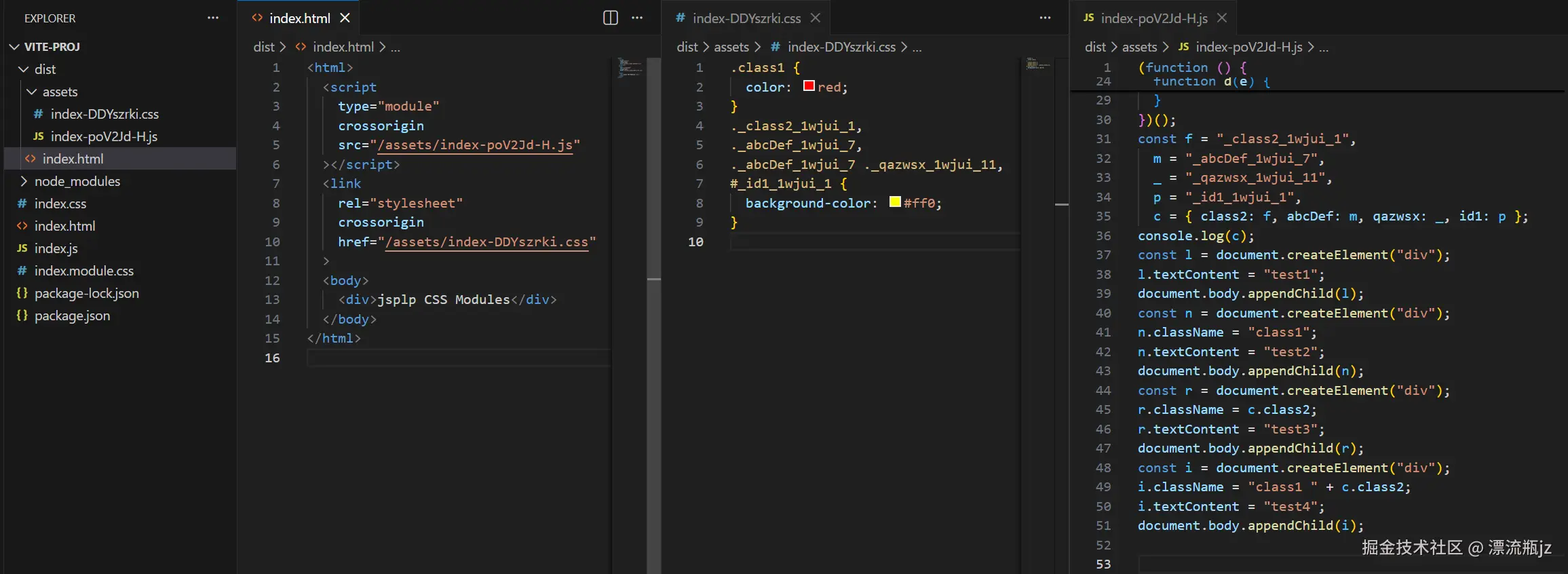
查看dist目录中打包后的文件内容,可以看到CSS文件和JS文件被分开单独引入到HTML文件中。两个CSS文件被合并为一个,普通CSS文件还是维持原来的类名,index.module.css则变为了带哈希值的新标识符名。对应的JS文件中引入的styles变为了常量对象,内容也是新标识符的映射关系。
通过上面的代码演示,我们能够了解CSS Modules的核心思路,即改变CSS标识符的名称,使其不会重复;需要使用对应标识符的地方要用JavaScript手动引入;同时更改CSS文件中的标识符以匹配新的名称。
CSS Modules特性
CSS Modules除了上面的核心特性之外,还包含一些特性。这里我们介绍和尝试一下它的主要特性:
多文件引用CSS模块
前面我们在同一个JavaScript文件中引入了CSS Modules的CSS文件,多次使用引入的标识符,发现值实际是一样的。那么如果在不同的文件中引入CSS Modules的CSS文件,新标识符会一样么?这里来试一下。首先创建两个CSS文件:
/* index1.module.css */
.class1 {
  color: red;
}

/* index2.module.css */
.class1 {
  color: yellow;
}
可以看到两个CSS文件中类名标识符是一致的,都是class1。然后是两个JavaScript文件index1.js和index2.js,里面总共举了三个例子:
// index1.js
import styles1 from "./index1.module.css";
import styles2 from "./index2.module.css";

const test1 = document.createElement("div");
test1.className = styles1.class1;
test1.textContent = "test1";
document.body.appendChild(test1);

const test2 = document.createElement("div");
test2.className = styles2.class1;
test2.textContent = "test2";
document.body.appendChild(test2);

//index2.js
import styles1 from "./index1.module.css";

const test3 = document.createElement("div");
test3.className = styles1.class1;
test3.textContent = "test3";
document.body.appendChild(test3);
最后是index.html,引入两个JavaScript文件:
<html>
  <script src="./index1.js" type="module"></script>
  <script src="./index2.js" type="module"></script>
  <body>
    <div>jsplp CSS Modules</div>
  </body>
</html>
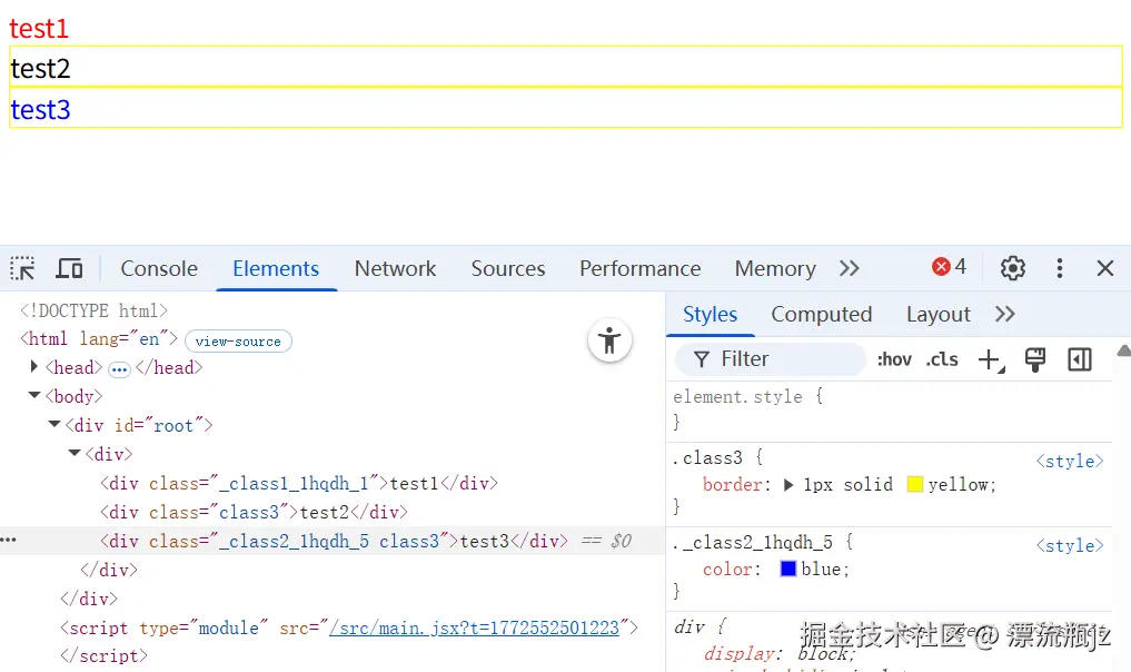
经过Vite打包后,在浏览器看下输出结果:
- test1和test3对比,分别在两个JavaScript文件中引入了同一个CSS模块文件index1.module.css,最后生成的类标识符是一致的,样式效果也一致。这是因为CSS文件只有一个,最后只会生成一份CSS规则。而且既然引入同一文件,规则肯定是一样的,没有必要分开两个类名。
- test1和test2对比,在同一个JavaScript文件中引入了两个CSS模块文件,虽然各自CSS文件中类名是一样的,但因为所属文件不同,因此生成的新类名不一样,这样有效避免了同名的样式冲突问题。
- test2和test3对比,分别在两个JavaScript文件中引入了两个CSS模块文件,生成的新类名也不一样,也避免了同名的样式冲突问题。
global全局规则
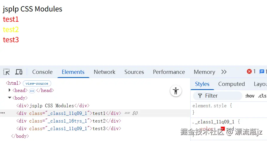
通过前面的例子可以看到,使用CSS Modules之后,所有自定义标识符名都变成了新的,只有引用才能生效的局部CSS规则。如果希望在这个CSS文件内定义部分全局都能生效的规则,CSS Modules也给出了方法,而且允许全局规则和局部规则混合嵌套使用。使用:global,就可以在CSS模块文件中使用全局规则。我们来看下例子。首先是index.module.css文件:
/* index.module.css */
.class1 {
    color: red;
}
:global(.class1) {
    color: blue;
}
:global(.class2) {
    .class3 {
        color: yellow;
    }
}
:local(.class4) {
    color: grey;
}
然后是index.js,这里给出了四种情况。可以看到带:global的标识符是不会被JavaScript文件导入的:
import styles from "./index.module.css";

console.log(styles);

function genEle(test, className) {
  const div = document.createElement("div");
  div.className = className;
  div.textContent = test;
  document.body.appendChild(div);
}
genEle("test1", styles.class1);
genEle("test2", "class1");

const div = document.createElement("div");
div.className = "class2";
div.innerHTML = `<div class='${styles.class3}'>test3</div>`;
document.body.appendChild(div);

genEle("test4", styles.class4);

/* 输出结果
{
  class1: '_class1_8tmyt_1',
  class3: '_class3_8tmyt_8',
  class4: '_class4_8tmyt_12'
}
*/
- test1: 正常的模块化CSS规则,做对比用
- test2: 与test1一样都用class1做类名,但这里没有使用导出的新类名,因此匹配到了带:global的全局CSS规则
- test3: 外层class2是全局类名,里面的class3没有用:global,因此还是局部规则。这是一个混合使用的例子,在CSS模块文件中,只有包裹在:global里面的类名才是全局规则,嵌套选择器和组合选择器需要单独包裹, 或者这样包裹在一起也可以:
:global(.cls1 + .cls2)
- test4: :local表示模块化的CSS规则,与不增加标识效果一致。一般为了强调才使用。
composes组合规则
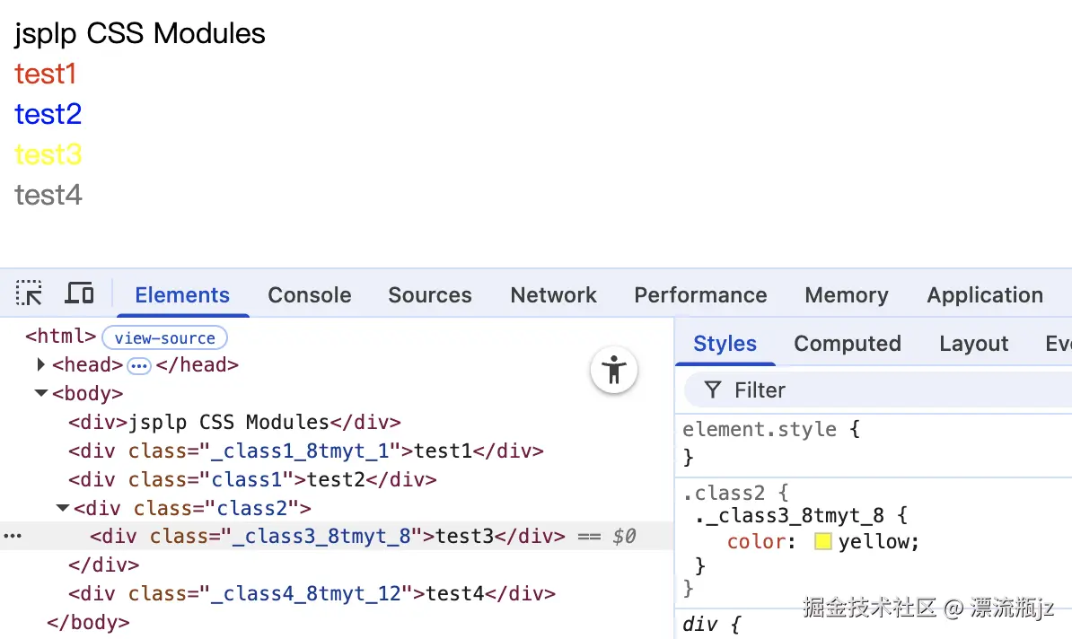
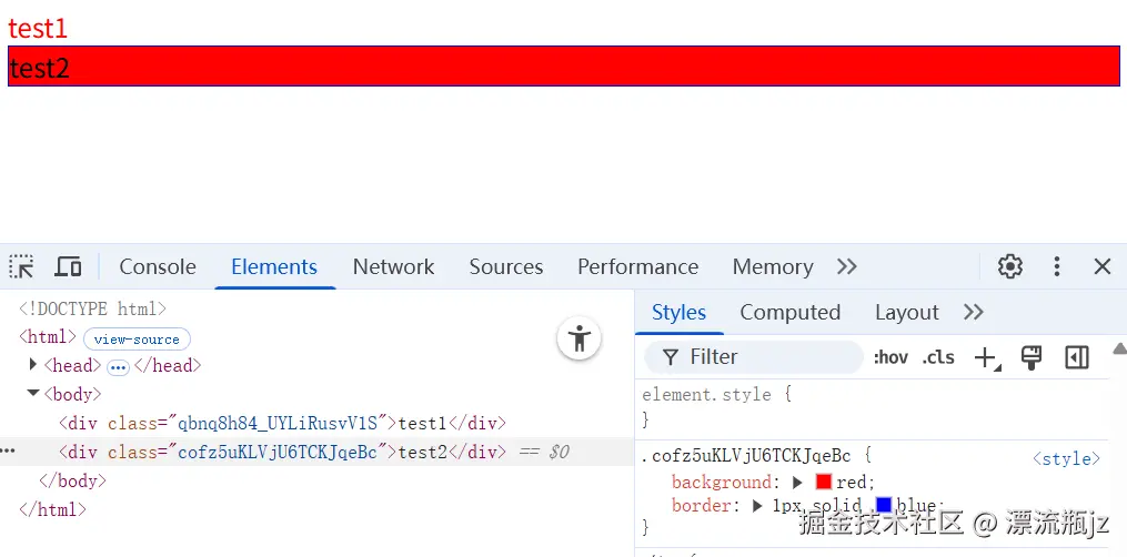
使用CSS Modules,使用composes属性,在规则中可以组合另一个类选择器的规则。这里举个例子看一下是如何组合的。首先是index.module.css文件:
.class1 {
  background: yellow;
}
.class2 {
  color: red;
  composes: class1;
}
.class1:hover {
  border: 1px solid blue;
}
然后是index.js中引入CSS文件,这里仅使用class2做类名:
import styles from "./index.module.css";

function genEle(test, className) {
  const div = document.createElement("div");
  div.className = className;
  div.textContent = test;
  document.body.appendChild(div);
}
genEle("test1", styles.class2);
我们的test1元素只定义了class2这个类名,但在浏览器中,却同时有了class1的类名。这时因为在CSS文件中定义class2的规则时,增加了composes属性,值为class1的类名。这相当于让class2继承class1,因此元素也具有了class1的类名和样式。同时还举了一个伪类的例子,这个组合规则对于伪类/为元素和选择器组合等都可以生效。composes属性也支持全局规则和跨文件引用,这里也举下例子:
/* index.module.css */
:global(.class1) {
  background: yellow;
}
.class2 {
  color: red;
  composes: class1 from global;
  composes: class3 from './index2.module.css';
}

/* index2.module.css */
.class3 {
  border: 1px solid blue;
}
这里仅更改了index.module.css文件,新增了index2.module.css文件,index.js文件内容没有变化。然后我们查看浏览器效果:
通过这个例子我们发现,CSS Modules可以组合全局规则,composes的类名后面加from global即可。同时composes可以在同一个类中使用很多次,都会生效。另外composes也可以跨文件组合,直接from文件名即可。
实现主题功能
使用CSS Modules主动引入类名的特性,通过不同场景下的类名切换,可以实现主题功能。首先定义两个CSS文件,其中的选择器一致,但是主题不一样:
/* red.module.css */
.class1 {
  color: red;
}
.class2 {
  border: 1px solid red;
}

/* blue.module.css */
.class1 {
  color: blue;
}
.class2 {
  border: 1px solid blue;
}
然后是index.js文件:
import styleRed from "./red.module.css";
import styleBlue from "./blue.module.css";

function genEle(test, className) {
  const div = document.createElement("div");
  div.className = className;
  div.textContent = test;
  document.body.appendChild(div);
}

function componentJz(styles) {
  genEle("test1", styles.class1);
  genEle("test2", styles.class2);
}

// 渲染红色主题
componentJz(styleRed);
// 渲染蓝色主题
componentJz(styleBlue);
可以看到,将引入的CSS Modules标识符对象传递给组件,组件中的元素使用这个对象作为类名。这样可以实现根据不同的条件传入不同的CSS文件对象,页面主题样式也随之变化。这里其实使用React组件举例更合适,但React使用方式要留到下面介绍,因此先使用纯JS示意。
React使用方式
React中使用CSS Modules与纯JavaScript使用基本一致。这里我们使用Vite创建一个React工程,展示在React中使用CSS Modules。首先执行命令行:
# 提示中选择React
npm create vite
# 进入工程
cd vite-react
# 安装依赖
npm install
# 增加依赖
npm add -S classnames
# 开发模式运行工程
npm run dev
创建App.module.css文件,内容如下:
.class1 {
  color: red;
}
.class2 {
  color: blue;
}
:global(.class3) {
  border: 1px solid yellow;
}
然后将App.jsx中的内容删掉,替换为下面的代码。这就是React中的使用方式,CSS文件引入的标识符对象作为className属性。同时这里演示了classnames的用法,可以方便的组合多种类名。
import styles from './App.module.css';
import cn from 'classnames';

export default function App() {
  return (
    <div>
      <div className={styles.class1}>test1</div>
      <div className='class3'>test2</div>
      <div className={cn(styles.class2, 'class3')}>test3</div>
    </div>
  )
}
Vue使用方式
Vue框架对于组件的组织方式比较特别,使用一个“单文件组件”的方式来组织代码,将所属同一个组件的HTML模板,JavaScript代码和CSS样式同时写到一个组件中。而且单文件组件中最流行的写法是“组件作用域CSS”,不是CSS Modules。下面我们分别介绍一下。
组件作用域CSS
组件作用域CSS,可以做到本组件的CSS样式就只影响本组件,不会影响别的组件;即使非类名选择器,例如标签选择器,属性选择器等,都仅限在本组件范围内生效。注意组件作用域CSS并不是CSS Modules,只不过功能上有部分相似之处。我们看一下例子,首先使用命令行创建Vue工程:
# 根据提示创建Vue工程
npm create vue@latest
# 进入工程
cd vite-vue
# 安装依赖
npm install
# 开发模式运行工程
npm run dev
然后我们删除App.vue中的内容,填充下面的代码。作为父组件。
<script setup>
import Comp1 from './comp1.vue'
import Comp2 from './comp2.vue'
</script>

<template>
  <div>
    父组件
    <div class="class1"> 父组件元素 </div>
    <p> 父组件p元素 </p>
  </div>
  <Comp1 />
  <Comp2 />
</template>

<style scoped>
p {
  color: yellow;
}
.class1 {
  background-color: aqua;
}
</style>
然后是样式选择器与父组件一致的子组件comp1.vue:
<template>
  <div>
    子组件1
    <div class="class1"> 子组件1元素 </div>
    <p> 子组件1p元素 </p>
  </div>
</template>

<style scoped>
p {
  color: red;
}
.class1 {
  background-color: blue;
}
</style>
最后是没有开启组件作用域CSS的comp2.vue组件:
<template>
  <div>
    子组件2
    <div class="class1"> 子组件2元素 </div>
    <p> 子组件2p元素 </p>
  </div>
</template>

<style>
div {
  border: 1px solid brown;
}
.class1 {
  color: brown;
}
</style>
在代码中可以看出,单文件组件将<template> <script> <style>在同一个vue文件中封装。如果使用作用域CSS,就在style标签上加scoped属性。有什么效果呢?我们看下浏览器截图:
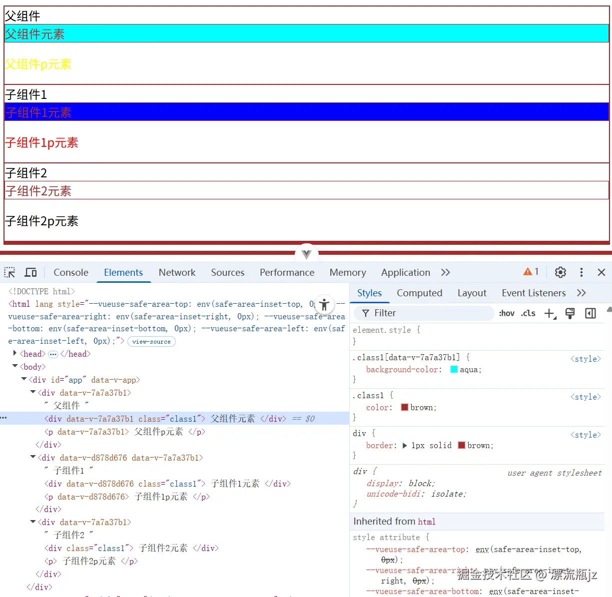
可以看到,在设置了scoped属性之后,组件生成的HTML代码中便会多了dat-v-xxxx的属性,每个组件的属性是单独的不会重复。对应的CSS选择器中也添加了属性选择器的条件。这样不管是类选择器还是标签选择器等,都只有匹配到了对应的data-v属性才会生效。
对于组件内CSS样式污染全局的问题,组件作用域CSS比CSS Modules的隔离更全面,基本可以做到完全不污染全局。例如App.vue组件和comp1.vue组件,两个选择器一致,但是样式却没有被污染。不过要注意,在父组件中引入子组件,子组件的根元素会同时被附加上父组件和子组件的data-v属性,例如comp1.vue组件的根结点。
comp2.vue组件没有使用组件作用域CSS,因此它的CSS能影响全局。包括使用scoped属性的组件内部,如果符合规则也能匹配上。这与CSS Modules不一致,因为CSS Modules修改了类名,因此源码中的符合规则的元素类名,生成代码中就不符合规则了。
特殊选择器
与CSS Modules一样,组件作用域CSS也有一些特殊的选择器用于处理一些特殊场景,主要有这几个:
- :deep() 深度选择器 样式可以影响子组件
- :slotted() 插槽选择器 样式可以影响插槽内容
- :global() 全局选择器 样式可以影响全局
下面我们举个例子演示一下选择器的使用方法。首先是父组件App.vue文件:
<script setup>
import Comp1 from './comp1.vue'
</script>

<template>
  <div>
    父组件
    <div class="class1"> 父组件元素 </div>
    <Comp1>
      <div class="class2"> slot元素 </div>
    </Comp1>
  </div>
  <Comp1 />
</template>

<style scoped>
:global(.class1) {
  color: red;
}
:deep(.class1) {
  background-color: aqua;
}
</style>
然后是子组件comp1.vue:
<template>
  <div>
    子组件1
    <div class="class1"> 子组件1元素 </div>
    <slot> </slot>
  </div>
</template>

<style scoped>
:slotted(.class2) {
  background-color: blue;
}
</style>
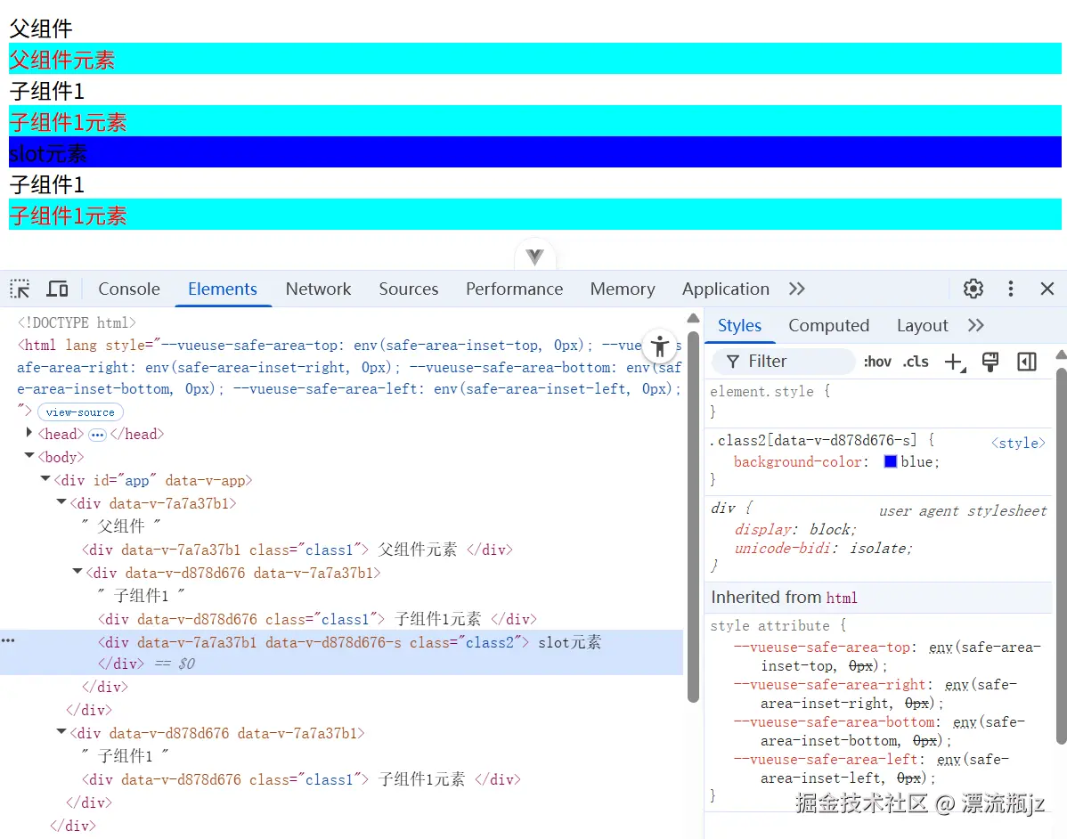
上面例子中展示了三种选择器的使用方式,其中全局选择器的效果和CSS Modules基本一致;深度选择器只能影响自己和子组件;插槽选择器影响的父组件中被包括在子组件插槽中的部分。通过对于组件作用域CSS的介绍,可以发现它虽然实现原理与CSS Modules不一致,但作用却有些相似,而且扩展了CSS Modules的作用范围。
Vue与CSS Modules
Vue中不仅有组件作用域CSS,单文件组件也可以直接集成CSS Modules开发。在style标签上加module属性,即可开启CSS Modules。我们继续举个例子演示用法,首先是父组件App.vue:
<script setup>
import Comp1 from './comp1.vue'
</script>

<template>
  <div>
    父组件
    <div :class="$style.class1"> 父组件元素 </div>
    <Comp1>
      <div :class="$style.class2"> slot元素 </div>
    </Comp1>
  </div>
</template>

<style module>
.class1 {
  color: red;
}
.class2 {
  background: yellow;
  composes: class1;
}
</style>
然后是子组件comp1.vue:
<script setup>
import { useCssModule } from 'vue'

const styles = useCssModule();
console.log(styles);
</script>

<template>
  <div>
    子组件1
    <div class="class1"> 子组件1元素 </div>
    <slot> </slot>
    <div :class="styles.class3"> 子组件1元素2 </div>
  </div>
</template>

<style module>
.class3 {
  border: 1px solid blue;
}
</style>

<!-- 输出结果
{ class3: "_class3_1wpng_3" }
-->
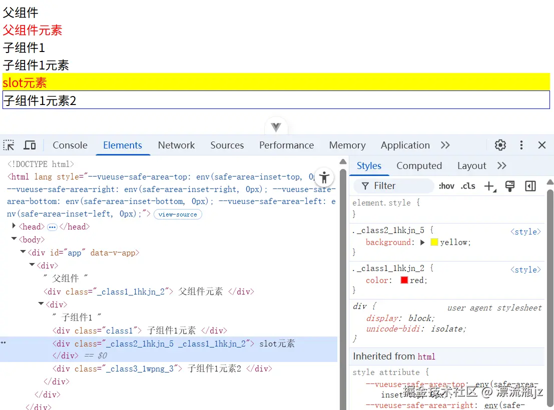
在父组件的template中,使用$style就可以拿到CSS Modules引入的标识符映射对象。如果希望在JavaScript文件中使用,则可以参考子组件的方式,使用useCssModule拿到标识符映射对象,进行处理后再提供给template。
Webpack使用方式
前面介绍了两种前端框架中CSS Modules的使用方式。因为它最终还需要构建工具进行处理才能生效,因此我们再关注一下它在不同构建工具中的使用方式。首先看下在Webpack中的使用。
接入CSS Modules
先创建一个Webapck工程,执行如下命令行:
npm init -y
npm install webpack webpack-cli style-loader css-loader html-webpack-plugin --save-dev
然后修改package.json中的scripts,增加"build": "webpack",后面执行npm run build即可构建结果。然后创建src/index.js,内容如下:
import * as styles from "./index.module.css";

console.log(styles);

function genEle(test, className) {
  const div = document.createElement("div");
  div.className = className;
  div.textContent = test;
  document.body.appendChild(div);
}

genEle("test1", styles.class1);
genEle("test2", styles.class2);
然后创建index.module.css,包含内容如下:
.class1 {
    color: red;
}
.class2 {
    background: yellow;
    composes: class1;
}
然后创建webpack.config.js配置文件,内容如下:
const path = require("path");
const HtmlWebpackPlugin = require("html-webpack-plugin");

module.exports = {
  mode: "production",
  entry: "./src/index.js",
  module: {
    rules: [
      {
        test: /\.css$/i,
        use: ["style-loader", "css-loader"],
      },
    ],
  },
  plugins: [
    new HtmlWebpackPlugin({
      title: "管理输出",
    }),
  ],
  output: {
    path: path.resolve(__dirname, "dist"),
  },
};

/* 输出结果
{
  class1:  "qbnq8h84_UYLiRusvV1S",
  class2:  "cofz5uKLVjU6TCKJqeBc qbnq8h84_UYLiRusvV1S",
  default: undefined,
  __esModule: true
  ...其它内容
}
*/
然后执行构建命令,生成dist目录。在浏览器中打开dist/index.html,可以看到CSS Modules已经接入成功,类名变成了带哈希的标识符,test2元素因为使用了composes特性,还包含了两个类名,在console输出时也带着。
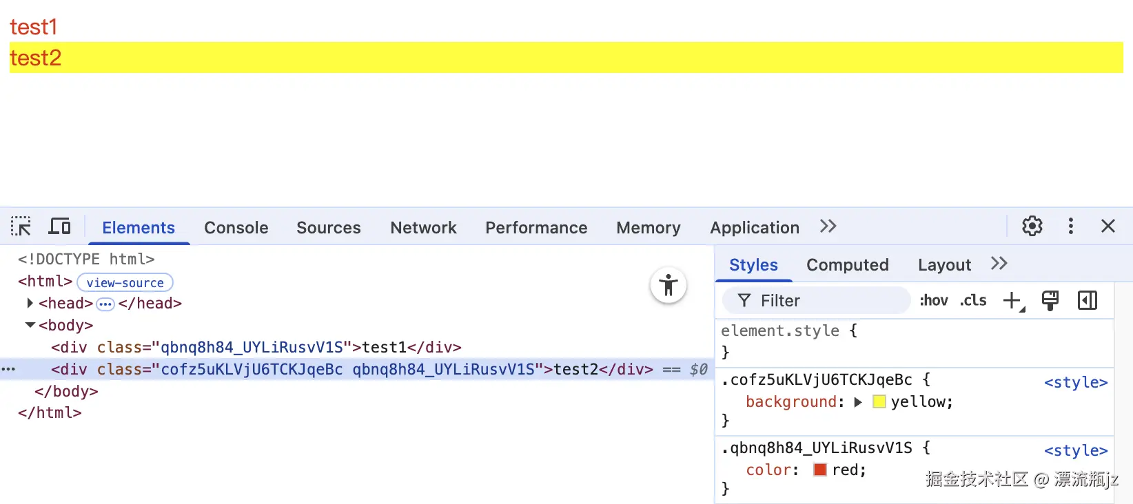
提供CSS Modules功能的,实际上是css-loader。默认情况下,当CSS文件的中间包含.module或者.icss时,css-loader会将其识别为CSS模块处理。可以看到JavaScript代码中引入CSS标识符时使用的是import * as,这也是因为css-loader并不支持默认导出所有标识符到一个对象中,而是只能单个导入,类似于import { class1 } from "./index.module.css";。
css-loader可以配置全部CSS文件开启CSS模块,配置modules选项为true即可。然后将index.module.css改为index.css也能使用CSS Modules功能。这里展示webpack.config.js中的配置改动:
const path = require("path");
const HtmlWebpackPlugin = require("html-webpack-plugin");

module.exports = {
  mode: "production",
  entry: "./src/index.js",
  module: {
    rules: [
      {
        test: /\.css$/i,
        use: [
          "style-loader",
          {
            loader: "css-loader",
            options: {
              modules: true,
            },
          },
        ],
      },
    ],
  },
  plugins: [
    new HtmlWebpackPlugin({
      title: "管理输出",
    }),
  ],
  output: {
    path: path.resolve(__dirname, "dist"),
  },
};
value变量
在css-loader文档中描述了开启CSS模块后,可以使用value变量的功能。虽然CSS Modules自己的主文档中没写,但是Webpack和Vite实际上都支持。value变量有点像CSS变量,一次定义,多处使用。这里我们举个例子,直接在前面的基础上修改CSS文件:
@value varRed red;
@value borderBlue 1px solid blue;

.class1 {
  color: varRed;
}
.class2 {
  background: varRed;
  border: borderBlue;
}
可以看到,使用方式和CSS变量类似,预先定义变量,随后引用标识符。但CSS变量是运行时,CSS Modules的变量是编译时。由于没有CSS变量好用,而且LESS和SCSS等都提供了更完善的编译时变量功能,因此CSS Modules的变量功能好像用的人不多。
模式
css-loader的modules配置表示CSS Modules相关配置,其中有一个mode配置,表示模式,有四种选项值,这里列举一下:
- local 将所有标识符编译为局部规则标识符
- global 将所有标识符编译为全局标识符,相当于所有标识符使用:global
- pure 与local模式一致,但是检测每一个CSS选择器是否存在局部标识符,如果不存在报错
- icss 仅处理composes特性,但是不转换局部标识符
local模式既是默认模式,与上面正常使用CSS Modules一致。global标识符会处理value变量,但不会转换成局部标识符。icss模式处理composes特性,但是也不转换局部标识符。pure模式则在普通local模式的基础上,增加了对于每个选择器的判断,这么判断的原因为:检测CSS模块文件中是否存在可以全局生效的CSS选择器。这里设置pure模式试一下,我们修改webpack.config.js中的css-loader配置:
{
  loader: "css-loader",
  options: {
    modules: {
      mode: 'pure'
    },
  },
}
然后创建修改index.module.scss文件:
.class1 {
  color: red;
}
.class2 {
  background: blue;
}
div {
  color: yellow;
}
执行npm run build,结果失败,命令行输出结果如下:
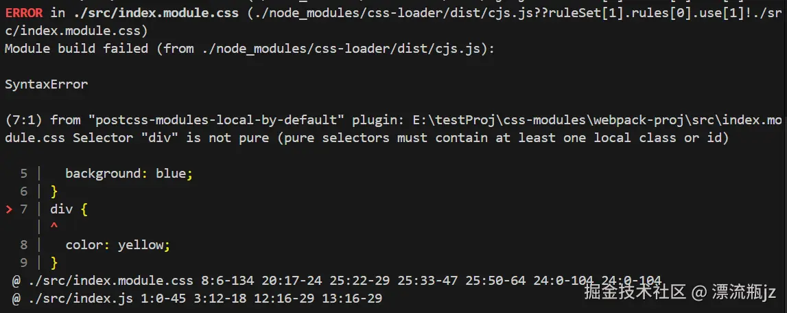
可以看到选择器div被标出来了,说它不“pure”,应该至少包含一个局部class或者id。这是因为div属性选择器,无法对属性选择器进行局部标识符的处理,因此这个选择器会全局生效,使用pure模式后,css-loader会寻找CSS模块文件中的全局选择器并报错,防止意外影响全局。
自定义标识符格式
在前面用Vite尝试CSS Modules时生成的新标识符格式,与Webpack生成的新标识符格式,看起来有点区别:Vite生成的带原来的类名,但是Webpack不带。这种标识符格式,实际上是可以更改的,使用localIdentName配置项即可:
{
  loader: "css-loader",
  options: {
    modules: {
      localIdentName: '[hash:base64]'
    },
  },
}
默认配置是[hash:base64],即原标识符的哈希值。还可以扩展其他格式:
-
[name] 源文件名称
-
[path] 目录名称
-
[file] 目录和文件名
-
[ext] 文件拓展名
-
[hash] 原标识符的哈希值
-
[local] 原来的标识符名
-
[hash:base64] 将hash做Base64处理
-
[hash:5] hash的长度限制为5
这些配置可以组合成模板字符串,例如[name]_[ext]_[hash]。这里举几个配置和对应的生成标识符的例子:
| 配置项 |
举例1 |
举例2 |
[name]_[ext]_[hash:7] |
index-module_-css_a9b9eaf |
index-module_-css_f3e6e28 |
[path]_[local]_[hash:base64:5] |
src-_class1_qbnq8 |
src-_class2_cofz5 |
使用postcss-modules
Webpack使用css-loader来支持CSS Modules,Vite背后则采用postcss-modules来支持CSS Modules。如果开启了lightningcss,则使用Lightning CSS来支持CSS Modules。postcss-modules是一个PostCSS插件,这里我们介绍一下。
引入postcss-modules
首先我们创建一个工程,引入PostCSS和postcss-modules,使其可以成功编译CSS Modules。首先执行命令行:
npm init -y
npm add -D postcss postcss-cli postcss-modules
# 后面执行下面命令行,可以编译CSS
# src 源文件目录 output 生成文件目录
npx postcss src -d output --no-map
创建PostCSS的配置文件postcss.config.js,里面引入postcss-modules插件。
const postcssModules = require("postcss-modules");
module.exports = {
  plugins: [postcssModules],
};
创建src/index.module.css,里面包含如下内容:
.class1 {
  color: red;
}
.class2 {
  composes: class1;
  background: blue;
}
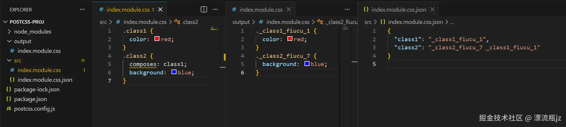
执行编译后,生成结果如上图。首先看左边的目录树,生成了output/index.module.css,内容是标识符改变后的CSS规则。但是在src目录中却还生成了一个index.module.css.json文件,内容为原标识符和新标识符的映射关系。因为PostCSS没有编译JavaScript文件的能力,因此这个映射关系作为额外的JSON文件导出了。
获取标识符映射数据
前面引入postcss-modules中,我们发现生成的标识符映射关系文件被放到了src源文件目录中。这有点让人不适,源代码目录不应该被生成的内容污染。postcss-modules提供了我们自行控制标识符映射数据的方式,需要修改配置文件postcss.config.js:
const path = require("path");
const fs = require("fs");
const postcssModules = require("postcss-modules");

module.exports = {
  plugins: [
    postcssModules({
      getJSON: (cssFileName, json, outputFileName) => {
        // 源CSS文件路径
        console.log(cssFileName);
        // 标识符映射数据
        console.log(json);
        // 默认要输出的文件路径 可以弃用
        console.log(outputFileName);
        console.log("---");

        // 创建目录 如果已经创建则静默成功
        fs.mkdirSync(path.resolve("./classMap"), { recursive: true });
        // 获取源文件名
        const cssName = path.basename(cssFileName);
        // 拼合新的路径
        const jsonFileName = path.resolve("./classMap/" + cssName + ".json");
        // 文件写入新路径
        fs.writeFileSync(jsonFileName, JSON.stringify(json));
      },
    }),
  ],
};
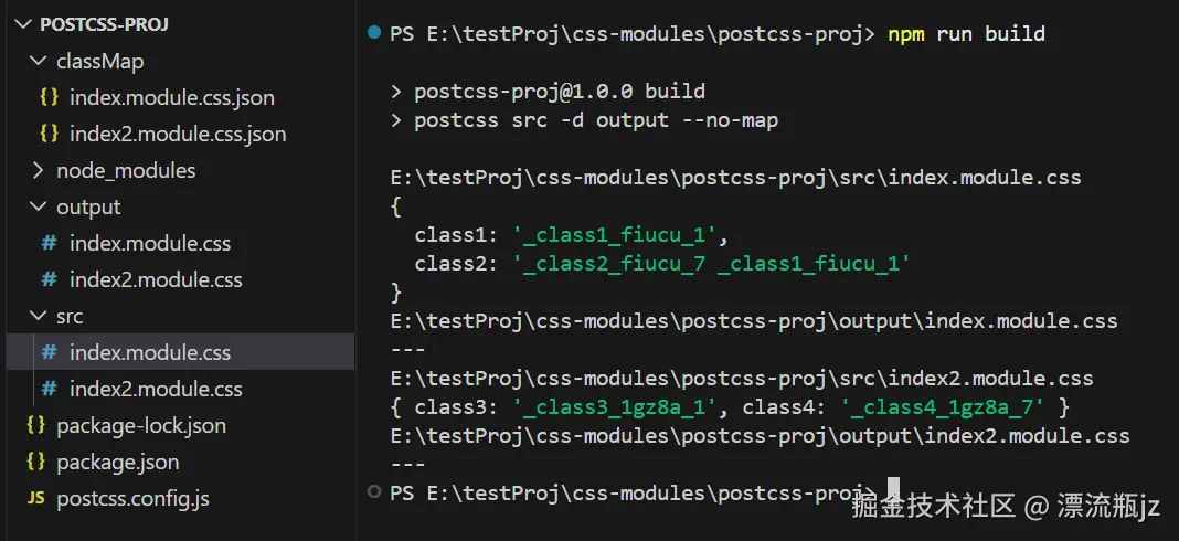
可以看到,对getJSON配置项传入函数,可以拿到文件路径和标识符数据,可以对它进行任意处理。上面给出了一个写入其它目录的例子。这里创建两个CSS文件index.module.css和index2.module.css,执行编译输出结果如下:
自定义标识符格式
在介绍Webpack使用方式时,我们提到css-loader支持自定义标识符格式,同样的postcss-modules也支持,而且格式也一样,通过修改generateScopedName配置:
const postcssModules = require("postcss-modules");
module.exports = {
  plugins: [
    postcssModules({
      generateScopedName: '[name]_[ext]_[hash:base64:5]'
    }),
  ],
};
因此,我们可以参考上面css-loader的文档来修改generateScopedName配置。generateScopedName还支持自定义函数,可以随心所欲的配置:
const path = require("path");
const postcssModules = require("postcss-modules");
module.exports = {
plugins: [
postcssModules({
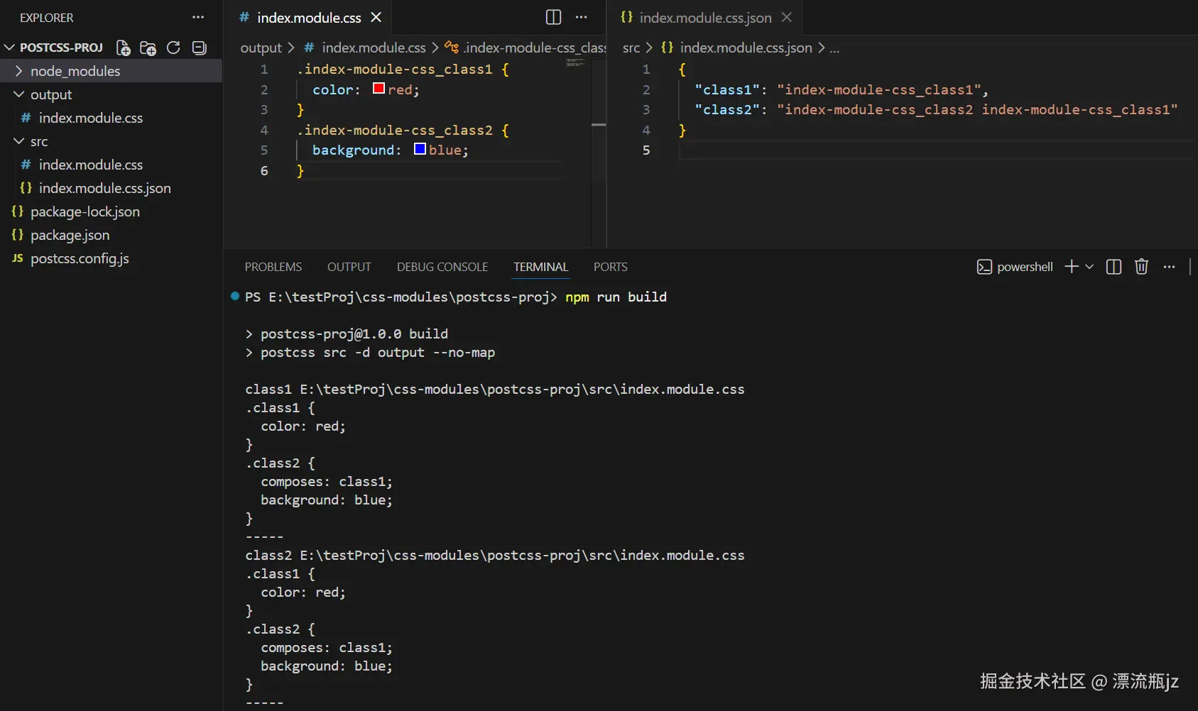
generateScopedName: (name, filename, css) => {
// name 文件路径 filename 文件路径
console.log(name, filename);
// CSS文件内容
console.log(css);
console.log('-----');
return `${path.basename(filename).replaceAll('.', '-')}_${name}`;
}
}),
],
};
在上面的例子中,我们将class名改为文件名+class名(仅供示例,实际使用还是会重复)。我们看下效果,成功的将class类名改为了我们自定义的格式。
原始标识符转换
CSS Modules推荐使用camelCase驼峰命名法来写CSS标识符,因为可以轻松在JavaScript中使用,例如styles.abcDef。但如果用kebab-case中划线命名法,在JavaScript中使用就稍微麻烦一些,但也不是不能用,例如:styles['abc-def']。但如果已有的CSS规则,postcss-modules提供了localsConvention配置项,可以让我们将原始标识符转换为驼峰命名法的形式。这样即使我们在CSS文件中使用中划线命名法,在JavaScript代码中也能用驼峰命名法引入。它共有四个选项可以配置。
- camelCase 输出为骆驼命名法,输出保留原标识符
- camelCaseOnly 输出为骆驼命名法,不保留原标识符
- dashes 仅转换中划线为骆驼命名法,输出保留原标识符
- dashesOnly 仅转换中划线为骆驼命名法,不保留原标识符
这里我们构造一个CSS文件,带有几种命名法:
.abcDef {
  color: red;
}
.bcd-efg {
  color: red;
}
.cde_fgh {
  color: red;
}
对于不同配置项,我们看一下输出结果:
// camelCase
{
  "abcDef": "_abcDef_cmy82_1",
  "bcd-efg": "_bcd-efg_cmy82_7",
  "bcdEfg": "_bcd-efg_cmy82_7",
  "cde_fgh": "_cde_fgh_cmy82_13",
  "cdeFgh": "_cde_fgh_cmy82_13"
}

// camelCaseOnly
{
  "abcDef": "_abcDef_cmy82_1",
  "bcdEfg": "_bcd-efg_cmy82_7",
  "cdeFgh": "_cde_fgh_cmy82_13"
}

// dashes
{
  "abcDef": "_abcDef_cmy82_1",
  "bcd-efg": "_bcd-efg_cmy82_7",
  "bcdEfg": "_bcd-efg_cmy82_7",
  "cde_fgh": "_cde_fgh_cmy82_13"
}

// dashesOnly
{
  "abcDef": "_abcDef_cmy82_1",
  "bcdEfg": "_bcd-efg_cmy82_7",
  "cde_fgh": "_cde_fgh_cmy82_13"
}
localsConvention配置还可以接受函数入参,这样我们可以自定义JavaScrript引入的标识符名,这里我们举了个例子,将标识符后面加了固定的后缀。
const postcssModules = require("postcss-modules");
module.exports = {
  plugins: [
    postcssModules({
      localsConvention: (originalClassName, generatedClassName, filPath) => {
        // 原标识符 转换后标识符
        console.log(originalClassName, generatedClassName);
        // CSS文件路径
        console.log(filPath);
        console.log("-----");
        return originalClassName + "_jzplp";
      },
    }),
  ],
};

/* 输出结果
{
  "abcDef_jzplp": "_abcDef_cmy82_1",
  "bcd-efg_jzplp": "_bcd-efg_cmy82_7",
  "cde_fgh_jzplp": "_cde_fgh_cmy82_13"
}
*/
处理路径别名
在CSS Modules的composes特性中,可以引入其它CSS文件中选择器的规则。很多人喜欢使用路径别名,例如@common/css等,postcss-modules也提供了resolve这个配置项,可以让我们自行控制别名,甚至修改路径。首先我们构造一个文件路径的例子:
/* src/common/com.css */
.classCommon {
  color: red;
}

/* src/copm1/index.module.css */
.class1 {
  background: yellow;
  composes: classCommon from '@common/com.css';
}
可以看到,我们先在common目录中设置了CSS文件,然后在copm1目录中,使用@common将其引入。如果不处理,@common这个路径CSS Module肯定是识别不了的。这里我们设置postcss.config.js:
const path = require("path");
const postcssModules = require("postcss-modules");
module.exports = {
  plugins: [
    postcssModules({
      resolve: (file, importer) => {
        // composes特性引入的文件路径
        console.log(file);
        // 当前处理的CSS文件
        console.log(importer);
        const newPath = path.resolve(
          process.cwd() + file.replace("@common", "/src/common"),
        );
        return newPath;
      },
    }),
  ],
};

/*
命令行输出结果
@common/com.css
E:\testProj\css-modules\postcss-proj\src\comp1\index.module.css

index.module.css.json输出结果
{"class1":"_class1_u2c4w_1 _classCommon_pc5si_1"}
*/
可以看到,提供自定义的resolve函数,可以接收composes中的路径与当前处理的文件路径,然后将我们的路径别名转化为真正的路径名。
解析PostHTML模板
postcss-modules导出的JSON文件,可以被posthtml-css-modules使用,用来提供给PostHTML模板提供新的标识符。首先我们将postcss-modules中的所有选项删除(为了不干扰这个例子)。然后创建一个CSS文件src/index.module.css:
.class1 {
  background: yellow;
}
.class2 {
  color: red;
  composes: class1;
}
然后创建index.js,处理PostHTML模板:
const posthtml = require('posthtml');
const posthtmlCssModules = require("posthtml-css-modules");

const template = `
<div css-module="class1">test1</div>
<div css-module="class2">test2</div>
`
posthtml([posthtmlCssModules("./src/index.module.css.json")])
.process(template)
.then(function (result) {
console.log(result.html);
});
我们还没安装新依赖呢。执行如下命令行,安装依赖和拿到编译结果:
# 安装依赖
npm add posthtml posthtml-css-modules
# 编译CSS 处理CSS Modules
postcss src -d output --no-map
# 执行上面代码,处理PostHTML模板
node index.js
最后输出结果如下。可以看到关键在于css-module属性,我们将其设置为原始的标识符,经过处理后就变为了转换后的标识符。
<div class="_class1_go5lk_1">test1</div>
<div class="_class2_go5lk_7 _class1_go5lk_1">test2</div>
posthtml-css-modules还支持传入目录,可以处理多个文件。同时在css-module中使用点符号分隔文件和属性。但由于postcss-modules默认生成的文件中肯定会出现点,例如 index1.css -> index1.css.json,因此我们先要处理postcss.config.js:
const path = require("path");
const fs = require("fs");

const postcssModules = require("postcss-modules");
module.exports = {
  plugins: [
    postcssModules({
      getJSON: (cssFileName, json) => {
        // 创建目录 如果已经创建则静默成功
        fs.mkdirSync(path.resolve("./classMap"), { recursive: true });
        // 获取源文件名
        const cssName = path.basename(cssFileName, ".css");
        // 拼合新的路径
        const jsonFileName = path.resolve("./classMap/" + cssName + ".json");
        // 文件写入新路径
        fs.writeFileSync(jsonFileName, JSON.stringify(json));
      },
    }),
  ],
};
例如我们有src目录,里面有两个JSON文件insex1.json和insex2.json,此时处理模板的代码修改为:
const posthtml = require('posthtml');
const posthtmlCssModules = require("posthtml-css-modules");

// 文件名.标识符
const template = `
<div css-module="index1.class1">test1</div>
<div css-module="index2.class2">test2</div>
`
posthtml([posthtmlCssModules("./classMap/")])
.process(template)
.then(function (result) {
console.log(result.html);
});

/* 输出结果
<div class="_class1_1c28r_1">test1</div>
<div class="_class2_10f6k_1">test2</div>
*/
Lightning CSS
Lightning CSS是一个用Rust编写的CSS编译工具,可以解析,编译,打包和压缩CSS代码,性能比用JavaScript 的同类工具要强很多。Lightning CSS也支持CSS modules,这里我们简单讲一下用法。
接入Lightning CSS
首先执行命令行新建工程,安装lightningcss依赖。然后创建index.mjs,内容如下:
import { transform } from 'lightningcss';

const cssData = `
.class1 { color: red }
.class2 { color: blue }
`;
let { code, exports } = transform({
  cssModules: true,
  code: Buffer.from(cssData),
});

console.log(code.toString());
console.log('-----');
console.log(exports);

/* 输出结果
._8Z4fiW_class1 {
  color: red;
}

._8Z4fiW_class2 {
  color: #00f;
}

-----
{
  class1: { name: '_8Z4fiW_class1', composes: [], isReferenced: false },
  class2: { name: '_8Z4fiW_class2', composes: [], isReferenced: false }
}
*/
从上面代码可以看到,Lightning CSS接收和返回的都是Buffer对象;设置cssModules为true可以处理CSS modules。其中code是返回代码,exports是返回的映射关系。Lightning CSS返回的映射关系格式与其它工具不同,它一个标识符为一个对象,其中的name为转换后的标识符。
composes特性的映射关系
与其它工具不一样,Lightning CSS处理composes特性并不将其直接作为name,而是单独放到composes数组中。这里我们举个例子试一下:
.class1 { color: red }
.class2 {
  color: blue;
  composes: class1;
  composes: jzplp from global;
  composes: abc from './style.css';
}

/* 输出结果
._8Z4fiW_class1 {
  color: red;
}

._8Z4fiW_class2 {
  color: #00f;
}

-----
{
  class1: { name: '_8Z4fiW_class1', composes: [], isReferenced: false },
  class2: {
    name: '_8Z4fiW_class2',
    composes: [
      { type: 'local', name: '_8Z4fiW_class1' },
      { type: 'global', name: 'jzplp' },
      { type: 'dependency', name: 'abc', specifier: './style.css' }
    ],
    isReferenced: false
  }
}
*/
这里举了三种composes例子,有不同的类型:
- local 本文件中的标识符
- global 全局标识符
- dependency 其它文件的标识符
注意dependency类型,这里没有实际读取另一个CSS文件(因为我们使用transform来编译,不能读取其它文件),而且这个name值也并没有变成转换后的值。Lightning CSS的文档中要求调用方自行处理。
使用bundle方法
前面我们提到,在使用composes特性引入另一个文件的标识符,最后映射关系中只给我们返回了文件路径,没有帮我们实际引入。这时候我们不用transform方法,转为使用bundle,Lightning CSS就可以帮我们读取文件了。我们构造一个例子。首先创建两个CSS文件:
/* index.css */
.class2 {
  background-color: red;
  composes: abc from './style.css';
}

/* style.css */
.abc {
  color: blue;
}
.bcd {
  font-size: 14px;
}
然后修改index.mjs:
import { bundle } from "lightningcss";

let { code, exports } = bundle({
  cssModules: true,
  filename: "./index.css",
});

console.log(code.toString());
console.log("-----");
console.dir(exports, { depth: null });

/* 输出结果
.Zvw1Mq_abc {
  color: #00f;
}

.Zvw1Mq_bcd {
  font-size: 14px;
}

.vkZoAa_class2 {
  background-color: red;
}

-----
{
  class2: {
    name: 'vkZoAa_class2',
    composes: [ { type: 'local', name: 'Zvw1Mq_abc' } ],
    isReferenced: false
  }
}
*/
可以看到,虽然我们只输入了一个index.css文件,但两个CSS文件实际上都被编译了。但映射关系还是只输出了index.css。之前的dependency类型消失了,因为拿到了转换后的类名,所以类型也被转为了local。
模块化CSS变量
Lightning CSS并不提供value变量功能,理由是CSS本身已经支持变量了。但Lightning CSS支持了将CSS变量标识符转换为hash标识符的功能,即局部CSS变量。这里我们试一下:
import { transform } from "lightningcss";

const cssData = `
.root {
  --abc: red;
}
.class1 {
  color: var(--abc);
  background: var(--bcd from global);
  font-size: var(--def from './style.css');
}
`;
let { code, exports } = transform({
  cssModules: {
    dashedIdents: true,
  },
  code: Buffer.from(cssData),
});

console.log(code.toString());
console.log("-----");
console.log(exports);

/* 输出结果
._8Z4fiW_root {
  --_8Z4fiW_abc: red;
}

._8Z4fiW_class1 {
  color: var(--_8Z4fiW_abc);
  background: var(--bcd);
  font-size: var(--tCZyqW);
}

-----
{
  class1: { name: '_8Z4fiW_class1', composes: [], isReferenced: false },
  '--abc': { name: '--_8Z4fiW_abc', composes: [], isReferenced: true },
  root: { name: '_8Z4fiW_root', composes: [], isReferenced: false }
}
*/
开启dashedIdents选项才能够局部化CSS变量。 这里列举了三个情形,与composes非常类似:
- 本文件的CSS变量 使用方法与CSS写法一致,工具会自己转换。exports中也导出了对应标识符。
- 全局CSS变量 使用from global可以设置为全局变量
- 从其它文件引入局部CSS变量
注意看从其它文件引入的情形,exports中并没有导出这个标识符,但是CSS文件却被转换了。这也是因为transform方法没有访问文件的能力,但这种“自行转换”的形式有些不妥,如果没有和另一个文件匹配,这个CSS变量引入就无法生效。这里我们换成bundle方法试一下。还是创建两个CSS文件:
/* index.css */
.root {
  --abc: red;
}
.class1 {
  color: var(--abc);
  background: var(--bcd from global);
  font-size: var(--def from './style.css');
}

/* style.css */
.root {
  --def: 14px;
}
然后修改index.mjs。通过执行结果可以看到,bundle方法将两个文件一起编译,保证结果的正确性。
import { bundle } from "lightningcss";

let { code, exports } = bundle({
  cssModules: {
    dashedIdents: true,
  },
  filename: "./index.css",
});

console.log(code.toString());
console.log("-----");
console.dir(exports, { depth: null });

/*
.Zvw1Mq_root {
  --Zvw1Mq_def: 14px;
}

.vkZoAa_root {
  --vkZoAa_abc: red;
}

.vkZoAa_class1 {
  color: var(--vkZoAa_abc);
  background: var(--bcd);
  font-size: var(--Zvw1Mq_def);
}

-----
{
  root: { name: 'vkZoAa_root', composes: [], isReferenced: false },
  '--abc': { name: '--vkZoAa_abc', composes: [], isReferenced: true },
  class1: { name: 'vkZoAa_class1', composes: [], isReferenced: false }
}
*/
Lightning CSS的CSS Modules还支持一些其它功能,例如自定义标识符,自定义标识符转换范围,pure模式等,这里就不赘述了。
背后的Postcss插件
观察css-loader和postcss-modules的依赖,发现它们都引用了四个前缀一致的PostCSS插件:
- postcss-modules-local-by-default
- postcss-modules-scope
- postcss-modules-extract-imports
- postcss-modules-values
这四个插件名称都以postcss-modules-开头,都是实现CSS Modules相关的插件,而且也在css-modules自己的仓库列表中。我们逐一介绍一下这几个插件。
postcss-modules-local-by-default
postcss-modules-local-by-default插件的作用是将标识符增加:local(),同时将:global()去掉。这样所有应该被局部化处理的标识符都有:local()标志,没有标志则说明无需处理。首先修改postcss.config.js,引入插件:
const postcssModules = require("postcss-modules-local-by-default");
module.exports = {
  plugins: [postcssModules],
};
然后是要编译的CSS文件和编译结果:
.class1 {
  color: red;
}
.class2:hover {
  color: blue;
}
:global(.class3) {
  color: blue;
}

/* 输出结果
:local(.class1) {
  color: red;
}
:local(.class2):hover {
  color: blue;
}
.class3 {
  color: blue;
}
*/
postcss-modules-scope
postcss-modules-scope插件的作用是将带:local()的CSS标识符转换成新标识符,同时输出一个:export,里面包含标识符转换关系。首先修改postcss.config.js,引入插件:
const postcssModules = require("postcss-modules-scope");
module.exports = {
  plugins: [postcssModules],
};
通过功能说明,我们发现postcss-modules-scope插件的输入实际上就是postcss-modules-local-by-default插件的输出,因此我们把前面的结果拿过来继续编译。可以看到输出的转换关系还是放在CSS文件中。
:local(.class1) {
  color: red;
}
:local(.class2):hover {
  color: blue;
}
.class3 {
  color: blue;
}
/* 输出结果
._E_testProj_css_modules_postcss2_proj_src_index__class1 {
  color: red;
}
._E_testProj_css_modules_postcss2_proj_src_index__class2:hover {
  color: blue;
}
.class3 {
  color: blue;
}
:export {
  class1: _E_testProj_css_modules_postcss2_proj_src_index__class1;
  class2: _E_testProj_css_modules_postcss2_proj_src_index__class2;
}
*/
postcss-modules-extract-imports
postcss-modules-extract-imports插件的作用是处理跨文件的composes,但并不是实际引入文件。首先修改配置文件postcss.config.js:
const postcssModules = require("postcss-modules-extract-imports");
module.exports = {
  plugins: [postcssModules],
};
然后是要编译的CSS文件和编译结果。通过结果可以看到,插件将跨文件的composes输出为了一个特殊标识符,然后在文件上面增加了:import,给出了对应CSS文件中文件标识符的映射关系。
.class1 {
  color: red;
  composes: abc from './style.css';
}
.class2 {
  color: red;
  composes: class1;
}

/* 输出结果
:import("./style.css") {
  i__imported_abc_0: abc;
}
.class1 {
  color: red;
  composes: i__imported_abc_0;
}
.class2 {
  color: red;
  composes: class1;
}
*/
postcss-modules-values
postcss-modules-values插件的作用是处理value变量特性的。首先修改配置文件postcss.config.js:
const postcssModules = require("postcss-modules-values");
module.exports = {
  plugins: [postcssModules],
};
然后是要编译的CSS文件和编译结果。通过结果可以看到,本文件的value变量直接替换成对应值,跨文件的处理方式则类似于postcss-modules-extract-imports,在文件上面增加了:import,标识出了对应关系。
@value colorRed: red;
@value colorBlue: from './styles.css';

.class1 {
  color: colorRed;
  background-color: colorBlue;
}

/* 输出结果
:import('./styles.css') {
  i__const_colorBlue_0: colorBlue;
}
:export {
  colorRed: red;
  colorBlue: i__const_colorBlue_0;
}
.class1 {
  color: red;
  background-color: i__const_colorBlue_0;
}
*/
总结
CSS Modules是非常流行的CSS工具,大部分构建工具都提供了对它的支持。这是因为:
- 较好的解决了前端组件化中CSS的问题,避免了CSS污染和冲突问题。
- 写法上就是普通CSS文件,不需要修改语法,容易被大众接收。
- 与现代前端框架开发集成较好,尤其是React。
- 与SCSS和Less等CSS预处理工具都兼容。
相对的,像是一些和CSS语法有区别的特性,例如value变量等,使用的人就少了。甚至新的Lightning CSS干脆不支持。
通过【背后的Postcss插件】这部分,我们了解到CSS Modules功能的实现是由css-modules提供的PostCSS插件实现的。但这些插件不能读取文件,也不能实现将CSS文件导出为JavaScript对象。处理文件和打包是构建工具负责的内容,因此还要构建工具自行适配,完成整个功能的开发提供给使用者。
参考
 登录
登录