 登录
登录未来将至:人形机器人运动会 - 肘子的 Swift 周报 #99
不久前在北京举办的世界人形机器人运动会上,出现了许多令人忍俊不禁的场景:机器人对着空气挥拳、跑步时左摇右摆、踢球时相互碰撞后集体倒地。尽管这些画面看起来颇为滑稽,但回顾过去几年人形机器人的发展历程就会发现,即便当前的产品仍存在诸多不足,其进步却是惊人的。按照这样的发展速度,也许在十年甚至更短的时间内,人形机器人就将走进我们的日常生活,满足各种实际需求。
不久前在北京举办的世界人形机器人运动会上,出现了许多令人忍俊不禁的场景:机器人对着空气挥拳、跑步时左摇右摆、踢球时相互碰撞后集体倒地。尽管这些画面看起来颇为滑稽,但回顾过去几年人形机器人的发展历程就会发现,即便当前的产品仍存在诸多不足,其进步却是惊人的。按照这样的发展速度,也许在十年甚至更短的时间内,人形机器人就将走进我们的日常生活,满足各种实际需求。
你是否曾经为缺少合适的交互组件而烦恼?对话框不够美观、提示信息不够明显、选择器不够好用?今天我们就来聊聊 Flutter 中的其他组件,让你的应用交互更加丰富和友好!
在我开发的一个电商应用中,用户反馈最多的问题是"操作反馈不够及时"和"选择功能不够方便"。后来我重新设计了交互组件,添加了美观的对话框、及时的提示信息和便捷的选择器,用户满意度提升了 45%!
好的交互组件能让用户:
// 简单的确认对话框
showDialog(
  context: context,
  builder: (context) => AlertDialog(
    title: Text('确认删除'),
    content: Text('确定要删除这个项目吗?'),
    actions: [
      TextButton(
        onPressed: () => Navigator.pop(context),
        child: Text('取消'),
      ),
      ElevatedButton(
        onPressed: () {
          Navigator.pop(context);
          print('删除操作');
        },
        child: Text('删除'),
      ),
    ],
  ),
);
就这么简单!用户点击后就会显示一个确认对话框。
// 自定义样式的对话框
showDialog(
  context: context,
  builder: (context) => Dialog(
    shape: RoundedRectangleBorder(
      borderRadius: BorderRadius.circular(20),
    ),
    child: Container(
      padding: EdgeInsets.all(24),
      child: Column(
        mainAxisSize: MainAxisSize.min,
        children: [
          Icon(
            Icons.check_circle,
            color: Colors.green,
            size: 64,
          ),
          SizedBox(height: 16),
          Text(
            '操作成功',
            style: TextStyle(
              fontSize: 24,
              fontWeight: FontWeight.bold,
            ),
          ),
          SizedBox(height: 8),
          Text(
            '您的操作已经成功完成',
            style: TextStyle(
              color: Colors.grey[600],
              fontSize: 16,
            ),
          ),
          SizedBox(height: 24),
          SizedBox(
            width: double.infinity,
            child: ElevatedButton(
              onPressed: () => Navigator.pop(context),
              child: Text('确定'),
            ),
          ),
        ],
      ),
    ),
  ),
);
class SmartSnackBar {
  static void showSuccess(BuildContext context, String message) {
    ScaffoldMessenger.of(context).showSnackBar(
      SnackBar(
        content: Row(
          children: [
            Icon(Icons.check_circle, color: Colors.white),
            SizedBox(width: 8),
            Expanded(child: Text(message)),
          ],
        ),
        backgroundColor: Colors.green,
        behavior: SnackBarBehavior.floating,
        shape: RoundedRectangleBorder(
          borderRadius: BorderRadius.circular(8),
        ),
      ),
    );
  }

  static void showError(BuildContext context, String message) {
    ScaffoldMessenger.of(context).showSnackBar(
      SnackBar(
        content: Row(
          children: [
            Icon(Icons.error, color: Colors.white),
            SizedBox(width: 8),
            Expanded(child: Text(message)),
          ],
        ),
        backgroundColor: Colors.red,
        behavior: SnackBarBehavior.floating,
        shape: RoundedRectangleBorder(
          borderRadius: BorderRadius.circular(8),
        ),
      ),
    );
  }

  static void showInfo(BuildContext context, String message) {
    ScaffoldMessenger.of(context).showSnackBar(
      SnackBar(
        content: Row(
          children: [
            Icon(Icons.info, color: Colors.white),
            SizedBox(width: 8),
            Expanded(child: Text(message)),
          ],
        ),
        backgroundColor: Colors.blue,
        behavior: SnackBarBehavior.floating,
        shape: RoundedRectangleBorder(
          borderRadius: BorderRadius.circular(8),
        ),
      ),
    );
  }
}

// 使用示例
SmartSnackBar.showSuccess(context, '保存成功!');
SmartSnackBar.showError(context, '网络连接失败');
SmartSnackBar.showInfo(context, '正在同步数据...');
class BottomActionSheet extends StatelessWidget {
  final String title;
  final List<ActionItem> actions;

  const BottomActionSheet({
    Key? key,
    required this.title,
    required this.actions,
  }) : super(key: key);

  @override
  Widget build(BuildContext context) {
    return Container(
      decoration: BoxDecoration(
        color: Colors.white,
        borderRadius: BorderRadius.vertical(top: Radius.circular(20)),
      ),
      child: Column(
        mainAxisSize: MainAxisSize.min,
        children: [
          // 标题栏
          Container(
            padding: EdgeInsets.all(16),
            decoration: BoxDecoration(
              border: Border(
                bottom: BorderSide(color: Colors.grey[200]!),
              ),
            ),
            child: Row(
              children: [
                Text(
                  title,
                  style: TextStyle(
                    fontSize: 18,
                    fontWeight: FontWeight.bold,
                  ),
                ),
                Spacer(),
                GestureDetector(
                  onTap: () => Navigator.pop(context),
                  child: Icon(Icons.close),
                ),
              ],
            ),
          ),

          // 操作列表
          ...actions.map((action) => ListTile(
            leading: Icon(action.icon, color: action.color),
            title: Text(action.title),
            subtitle: action.subtitle != null ? Text(action.subtitle!) : null,
            onTap: () {
              Navigator.pop(context);
              action.onTap?.call();
            },
          )).toList(),

          // 底部间距
          SizedBox(height: 16),
        ],
      ),
    );
  }
}

class ActionItem {
  final String title;
  final String? subtitle;
  final IconData icon;
  final Color color;
  final VoidCallback? onTap;

  ActionItem({
    required this.title,
    this.subtitle,
    required this.icon,
    this.color = Colors.blue,
    this.onTap,
  });
}

// 使用示例
showModalBottomSheet(
  context: context,
  builder: (context) => BottomActionSheet(
    title: '选择操作',
    actions: [
      ActionItem(
        title: '分享',
        subtitle: '分享给朋友',
        icon: Icons.share,
        color: Colors.blue,
        onTap: () => print('分享'),
      ),
      ActionItem(
        title: '收藏',
        subtitle: '添加到收藏夹',
        icon: Icons.favorite,
        color: Colors.red,
        onTap: () => print('收藏'),
      ),
      ActionItem(
        title: '删除',
        subtitle: '永久删除此项目',
        icon: Icons.delete,
        color: Colors.red,
        onTap: () => print('删除'),
      ),
    ],
  ),
);
class SmartDateTimePicker {
  static Future<DateTime?> pickDate(BuildContext context, {
    DateTime? initialDate,
    DateTime? firstDate,
    DateTime? lastDate,
  }) async {
    final DateTime? picked = await showDatePicker(
      context: context,
      initialDate: initialDate ?? DateTime.now(),
      firstDate: firstDate ?? DateTime(1900),
      lastDate: lastDate ?? DateTime(2100),
      builder: (context, child) {
        return Theme(
          data: Theme.of(context).copyWith(
            colorScheme: ColorScheme.light(
              primary: Colors.blue,
              onPrimary: Colors.white,
              surface: Colors.white,
              onSurface: Colors.black,
            ),
          ),
          child: child!,
        );
      },
    );
    return picked;
  }

  static Future<TimeOfDay?> pickTime(BuildContext context, {
    TimeOfDay? initialTime,
  }) async {
    final TimeOfDay? picked = await showTimePicker(
      context: context,
      initialTime: initialTime ?? TimeOfDay.now(),
      builder: (context, child) {
        return Theme(
          data: Theme.of(context).copyWith(
            colorScheme: ColorScheme.light(
              primary: Colors.blue,
              onPrimary: Colors.white,
              surface: Colors.white,
              onSurface: Colors.black,
            ),
          ),
          child: child!,
        );
      },
    );
    return picked;
  }

  static Future<DateTime?> pickDateTime(BuildContext context) async {
    final DateTime? date = await pickDate(context);
    if (date != null) {
      final TimeOfDay? time = await pickTime(context);
      if (time != null) {
        return DateTime(
          date.year,
          date.month,
          date.day,
          time.hour,
          time.minute,
        );
      }
    }
    return null;
  }
}

// 使用示例
ElevatedButton(
  onPressed: () async {
    final date = await SmartDateTimePicker.pickDate(context);
    if (date != null) {
      print('选择的日期: $date');
    }
  },
  child: Text('选择日期'),
),

ElevatedButton(
  onPressed: () async {
    final time = await SmartDateTimePicker.pickTime(context);
    if (time != null) {
      print('选择的时间: $time');
    }
  },
  child: Text('选择时间'),
),

ElevatedButton(
  onPressed: () async {
    final dateTime = await SmartDateTimePicker.pickDateTime(context);
    if (dateTime != null) {
      print('选择的日期时间: $dateTime');
    }
  },
  child: Text('选择日期时间'),
),
class SmartProgressIndicator extends StatelessWidget {
  final double progress;
  final String? label;
  final Color? color;
  final double height;

  const SmartProgressIndicator({
    Key? key,
    required this.progress,
    this.label,
    this.color,
    this.height = 8.0,
  }) : super(key: key);

  @override
  Widget build(BuildContext context) {
    return Column(
      crossAxisAlignment: CrossAxisAlignment.start,
      children: [
        if (label != null) ...[
          Text(
            label!,
            style: TextStyle(
              fontSize: 14,
              fontWeight: FontWeight.w500,
            ),
          ),
          SizedBox(height: 8),
        ],
        LinearProgressIndicator(
          value: progress.clamp(0.0, 1.0),
          backgroundColor: Colors.grey[200],
          valueColor: AlwaysStoppedAnimation<Color>(
            color ?? Colors.blue,
          ),
          minHeight: height,
        ),
        SizedBox(height: 4),
        Text(
          '${(progress * 100).toInt()}%',
          style: TextStyle(
            fontSize: 12,
            color: Colors.grey[600],
          ),
        ),
      ],
    );
  }
}

class CircularProgressWithLabel extends StatelessWidget {
  final double progress;
  final String label;
  final double size;
  final Color? color;

  const CircularProgressWithLabel({
    Key? key,
    required this.progress,
    required this.label,
    this.size = 100.0,
    this.color,
  }) : super(key: key);

  @override
  Widget build(BuildContext context) {
    return Column(
      children: [
        SizedBox(
          width: size,
          height: size,
          child: Stack(
            alignment: Alignment.center,
            children: [
              CircularProgressIndicator(
                value: progress.clamp(0.0, 1.0),
                strokeWidth: 8,
                backgroundColor: Colors.grey[200],
                valueColor: AlwaysStoppedAnimation<Color>(
                  color ?? Colors.blue,
                ),
              ),
              Text(
                '${(progress * 100).toInt()}%',
                style: TextStyle(
                  fontSize: 18,
                  fontWeight: FontWeight.bold,
                ),
              ),
            ],
          ),
        ),
        SizedBox(height: 8),
        Text(
          label,
          style: TextStyle(
            fontSize: 14,
            color: Colors.grey[600],
          ),
        ),
      ],
    );
  }
}

// 使用示例
SmartProgressIndicator(
  progress: 0.75,
  label: '下载进度',
  color: Colors.green,
),

CircularProgressWithLabel(
  progress: 0.6,
  label: '上传中',
  color: Colors.orange,
),
class CustomSwitch extends StatefulWidget {
  final bool value;
  final ValueChanged<bool>? onChanged;
  final Color? activeColor;
  final Color? inactiveColor;
  final double width;
  final double height;

  const CustomSwitch({
    Key? key,
    required this.value,
    this.onChanged,
    this.activeColor,
    this.inactiveColor,
    this.width = 50.0,
    this.height = 30.0,
  }) : super(key: key);

  @override
  _CustomSwitchState createState() => _CustomSwitchState();
}

class _CustomSwitchState extends State<CustomSwitch>
    with SingleTickerProviderStateMixin {
  late AnimationController _controller;
  late Animation<double> _animation;

  @override
  void initState() {
    super.initState();
    _controller = AnimationController(
      duration: Duration(milliseconds: 200),
      vsync: this,
    );
    _animation = Tween<double>(
      begin: 0.0,
      end: 1.0,
    ).animate(CurvedAnimation(
      parent: _controller,
      curve: Curves.easeInOut,
    ));

    if (widget.value) {
      _controller.value = 1.0;
    }
  }

  @override
  void didUpdateWidget(CustomSwitch oldWidget) {
    super.didUpdateWidget(oldWidget);
    if (widget.value != oldWidget.value) {
      if (widget.value) {
        _controller.forward();
      } else {
        _controller.reverse();
      }
    }
  }

  @override
  void dispose() {
    _controller.dispose();
    super.dispose();
  }

  @override
  Widget build(BuildContext context) {
    return GestureDetector(
      onTap: () {
        widget.onChanged?.call(!widget.value);
      },
      child: AnimatedBuilder(
        animation: _animation,
        builder: (context, child) {
          return Container(
            width: widget.width,
            height: widget.height,
            decoration: BoxDecoration(
              borderRadius: BorderRadius.circular(widget.height / 2),
              color: Color.lerp(
                widget.inactiveColor ?? Colors.grey[300],
                widget.activeColor ?? Colors.blue,
                _animation.value,
              ),
            ),
            child: Padding(
              padding: EdgeInsets.all(2),
              child: Align(
                alignment: Alignment.lerp(
                  Alignment.centerLeft,
                  Alignment.centerRight,
                  _animation.value,
                )!,
                child: Container(
                  width: widget.height - 4,
                  height: widget.height - 4,
                  decoration: BoxDecoration(
                    color: Colors.white,
                    shape: BoxShape.circle,
                    boxShadow: [
                      BoxShadow(
                        color: Colors.black.withOpacity(0.2),
                        blurRadius: 4,
                        offset: Offset(0, 2),
                      ),
                    ],
                  ),
                ),
              ),
            ),
          );
        },
      ),
    );
  }
}

// 使用示例
CustomSwitch(
  value: _isEnabled,
  onChanged: (value) {
    setState(() {
      _isEnabled = value;
    });
  },
  activeColor: Colors.green,
  inactiveColor: Colors.grey,
),
class CustomSlider extends StatefulWidget {
  final double value;
  final double min;
  final double max;
  final ValueChanged<double>? onChanged;
  final Color? activeColor;
  final Color? inactiveColor;
  final double height;

  const CustomSlider({
    Key? key,
    required this.value,
    required this.min,
    required this.max,
    this.onChanged,
    this.activeColor,
    this.inactiveColor,
    this.height = 20.0,
  }) : super(key: key);

  @override
  _CustomSliderState createState() => _CustomSliderState();
}

class _CustomSliderState extends State<CustomSlider> {
  double _currentValue = 0.0;

  @override
  void initState() {
    super.initState();
    _currentValue = widget.value;
  }

  @override
  void didUpdateWidget(CustomSlider oldWidget) {
    super.didUpdateWidget(oldWidget);
    if (widget.value != oldWidget.value) {
      _currentValue = widget.value;
    }
  }

  double get _progress => (_currentValue - widget.min) / (widget.max - widget.min);

  @override
  Widget build(BuildContext context) {
    return GestureDetector(
      onPanUpdate: (details) {
        final RenderBox renderBox = context.findRenderObject() as RenderBox;
        final localPosition = renderBox.globalToLocal(details.globalPosition);
        final width = renderBox.size.width;
        final progress = (localPosition.dx / width).clamp(0.0, 1.0);
        final newValue = widget.min + progress * (widget.max - widget.min);

        setState(() {
          _currentValue = newValue;
        });
        widget.onChanged?.call(newValue);
      },
      child: Container(
        height: widget.height,
        decoration: BoxDecoration(
          borderRadius: BorderRadius.circular(widget.height / 2),
          color: widget.inactiveColor ?? Colors.grey[300],
        ),
        child: Stack(
          children: [
            // 进度条
            Container(
              width: MediaQuery.of(context).size.width * _progress,
              decoration: BoxDecoration(
                borderRadius: BorderRadius.circular(widget.height / 2),
                color: widget.activeColor ?? Colors.blue,
              ),
            ),
            // 滑块
            Positioned(
              left: (MediaQuery.of(context).size.width - widget.height) * _progress,
              child: Container(
                width: widget.height,
                height: widget.height,
                decoration: BoxDecoration(
                  color: Colors.white,
                  shape: BoxShape.circle,
                  boxShadow: [
                    BoxShadow(
                      color: Colors.black.withOpacity(0.2),
                      blurRadius: 4,
                      offset: Offset(0, 2),
                    ),
                  ],
                ),
              ),
            ),
          ],
        ),
      ),
    );
  }
}

// 使用示例
CustomSlider(
  value: _sliderValue,
  min: 0.0,
  max: 100.0,
  onChanged: (value) {
    setState(() {
      _sliderValue = value;
    });
  },
  activeColor: Colors.green,
),
// 使用 const 构造函数
class OptimizedDialog extends StatelessWidget {
  static const List<String> _defaultOptions = ['选项1', '选项2', '选项3'];

  const OptimizedDialog({Key? key}) : super(key: key);

  @override
  Widget build(BuildContext context) {
    return AlertDialog(
      title: const Text('选择'),
      content: Column(
        mainAxisSize: MainAxisSize.min,
        children: _defaultOptions.map((option) => const ListTile(
          title: Text('选项'),
        )).toList(),
      ),
    );
  }
}

// 避免在 build 方法中创建回调函数
class EfficientDialog extends StatelessWidget {
  final VoidCallback onConfirm;

  const EfficientDialog({
    Key? key,
    required this.onConfirm,
  }) : super(key: key);

  @override
  Widget build(BuildContext context) {
    return AlertDialog(
      title: Text('确认'),
      actions: [
        TextButton(
          onPressed: () => Navigator.pop(context),
          child: Text('取消'),
        ),
        ElevatedButton(
          onPressed: () {
            Navigator.pop(context);
            onConfirm();
          },
          child: Text('确认'),
        ),
      ],
    );
  }
}
class SafeDialog extends StatelessWidget {
  final String title;
  final String content;
  final List<Widget> actions;

  const SafeDialog({
    Key? key,
    required this.title,
    required this.content,
    required this.actions,
  }) : super(key: key);

  @override
  Widget build(BuildContext context) {
    try {
      return AlertDialog(
        title: Text(title),
        content: Text(content),
        actions: actions.map((action) {
          try {
            return action;
          } catch (e) {
            return TextButton(
              onPressed: () => Navigator.pop(context),
              child: Text('确定'),
            );
          }
        }).toList(),
      );
    } catch (e) {
      // 提供降级显示
      return AlertDialog(
        title: Text('错误'),
        content: Text('对话框加载失败'),
        actions: [
          TextButton(
            onPressed: () => Navigator.pop(context),
            child: Text('确定'),
          ),
        ],
      );
    }
  }
}
class AccessibleDialog extends StatelessWidget {
  final String title;
  final String content;
  final VoidCallback? onConfirm;

  const AccessibleDialog({
    Key? key,
    required this.title,
    required this.content,
    this.onConfirm,
  }) : super(key: key);

  @override
  Widget build(BuildContext context) {
    return AlertDialog(
      title: Semantics(
        label: '对话框标题: $title',
        child: Text(title),
      ),
      content: Semantics(
        label: '对话框内容: $content',
        child: Text(content),
      ),
      actions: [
        Semantics(
          label: '取消按钮',
          button: true,
          child: TextButton(
            onPressed: () => Navigator.pop(context),
            child: Text('取消'),
          ),
        ),
        Semantics(
          label: '确认按钮',
          button: true,
          child: ElevatedButton(
            onPressed: () {
              Navigator.pop(context);
              onConfirm?.call();
            },
            child: Text('确认'),
          ),
        ),
      ],
    );
  }
}
其他组件是 Flutter 应用中不可或缺的交互元素,好的交互组件能让应用更加专业和用户友好。通过合理使用各种组件,我们可以:
掌握了其他组件的基础后,你可以继续学习:
记住,好的交互设计不仅仅是功能完整,更重要的是让用户感到舒适和便捷。在实践中不断优化,你一定能创建出用户喜爱的应用!
🌟 如果这篇文章对你有帮助,请给个 Star 支持一下! 🌟
通过丰富的图表、对比分析和实际案例,全面掌握 Flutter PageView 的使用技巧
| 章节 | 内容 | 难度等级 |
|---|---|---|
| 基础 PageView | 基础页面视图实现 | ⭐⭐ |
| PageView.builder | 动态页面构建 | ⭐⭐⭐ |
| PageController 控制 | 页面控制器使用 | ⭐⭐⭐ |
| 高级特性 | 高级功能实现 | ⭐⭐⭐⭐ |
| 实际应用场景 | 真实项目案例 | ⭐⭐⭐⭐ |
PageView 是 Flutter 中用于实现页面滑动切换的重要控件,支持水平和垂直方向的页面切换,常用于引导页、轮播图、图片浏览等场景。
graph TD
    A[Flutter PageView System] --> B[PageView Container]
    A --> C[PageController]
    A --> D[Page Management]
    A --> E[Gesture Handling]

    B --> F[Scroll Direction]
    B --> G[Page Transition]
    B --> H[Scroll Physics]

    C --> I[Page Index Control]
    C --> J[Animation Control]
    C --> K[Viewport Fraction]

    D --> L[Page Building]
    D --> M[Lazy Loading]
    D --> N[Page Caching]

    E --> O[Touch Gestures]
    E --> P[Swipe Detection]
    E --> Q[Gesture Conflicts]

    F --> R[Horizontal Scroll]
    F --> S[Vertical Scroll]

    G --> T[Page Animation]
    G --> U[Transition Effects]
    G --> V[Custom Transitions]

    H --> W[ClampingScrollPhysics]
    H --> X[BouncingScrollPhysics]
    H --> Y[Custom Physics]
| 特性 | PageView | PageView.builder | PageView.custom |
|---|---|---|---|
| 性能 | ⭐⭐⭐ | ⭐⭐⭐⭐⭐ | ⭐⭐⭐⭐ |
| 内存占用 | ⭐⭐ | ⭐⭐⭐⭐⭐ | ⭐⭐⭐⭐ |
| 灵活性 | ⭐⭐ | ⭐⭐⭐⭐ | ⭐⭐⭐⭐⭐ |
| 使用复杂度 | ⭐ | ⭐⭐⭐ | ⭐⭐⭐⭐ |
| 适用场景 | 固定页面 | 动态页面 | 自定义需求 |
import 'package:flutter/material.dart';

class BasicPageViewExample extends StatelessWidget {
  @override
  Widget build(BuildContext context) {
    return Scaffold(
      appBar: AppBar(title: Text('基础 PageView')),
      body: PageView(
        children: [
          Container(
            color: Colors.red[100],
            child: Center(
              child: Text(
                '第一页',
                style: TextStyle(fontSize: 24, fontWeight: FontWeight.bold),
              ),
            ),
          ),
          Container(
            color: Colors.green[100],
            child: Center(
              child: Text(
                '第二页',
                style: TextStyle(fontSize: 24, fontWeight: FontWeight.bold),
              ),
            ),
          ),
          Container(
            color: Colors.blue[100],
            child: Center(
              child: Text(
                '第三页',
                style: TextStyle(fontSize: 24, fontWeight: FontWeight.bold),
              ),
            ),
          ),
        ],
      ),
    );
  }
}
class PageViewBuilderExample extends StatelessWidget {
  final List<Color> colors = [
    Colors.red,
    Colors.green,
    Colors.blue,
    Colors.orange,
    Colors.purple,
    Colors.teal,
  ];

  @override
  Widget build(BuildContext context) {
    return Scaffold(
      appBar: AppBar(title: Text('PageView.builder')),
      body: PageView.builder(
        itemCount: colors.length,
        itemBuilder: (context, index) {
          return Container(
            color: colors[index].withOpacity(0.3),
            child: Center(
              child: Column(
                mainAxisAlignment: MainAxisAlignment.center,
                children: [
                  Icon(
                    Icons.pages,
                    size: 64,
                    color: colors[index],
                  ),
                  SizedBox(height: 16),
                  Text(
                    '页面 ${index + 1}',
                    style: TextStyle(
                      fontSize: 24,
                      fontWeight: FontWeight.bold,
                      color: colors[index],
                    ),
                  ),
                  SizedBox(height: 8),
                  Text(
                    '这是第 ${index + 1} 个页面',
                    style: TextStyle(
                      fontSize: 16,
                      color: colors[index].withOpacity(0.8),
                    ),
                  ),
                ],
              ),
            ),
          );
        },
      ),
    );
  }
}
class ControlledPageView extends StatefulWidget {
  @override
  _ControlledPageViewState createState() => _ControlledPageViewState();
}

class _ControlledPageViewState extends State<ControlledPageView> {
  late PageController _pageController;
  int _currentPage = 0;

  final List<PageData> pages = [
    PageData('欢迎', '欢迎使用我们的应用', Icons.waving_hand, Colors.blue),
    PageData('功能', '探索强大的功能特性', Icons.star, Colors.green),
    PageData('开始', '立即开始您的旅程', Icons.rocket_launch, Colors.orange),
  ];

  @override
  void initState() {
    super.initState();
    _pageController = PageController(initialPage: 0);
  }

  @override
  void dispose() {
    _pageController.dispose();
    super.dispose();
  }

  @override
  Widget build(BuildContext context) {
    return Scaffold(
      appBar: AppBar(title: Text('控制器 PageView')),
      body: Column(
        children: [
          // 页面指示器
          Container(
            padding: EdgeInsets.all(16),
            child: Row(
              mainAxisAlignment: MainAxisAlignment.center,
              children: List.generate(pages.length, (index) {
                return Container(
                  margin: EdgeInsets.symmetric(horizontal: 4),
                  width: _currentPage == index ? 12 : 8,
                  height: 8,
                  decoration: BoxDecoration(
                    color: _currentPage == index
                        ? Colors.blue
                        : Colors.grey[300],
                    borderRadius: BorderRadius.circular(4),
                  ),
                );
              }),
            ),
          ),
          // PageView
          Expanded(
            child: PageView.builder(
              controller: _pageController,
              itemCount: pages.length,
              onPageChanged: (index) {
                setState(() {
                  _currentPage = index;
                });
              },
              itemBuilder: (context, index) {
                return _buildPage(pages[index]);
              },
            ),
          ),
          // 控制按钮
          Container(
            padding: EdgeInsets.all(16),
            child: Row(
              mainAxisAlignment: MainAxisAlignment.spaceBetween,
              children: [
                ElevatedButton(
                  onPressed: _currentPage > 0 ? _previousPage : null,
                  child: Text('上一页'),
                ),
                Text('${_currentPage + 1} / ${pages.length}'),
                ElevatedButton(
                  onPressed: _currentPage < pages.length - 1 ? _nextPage : null,
                  child: Text('下一页'),
                ),
              ],
            ),
          ),
        ],
      ),
    );
  }

  Widget _buildPage(PageData pageData) {
    return Container(
      padding: EdgeInsets.all(32),
      color: pageData.color.withOpacity(0.1),
      child: Column(
        mainAxisAlignment: MainAxisAlignment.center,
        children: [
          Icon(
            pageData.icon,
            size: 80,
            color: pageData.color,
          ),
          SizedBox(height: 32),
          Text(
            pageData.title,
            style: TextStyle(
              fontSize: 28,
              fontWeight: FontWeight.bold,
              color: pageData.color,
            ),
          ),
          SizedBox(height: 16),
          Text(
            pageData.description,
            style: TextStyle(
              fontSize: 16,
              color: Colors.grey[600],
            ),
            textAlign: TextAlign.center,
          ),
        ],
      ),
    );
  }

  void _nextPage() {
    _pageController.nextPage(
      duration: Duration(milliseconds: 300),
      curve: Curves.easeInOut,
    );
  }

  void _previousPage() {
    _pageController.previousPage(
      duration: Duration(milliseconds: 300),
      curve: Curves.easeInOut,
    );
  }
}

class PageData {
  final String title;
  final String description;
  final IconData icon;
  final Color color;

  PageData(this.title, this.description, this.icon, this.color);
}
class AutoPlayPageView extends StatefulWidget {
  @override
  _AutoPlayPageViewState createState() => _AutoPlayPageViewState();
}

class _AutoPlayPageViewState extends State<AutoPlayPageView> {
  late PageController _pageController;
  late Timer _timer;
  int _currentPage = 0;

  final List<BannerData> banners = [
    BannerData('轮播图1', '这是第一张轮播图', 'https://via.placeholder.com/400x200/FF5722/FFFFFF?text=Banner+1'),
    BannerData('轮播图2', '这是第二张轮播图', 'https://via.placeholder.com/400x200/4CAF50/FFFFFF?text=Banner+2'),
    BannerData('轮播图3', '这是第三张轮播图', 'https://via.placeholder.com/400x200/2196F3/FFFFFF?text=Banner+3'),
    BannerData('轮播图4', '这是第四张轮播图', 'https://via.placeholder.com/400x200/9C27B0/FFFFFF?text=Banner+4'),
  ];

  @override
  void initState() {
    super.initState();
    _pageController = PageController();
    _startAutoPlay();
  }

  @override
  void dispose() {
    _timer.cancel();
    _pageController.dispose();
    super.dispose();
  }

  void _startAutoPlay() {
    _timer = Timer.periodic(Duration(seconds: 3), (timer) {
      if (_currentPage < banners.length - 1) {
        _currentPage++;
      } else {
        _currentPage = 0;
      }

      _pageController.animateToPage(
        _currentPage,
        duration: Duration(milliseconds: 300),
        curve: Curves.easeInOut,
      );
    });
  }

  @override
  Widget build(BuildContext context) {
    return Scaffold(
      appBar: AppBar(title: Text('自动轮播 PageView')),
      body: Column(
        children: [
          // 轮播图
          Container(
            height: 200,
            child: PageView.builder(
              controller: _pageController,
              itemCount: banners.length,
              onPageChanged: (index) {
                setState(() {
                  _currentPage = index;
                });
              },
              itemBuilder: (context, index) {
                return _buildBanner(banners[index]);
              },
            ),
          ),
          // 指示器
          Container(
            padding: EdgeInsets.symmetric(vertical: 16),
            child: Row(
              mainAxisAlignment: MainAxisAlignment.center,
              children: List.generate(banners.length, (index) {
                return GestureDetector(
                  onTap: () {
                    _pageController.animateToPage(
                      index,
                      duration: Duration(milliseconds: 300),
                      curve: Curves.easeInOut,
                    );
                  },
                  child: Container(
                    margin: EdgeInsets.symmetric(horizontal: 4),
                    width: _currentPage == index ? 24 : 8,
                    height: 8,
                    decoration: BoxDecoration(
                      color: _currentPage == index
                          ? Colors.blue
                          : Colors.grey[300],
                      borderRadius: BorderRadius.circular(4),
                    ),
                  ),
                );
              }),
            ),
          ),
          // 控制按钮
          Padding(
            padding: EdgeInsets.all(16),
            child: Row(
              mainAxisAlignment: MainAxisAlignment.spaceEvenly,
              children: [
                ElevatedButton(
                  onPressed: () {
                    _timer.cancel();
                    ScaffoldMessenger.of(context).showSnackBar(
                      SnackBar(content: Text('自动播放已停止')),
                    );
                  },
                  child: Text('停止自动播放'),
                ),
                ElevatedButton(
                  onPressed: () {
                    _timer.cancel();
                    _startAutoPlay();
                    ScaffoldMessenger.of(context).showSnackBar(
                      SnackBar(content: Text('自动播放已开始')),
                    );
                  },
                  child: Text('开始自动播放'),
                ),
              ],
            ),
          ),
        ],
      ),
    );
  }

  Widget _buildBanner(BannerData banner) {
    return Container(
      margin: EdgeInsets.symmetric(horizontal: 8),
      decoration: BoxDecoration(
        borderRadius: BorderRadius.circular(8),
        boxShadow: [
          BoxShadow(
            color: Colors.black26,
            blurRadius: 4,
            offset: Offset(0, 2),
          ),
        ],
      ),
      child: ClipRRect(
        borderRadius: BorderRadius.circular(8),
        child: Stack(
          fit: StackFit.expand,
          children: [
            // 背景图片(这里用颜色代替)
            Container(
              color: Colors.primaries[banners.indexOf(banner) % Colors.primaries.length],
            ),
            // 文字覆盖层
            Container(
              decoration: BoxDecoration(
                gradient: LinearGradient(
                  begin: Alignment.topCenter,
                  end: Alignment.bottomCenter,
                  colors: [
                    Colors.transparent,
                    Colors.black54,
                  ],
                ),
              ),
              child: Padding(
                padding: EdgeInsets.all(16),
                child: Column(
                  mainAxisAlignment: MainAxisAlignment.end,
                  crossAxisAlignment: CrossAxisAlignment.start,
                  children: [
                    Text(
                      banner.title,
                      style: TextStyle(
                        color: Colors.white,
                        fontSize: 18,
                        fontWeight: FontWeight.bold,
                      ),
                    ),
                    SizedBox(height: 4),
                    Text(
                      banner.description,
                      style: TextStyle(
                        color: Colors.white70,
                        fontSize: 14,
                      ),
                    ),
                  ],
                ),
              ),
            ),
          ],
        ),
      ),
    );
  }
}

class BannerData {
  final String title;
  final String description;
  final String imageUrl;

  BannerData(this.title, this.description, this.imageUrl);
}
class VerticalPageView extends StatefulWidget {
  @override
  _VerticalPageViewState createState() => _VerticalPageViewState();
}

class _VerticalPageViewState extends State<VerticalPageView> {
  int _currentPage = 0;

  final List<StoryData> stories = [
    StoryData('故事1', '这是一个关于勇气的故事...', Icons.favorite, Colors.red),
    StoryData('故事2', '这是一个关于友谊的故事...', Icons.people, Colors.blue),
    StoryData('故事3', '这是一个关于梦想的故事...', Icons.star, Colors.orange),
    StoryData('故事4', '这是一个关于成长的故事...', Icons.trending_up, Colors.green),
  ];

  @override
  Widget build(BuildContext context) {
    return Scaffold(
      appBar: AppBar(title: Text('垂直 PageView')),
      body: Row(
        children: [
          // 侧边指示器
          Container(
            width: 60,
            child: Column(
              mainAxisAlignment: MainAxisAlignment.center,
              children: List.generate(stories.length, (index) {
                return GestureDetector(
                  onTap: () {
                    // 这里可以添加跳转到指定页面的逻辑
                  },
                  child: Container(
                    margin: EdgeInsets.symmetric(vertical: 8),
                    width: 40,
                    height: 40,
                    decoration: BoxDecoration(
                      color: _currentPage == index
                          ? stories[index].color
                          : Colors.grey[300],
                      shape: BoxShape.circle,
                    ),
                    child: Icon(
                      stories[index].icon,
                      color: _currentPage == index
                          ? Colors.white
                          : Colors.grey[600],
                      size: 20,
                    ),
                  ),
                );
              }),
            ),
          ),
          // 垂直 PageView
          Expanded(
            child: PageView.builder(
              scrollDirection: Axis.vertical,
              itemCount: stories.length,
              onPageChanged: (index) {
                setState(() {
                  _currentPage = index;
                });
              },
              itemBuilder: (context, index) {
                return _buildStoryPage(stories[index]);
              },
            ),
          ),
        ],
      ),
    );
  }

  Widget _buildStoryPage(StoryData story) {
    return Container(
      padding: EdgeInsets.all(24),
      decoration: BoxDecoration(
        gradient: LinearGradient(
          begin: Alignment.topLeft,
          end: Alignment.bottomRight,
          colors: [
            story.color.withOpacity(0.1),
            story.color.withOpacity(0.3),
          ],
        ),
      ),
      child: Column(
        mainAxisAlignment: MainAxisAlignment.center,
        children: [
          Icon(
            story.icon,
            size: 80,
            color: story.color,
          ),
          SizedBox(height: 32),
          Text(
            story.title,
            style: TextStyle(
              fontSize: 28,
              fontWeight: FontWeight.bold,
              color: story.color,
            ),
          ),
          SizedBox(height: 16),
          Text(
            story.content,
            style: TextStyle(
              fontSize: 16,
              color: Colors.grey[700],
              height: 1.5,
            ),
            textAlign: TextAlign.center,
          ),
          SizedBox(height: 32),
          Text(
            '向上滑动查看下一个故事',
            style: TextStyle(
              fontSize: 12,
              color: Colors.grey[500],
            ),
          ),
        ],
      ),
    );
  }
}

class StoryData {
  final String title;
  final String content;
  final IconData icon;
  final Color color;

  StoryData(this.title, this.content, this.icon, this.color);
}
class CustomTransitionPageView extends StatefulWidget {
  @override
  _CustomTransitionPageViewState createState() => _CustomTransitionPageViewState();
}

class _CustomTransitionPageViewState extends State<CustomTransitionPageView> {
  late PageController _pageController;
  double _currentPageValue = 0.0;

  final List<Color> colors = [
    Colors.red,
    Colors.green,
    Colors.blue,
    Colors.orange,
    Colors.purple,
  ];

  @override
  void initState() {
    super.initState();
    _pageController = PageController();
    _pageController.addListener(() {
      setState(() {
        _currentPageValue = _pageController.page ?? 0.0;
      });
    });
  }

  @override
  void dispose() {
    _pageController.dispose();
    super.dispose();
  }

  @override
  Widget build(BuildContext context) {
    return Scaffold(
      appBar: AppBar(title: Text('自定义切换效果')),
      body: PageView.builder(
        controller: _pageController,
        itemCount: colors.length,
        itemBuilder: (context, index) {
          return _buildTransformPage(index);
        },
      ),
    );
  }

  Widget _buildTransformPage(int index) {
    double value = 1.0;
    if (_pageController.position.haveDimensions) {
      value = (_currentPageValue - index).abs();
      value = (1 - (value * 0.3)).clamp(0.0, 1.0);
    }

    return Transform.scale(
      scale: value,
      child: Container(
        margin: EdgeInsets.all(16),
        decoration: BoxDecoration(
          color: colors[index],
          borderRadius: BorderRadius.circular(16),
          boxShadow: [
            BoxShadow(
              color: colors[index].withOpacity(0.3),
              blurRadius: 10,
              offset: Offset(0, 5),
            ),
          ],
        ),
        child: Center(
          child: Column(
            mainAxisAlignment: MainAxisAlignment.center,
            children: [
              Icon(
                Icons.pages,
                size: 64,
                color: Colors.white,
              ),
              SizedBox(height: 16),
              Text(
                '页面 ${index + 1}',
                style: TextStyle(
                  fontSize: 24,
                  fontWeight: FontWeight.bold,
                  color: Colors.white,
                ),
              ),
            ],
          ),
        ),
      ),
    );
  }
}
class InfinitePageView extends StatefulWidget {
  @override
  _InfinitePageViewState createState() => _InfinitePageViewState();
}

class _InfinitePageViewState extends State<InfinitePageView> {
  late PageController _pageController;

  final List<ImageData> images = [
    ImageData('图片1', Icons.image, Colors.red),
    ImageData('图片2', Icons.photo, Colors.green),
    ImageData('图片3', Icons.camera_alt, Colors.blue),
    ImageData('图片4', Icons.photo_camera, Colors.orange),
  ];

  @override
  void initState() {
    super.initState();
    // 从中间位置开始,实现无限循环的效果
    _pageController = PageController(initialPage: images.length * 1000);
  }

  @override
  void dispose() {
    _pageController.dispose();
    super.dispose();
  }

  @override
  Widget build(BuildContext context) {
    return Scaffold(
      appBar: AppBar(title: Text('无限循环 PageView')),
      body: PageView.builder(
        controller: _pageController,
        itemBuilder: (context, index) {
          // 使用模运算实现循环
          final realIndex = index % images.length;
          return _buildImagePage(images[realIndex], realIndex);
        },
      ),
    );
  }

  Widget _buildImagePage(ImageData imageData, int index) {
    return Container(
      margin: EdgeInsets.all(16),
      decoration: BoxDecoration(
        color: imageData.color.withOpacity(0.1),
        borderRadius: BorderRadius.circular(16),
        border: Border.all(color: imageData.color, width: 2),
      ),
      child: Column(
        mainAxisAlignment: MainAxisAlignment.center,
        children: [
          Icon(
            imageData.icon,
            size: 80,
            color: imageData.color,
          ),
          SizedBox(height: 16),
          Text(
            imageData.title,
            style: TextStyle(
              fontSize: 24,
              fontWeight: FontWeight.bold,
              color: imageData.color,
            ),
          ),
          SizedBox(height: 8),
          Text(
            '索引: $index',
            style: TextStyle(
              fontSize: 16,
              color: Colors.grey[600],
            ),
          ),
          SizedBox(height: 16),
          Text(
            '可以无限向左右滑动',
            style: TextStyle(
              fontSize: 14,
              color: Colors.grey[500],
            ),
          ),
        ],
      ),
    );
  }
}

class ImageData {
  final String title;
  final IconData icon;
  final Color color;

  ImageData(this.title, this.icon, this.color);
}
class OnboardingPageView extends StatefulWidget {
  @override
  _OnboardingPageViewState createState() => _OnboardingPageViewState();
}

class _OnboardingPageViewState extends State<OnboardingPageView> {
  late PageController _pageController;
  int _currentPage = 0;

  final List<OnboardingData> onboardingPages = [
    OnboardingData(
      '欢迎使用',
      '感谢您选择我们的应用,让我们开始这段美妙的旅程',
      Icons.waving_hand,
      Colors.blue,
    ),
    OnboardingData(
      '强大功能',
      '我们为您提供了丰富的功能,让您的体验更加完美',
      Icons.star,
      Colors.green,
    ),
    OnboardingData(
      '简单易用',
      '直观的界面设计,让您轻松上手,享受流畅的操作体验',
      Icons.touch_app,
      Colors.orange,
    ),
    OnboardingData(
      '开始使用',
      '一切准备就绪,现在就开始探索我们的应用吧!',
      Icons.rocket_launch,
      Colors.purple,
    ),
  ];

  @override
  void initState() {
    super.initState();
    _pageController = PageController();
  }

  @override
  void dispose() {
    _pageController.dispose();
    super.dispose();
  }

  @override
  Widget build(BuildContext context) {
    return Scaffold(
      body: SafeArea(
        child: Column(
          children: [
            // 跳过按钮
            Align(
              alignment: Alignment.topRight,
              child: Padding(
                padding: EdgeInsets.all(16),
                child: TextButton(
                  onPressed: _skipOnboarding,
                  child: Text('跳过'),
                ),
              ),
            ),
            // PageView
            Expanded(
              child: PageView.builder(
                controller: _pageController,
                itemCount: onboardingPages.length,
                onPageChanged: (index) {
                  setState(() {
                    _currentPage = index;
                  });
                },
                itemBuilder: (context, index) {
                  return _buildOnboardingPage(onboardingPages[index]);
                },
              ),
            ),
            // 指示器和按钮
            Padding(
              padding: EdgeInsets.all(24),
              child: Column(
                children: [
                  // 页面指示器
                  Row(
                    mainAxisAlignment: MainAxisAlignment.center,
                    children: List.generate(onboardingPages.length, (index) {
                      return AnimatedContainer(
                        duration: Duration(milliseconds: 300),
                        margin: EdgeInsets.symmetric(horizontal: 4),
                        width: _currentPage == index ? 24 : 8,
                        height: 8,
                        decoration: BoxDecoration(
                          color: _currentPage == index
                              ? onboardingPages[index].color
                              : Colors.grey[300],
                          borderRadius: BorderRadius.circular(4),
                        ),
                      );
                    }),
                  ),
                  SizedBox(height: 24),
                  // 下一步/完成按钮
                  SizedBox(
                    width: double.infinity,
                    height: 50,
                    child: ElevatedButton(
                      onPressed: _nextPage,
                      style: ElevatedButton.styleFrom(
                        backgroundColor: onboardingPages[_currentPage].color,
                        shape: RoundedRectangleBorder(
                          borderRadius: BorderRadius.circular(25),
                        ),
                      ),
                      child: Text(
                        _currentPage == onboardingPages.length - 1
                            ? '开始使用'
                            : '下一步',
                        style: TextStyle(
                          fontSize: 16,
                          fontWeight: FontWeight.bold,
                          color: Colors.white,
                        ),
                      ),
                    ),
                  ),
                ],
              ),
            ),
          ],
        ),
      ),
    );
  }

  Widget _buildOnboardingPage(OnboardingData data) {
    return Padding(
      padding: EdgeInsets.all(32),
      child: Column(
        mainAxisAlignment: MainAxisAlignment.center,
        children: [
          Icon(
            data.icon,
            size: 120,
            color: data.color,
          ),
          SizedBox(height: 48),
          Text(
            data.title,
            style: TextStyle(
              fontSize: 28,
              fontWeight: FontWeight.bold,
              color: data.color,
            ),
            textAlign: TextAlign.center,
          ),
          SizedBox(height: 24),
          Text(
            data.description,
            style: TextStyle(
              fontSize: 16,
              color: Colors.grey[600],
              height: 1.5,
            ),
            textAlign: TextAlign.center,
          ),
        ],
      ),
    );
  }

  void _nextPage() {
    if (_currentPage < onboardingPages.length - 1) {
      _pageController.nextPage(
        duration: Duration(milliseconds: 300),
        curve: Curves.easeInOut,
      );
    } else {
      _completeOnboarding();
    }
  }

  void _skipOnboarding() {
    _completeOnboarding();
  }

  void _completeOnboarding() {
    // 这里可以导航到主页面或保存引导完成状态
    Navigator.of(context).pushReplacement(
      MaterialPageRoute(builder: (context) => MainApp()),
    );
  }
}

class OnboardingData {
  final String title;
  final String description;
  final IconData icon;
  final Color color;

  OnboardingData(this.title, this.description, this.icon, this.color);
}

// 主应用页面(示例)
class MainApp extends StatelessWidget {
  @override
  Widget build(BuildContext context) {
    return Scaffold(
      appBar: AppBar(title: Text('主应用')),
      body: Center(
        child: Text(
          '欢迎来到主应用!',
          style: TextStyle(fontSize: 24),
        ),
      ),
    );
  }
}
class ImageGalleryPageView extends StatefulWidget {
  final List<String> imageUrls;
  final int initialIndex;

  ImageGalleryPageView({
    required this.imageUrls,
    this.initialIndex = 0,
  });

  @override
  _ImageGalleryPageViewState createState() => _ImageGalleryPageViewState();
}

class _ImageGalleryPageViewState extends State<ImageGalleryPageView> {
  late PageController _pageController;
  late int _currentIndex;

  @override
  void initState() {
    super.initState();
    _currentIndex = widget.initialIndex;
    _pageController = PageController(initialPage: widget.initialIndex);
  }

  @override
  void dispose() {
    _pageController.dispose();
    super.dispose();
  }

  @override
  Widget build(BuildContext context) {
    return Scaffold(
      backgroundColor: Colors.black,
      appBar: AppBar(
        backgroundColor: Colors.black,
        title: Text(
          '${_currentIndex + 1} / ${widget.imageUrls.length}',
          style: TextStyle(color: Colors.white),
        ),
        iconTheme: IconThemeData(color: Colors.white),
        actions: [
          IconButton(
            icon: Icon(Icons.share),
            onPressed: _shareImage,
          ),
          IconButton(
            icon: Icon(Icons.download),
            onPressed: _downloadImage,
          ),
        ],
      ),
      body: PageView.builder(
        controller: _pageController,
        itemCount: widget.imageUrls.length,
        onPageChanged: (index) {
          setState(() {
            _currentIndex = index;
          });
        },
        itemBuilder: (context, index) {
          return _buildImagePage(widget.imageUrls[index], index);
        },
      ),
      bottomNavigationBar: Container(
        color: Colors.black,
        padding: EdgeInsets.all(16),
        child: Row(
          mainAxisAlignment: MainAxisAlignment.spaceEvenly,
          children: [
            IconButton(
              icon: Icon(Icons.zoom_in, color: Colors.white),
              onPressed: _zoomIn,
            ),
            IconButton(
              icon: Icon(Icons.zoom_out, color: Colors.white),
              onPressed: _zoomOut,
            ),
            IconButton(
              icon: Icon(Icons.rotate_right, color: Colors.white),
              onPressed: _rotateImage,
            ),
            IconButton(
              icon: Icon(Icons.info, color: Colors.white),
              onPressed: _showImageInfo,
            ),
          ],
        ),
      ),
    );
  }

  Widget _buildImagePage(String imageUrl, int index) {
    return InteractiveViewer(
      panEnabled: true,
      boundaryMargin: EdgeInsets.all(20),
      minScale: 0.5,
      maxScale: 4.0,
      child: Center(
        child: Container(
          decoration: BoxDecoration(
            color: Colors.grey[300],
            borderRadius: BorderRadius.circular(8),
          ),
          child: Icon(
            Icons.image,
            size: 200,
            color: Colors.grey[600],
          ),
          // 在实际应用中,这里应该是 Image.network(imageUrl)
        ),
      ),
    );
  }

  void _shareImage() {
    ScaffoldMessenger.of(context).showSnackBar(
      SnackBar(content: Text('分享图片 ${_currentIndex + 1}')),
    );
  }

  void _downloadImage() {
    ScaffoldMessenger.of(context).showSnackBar(
      SnackBar(content: Text('下载图片 ${_currentIndex + 1}')),
    );
  }

  void _zoomIn() {
    ScaffoldMessenger.of(context).showSnackBar(
      SnackBar(content: Text('放大图片')),
    );
  }

  void _zoomOut() {
    ScaffoldMessenger.of(context).showSnackBar(
      SnackBar(content: Text('缩小图片')),
    );
  }

  void _rotateImage() {
    ScaffoldMessenger.of(context).showSnackBar(
      SnackBar(content: Text('旋转图片')),
    );
  }

  void _showImageInfo() {
    showDialog(
      context: context,
      builder: (context) => AlertDialog(
        title: Text('图片信息'),
        content: Column(
          mainAxisSize: MainAxisSize.min,
          crossAxisAlignment: CrossAxisAlignment.start,
          children: [
            Text('图片编号: ${_currentIndex + 1}'),
            Text('总数量: ${widget.imageUrls.length}'),
            Text('URL: ${widget.imageUrls[_currentIndex]}'),
          ],
        ),
        actions: [
          TextButton(
            onPressed: () => Navigator.of(context).pop(),
            child: Text('确定'),
          ),
        ],
      ),
    );
  }
}
PageView.builder 实现按需构建PageView 是 Flutter 中实现页面滑动切换的核心组件,通过合理的配置和自定义,可以创建出丰富多样的页面切换效果。在实际应用中,要注意性能优化和用户体验的平衡,特别是在处理大量页面或复杂内容时。
Alignment refers to the practice of placing data or code at memoryaddresses that are multiples of a specific value, typically a power of2. This is typically done to meet the requirements of the programminglanguage, ABI, or the underlying hardware. Misaligned memory accessesmight be expensive or will cause traps on certain architectures.
This blog post explores how alignment is represented and managed asC++ code is transformed through the compilation pipeline: from sourcecode to LLVM IR, assembly, and finally the object file. We'll focus onalignment for both variables and functions.
C++ [basic.align]specifies
Object types have alignment requirements ([basic.fundamental],[basic.compound]) which place restrictions on the addresses at which anobject of that type may be allocated. An alignment is animplementation-defined integer value representing the number of bytesbetween successive addresses at which a given object can be allocated.An object type imposes an alignment requirement on every object of thattype; stricter alignment can be requested using the alignment specifier([dcl.align]). Attempting to create an object ([intro.object]) instorage that does not meet the alignment requirements of the object'stype is undefined behavior.
alignas can be used to request a stricter alignment.
An alignment-specifier may be applied to a variable or to a classdata member, but it shall not be applied to a bit-field, a functionparameter, or an exception-declaration ([except.handle]). Analignment-specifier may also be applied to the declaration of a class(in an elaborated-type-specifier ([dcl.type.elab]) or class-head([class]), respectively). An alignment-specifier with an ellipsis is apack expansion ([temp.variadic]).
Example:
1
2alignas(16) int i0;
struct alignas(8) S {};
If the strictest alignas on a declaration is weaker thanthe alignment it would have without any alignas specifiers, the programis ill-formed.
1 |
% echo 'alignas(2) int v;' | clang -fsyntax-only -xc++ - |
However, the GNU extension __attribute__((aligned(1)))can request a weaker alignment.
1 |
typedef int32_t __attribute__((aligned(1))) unaligned_int32_t; |
Further reading:
In the LLVM Intermediate Representation (IR), both global variablesand functions can have an align attribute to specify theirrequired alignment.
An explicit alignment may be specified for a global, which must be apower of 2. If not present, or if the alignment is set to zero, thealignment of the global is set by the target to whatever it feelsconvenient. If an explicit alignment is specified, the global is forcedto have exactly that alignment. Targets and optimizers are not allowedto over-align the global if the global has an assigned section. In thiscase, the extra alignment could be observable: for example, code couldassume that the globals are densely packed in their section and try toiterate over them as an array, alignment padding would break thisiteration. For TLS variables, the module flag MaxTLSAlign, if present,limits the alignment to the given value. Optimizers are not allowed toimpose a stronger alignment on these variables. The maximum alignment is1 << 32.
Function alignment
An explicit alignment may be specified for a function. If notpresent, or if the alignment is set to zero, the alignment of thefunction is set by the target to whatever it feels convenient. If anexplicit alignment is specified, the function is forced to have at leastthat much alignment. All alignments must be a power of 2.
A backend can override this with a preferred function alignment(STI->getTargetLowering()->getPrefFunctionAlignment()),if that is larger than the specified align value. (
In addition, align can be used in parameter attributesto decorate a pointer or
Global variablesAsmPrinter::emitGlobalVariable determines the alignment forglobal variables based on a set of nuanced rules:
explicit),explicit.getPrefTypeAlign, referred to as pref).Returnpref < explicit ? explicit : max(E, getABITypeAlign).getPrefTypeAlign.getPrefTypeAlign employs a heuristic for global variabledefinitions: if the variable's size exceeds 16 bytes and the preferredalignment is less than 16 bytes, it sets the alignment to 16 bytes. Thisheuristic balances performance and memory efficiency for common cases,though it may not be optimal for all scenarios. (See
For assembly output, AsmPrinter emits .p2align (power of2 alignment) directives with a zero fill value (i.e. the padding bytesare zeros).
1
2
3
4
5
6
7
8
9
10% echo 'int v0;' | clang --target=x86_64 -S -xc - -o -
.file "-"
.type v0,@object # @v0
.bss
.globl v0
.p2align 2, 0x0
v0:
.long 0 # 0x0
.size v0, 4
...
Functions For functions,AsmPrinter::emitFunctionHeader emits alignment directivesbased on the machine function's alignment settings.
1 |
void MachineFunction::init() { |
-Os or -Oz), take the maximum of the minimumalignment and the preferred alignment. For example,X86TargetLowering sets the preferred function alignment to16.1 |
% echo 'void f(){} [[gnu::aligned(32)]] void g(){}' | clang --target=x86_64 -S -xc - -o - |
The emitted .p2align directives omits the fill valueargument: for code sections, this space is filled with no-opinstructions.
GNU Assembler supports multiple alignment directives:
.p2align 3: align to 2**3.balign 8: align to 8.align 8: this is identical to .balign onsome targets and .p2align on the others.Clang supports "direct object emission" (clang -ctypically bypasses a separate assembler), the LLVMAsmPrinter directlyuses the MCObjectStreamer API. This allows Clang to emitthe machine code directly into the object file, bypassing the need toparse and interpret alignment directives and instructions from atext-based assembly file.
These alignment directives has an optional third argument: themaximum number of bytes to skip. If doing the alignment would requireskipping more bytes than the specified maximum, the alignment is notdone at all. GCC's -falign-functions=m:n utilizes thisfeature.
In an object file, the section alignment is determined by thestrictest alignment directive present in that section. The assemblersets the section's overall alignment to the maximum of all thesedirectives, as if an implicit directive were at the start.
1 |
.section .text.a,"ax" |
This alignment is stored in the sh_addralign fieldwithin the ELF section header table. You can inspect this value usingtools such as readelf -WS (llvm-readelf -S) orobjdump -h (llvm-objdump -h).
The linker combines multiple object files into a single executable.When it maps input sections from each object file into output sectionsin the final executable, it ensures that section alignments specified inthe object files are preserved.
Output section alignment: This is the maximumsh_addralign value among all its contributing inputsections. This ensures the strictest alignment requirements are met.
Section placement: The linker also uses inputsh_addralign information to position each input sectionwithin the output section. As illustrated in the following example, eachinput section (like a.o:.text.f or b.o:.text)is aligned according to its sh_addralign value before beingplaced sequentially.
1 |
output .text |
Link script control A linker script can override thedefault alignment behavior. The ALIGN keyword enforces astricter alignment. For example .text : ALIGN(32) { ... }aligns the section to at least a 32-byte boundary. This is often done tooptimize for specific hardware or for memory mapping requirements.
The SUBALIGN keyword on an output section overrides theinput section alignments.
Padding: To achieve the required alignment, thelinker may insert padding between sections or before the first inputsection (if there is a gap after the output section start). The fillvalue is determined by the following rules:
=fillexpoutput section attribute (within an output sectiondescription).Linkers typically preserve the order of input sections from objectfiles. To minimize the padding required between sections, linker scriptscan use a SORT_BY_ALIGNMENT keyword to arrange inputsections in descending order of their alignment requirements. Similarly,GNU ld supports --sort-commonto sort COMMON symbols by decreasing alignment.
While this sorting can reduce wasted space, modern linking strategiesoften prioritize other factors, such as cache locality (for performance)and data similarity (for Lempel–Ziv compression ratio), which canconflict with sorting by alignment. (Search--bp-compression-sort= on
Some platforms have special rules. For example,
larl (load address relative long)instruction cannot generate odd addresses. To prevent GOT indirection,compilers ensure that symbols are at least aligned by 2. (power: for doubleand long double, the first member of this data type is aligned accordingto its natural alignment value; subsequent members of the aggregate arealigned on 4-byte boundaries. (https://reviews.llvm.org/D79719)The standard representation of the the Itanium C++ ABI requiresmember function pointers to be even, to distinguish between virtual andnon-virtual functions.
In the standard representation, a member function pointer for avirtual function is represented with ptr set to 1 plus the function'sv-table entry offset (in bytes), converted to a function pointer as ifby
reinterpret_cast<fnptr_t>(uintfnptr_t(1 + offset)),whereuintfnptr_tis an unsigned integer of the same sizeasfnptr_t.
Conceptually, a pointer to member function is a tuple:
this pointerDue to the least significant bit discriminator, members function needa stricter alignment even if __attribute__((aligned(1))) isspecified:
1 |
virtual void bar1() __attribute__((aligned(1))); |
Side note: check out
Contemporary architectures generally support unaligned memory access,likely with very small performance penalties. However, someimplementations might restrict or penalize unaligned accesses heavily,or require specific handling. Even on architectures supporting unalignedaccess, atomic operations might still require alignment.
sctlr_el1 enables alignment check.Linux's RISC-V port supportsprctl(PR_SET_UNALIGN, PR_UNALIGN_SIGBUS); to enable strictalignment.
clang -fsanitize=alignment can detect misaligned memoryaccess. Check out my
In 1989, US Patent 4814976, which covers "RISC computer withunaligned reference handling and method for the same" (4 instructions:lwl, lwr, swl, and swr), was granted to MIPS Computer Systems Inc. Itcaused a barrier for other RISC processors, see
Almost every microprocessor in the world can emulate thefunctionality of unaligned loads and stores in software. MIPSTechnologies did not invent that. By any reasonable interpretation ofthe MIPS Technologies' patent, Lexra did not infringe. In mid-2001 Lexrareceived a ruling from the USPTO that all claims in the the lawsuit wereinvalid because of prior art in an IBM CISC patent. However, MIPSTechnologies appealed the USPTO ruling in Federal court, adding toLexra's legal costs and hurting its sales. That forced Lexra into anunfavorable settlement. The patent expired on December 23, 2006 at whichpoint it became legal for anybody to implement the complete MIPS-Iinstruction set, including unaligned loads and stores.
GCC offers a family of performance-tuning options named-falign-*, that instruct the compiler to align certain codesegments to specific memory boundaries. These options might improveperformance by preventing certain instructions from crossing cache lineboundaries (or instruction fetch boundaries), which can otherwise causean extra cache miss.
-falign-function=n: Align functions.-falign-labels=n: Align branch targets.-falign-jumps=n: Align branch targets, for branchtargets where the targets can only be reached by jumping.-falign-loops=n: Align the beginning of loops.Important considerations
Inefficiency with Small Functions: Aligning smallfunctions can be inefficient and may not be worth the overhead. Toaddress this, GCC introduced -flimit-function-alignment in2016. The option sets .p2align directive's max-skip operandto the estiminated function size minus one.
1 |
% echo 'int add1(int a){return a+1;}' | gcc -O2 -S -fcf-protection=none -xc - -o - -falign-functions=16 | grep p2align |
The max-skip operand, if present, is evaluated at parse time, so youcannot do:
1
2
3
4.p2align 4, , b-a
a:
nop
b:
In LLVM, the x86 backend does not implementTargetInstrInfo::getInstSizeInBytes, making it challengingto implement -flimit-function-alignment.
Cold code: These options don't apply to coldfunctions. To ensure that cold functions are also aligned, use-fmin-function-alignment=n instead.
Benchmarking: Aligning functions can make benchmarksmore reliable. For example, on x86-64, a hot function less than 32 bytesmight be placed in a way that uses one or two cache lines (determined byfunction_addr % cache_line_size), making benchmark resultsnoisy. Using -falign-functions=32 can ensure the functionalways occupies a single cache line, leading to more consistentperformance measurements.
LLVM notes: In clang/lib/CodeGen/CodeGenModule.cpp,-falign-function=N sets the alignment if a function doesnot have the gnu::aligned attribute.
A hardware loop typically consistants of 3 parts:
A low-overhead loop (also called a zero-overhead loop) is ahardware-assisted looping mechanism found in many processorarchitectures, particularly digital signal processors (DSPs). Theprocessor includes dedicated registers that store the loop startaddress, loop end address, and loop count. A hardware loop typicallyconsists of three components:
Here is an example from Arm v8.1-M low-overhead branch extension.
1 |
1: |
To minimize the number of cache lines used by the loop body, ideallythe loop body (the instruction immediately following DLS) should bealigned to a 64-byte boundary. However, GNU Assembler lacks a directiveto specify alignment like "align DLS to a multiple of 64 plus 60 bytes."Inserting an alignment after the DLS is counterproductive, as it wouldintroduce unwanted NOP instructions at the beginning of the loop body,negating the performance benefits of the low-overhead loopmechanism.
It would be desirable to simulate the functionality with.org ((.+4+63) & -64) - 4 // ensure that .+4 is aligned to 64-byte boundary,but this complex expression involves bitwise AND and is not arelocatable expression. LLVM integrated assembler would reportexpected absolute expression while GNU Assembler has asimilar error.
A potential solution would be to extend the alignment directives withan optional offset parameter:
1 |
# Align to 64-byte boundary with 60-byte offset, using NOP padding in code sections |
Xtensa's LOOP instructions has similar alignmentrequirement, but I am not familiar with the detail. The GNU Assembleruses the special alignment as a special machine-dependent fragment. (

老司机 iOS 周报,只为你呈现有价值的信息。
你也可以为这个项目出一份力,如果发现有价值的信息、文章、工具等可以到 Issues 里提给我们,我们会尽快处理。记得写上推荐的理由哦。有建议和意见也欢迎到 Issues 提出。
@AidenRao:这边文章用比较简单易懂的话,介绍苹果的相机从拍摄到 Swift 中展示的完整流程。文章不长,比较适合做个相机原理了解。
@Kyle-Ye: 文章介绍了如何通过 SwiftUI 中的相关环境变量,使用 DisplayList 输出分析视图渲染问题,通过符号断点和汇编调试深入分析 SwiftUI 内部机制,并使用 AttributeGraph 等调试工具进行问题定位。
@Smallfly:这篇文章聚焦 Swift 中 Equatable 与 Hashable 协议的性能优化,揭示了编译器自动合成实现的潜在瓶颈,并提出结合 Identifiable 协议的改进方案。核心内容包括:
Equatable/Hashable 会逐成员比较或哈希,对含大集合(如 [User])或嵌套结构的类型,复杂度达 O(N),在 SwiftUI 视图更新、Set 操作中易成性能瓶颈。Identifiable 的 id 属性(如 UUID),仅基于唯一标识实现 Equatable 和 Hashable,将操作复杂度降至 O(1)。Company 类型,Identifiable 方案的 Equatable 快 3 倍,Hashable 快 3 万倍。文章结合编译器源码与 SwiftUI 实践,为性能敏感场景提供了可落地的优化思路。
@Barney:这篇文章详细总结了 iOS 26 中 UIKit 的全面更新。尽管 UIKit 不再是 WWDC 的主角,但今年仍获得了大量新特性。
主要更新概况:
• Liquid Glass 设计语言:新增 UIGlassEffect、UIButton.Configuration 的玻璃按钮样式,以及 UIBarButtonItem 的共享背景支持
• 导航栏增强:UINavigationItem 新增 subtitle、largeTitle、attributedTitle 等属性,支持更丰富的标题展示
• 分割视图改进:UISplitViewController 支持新的 inspector 列,提供类似 macOS 的检查器面板
• 标签栏配件:UITabAccessory 允许在标签栏上方添加浮动工具栏,支持折叠展开动画
• HDR 色彩支持:UIColor 新增 HDR 初始化方法,UIColorPickerViewController 支持曝光调节
• 角落配置 API:UICornerConfiguration 提供统一的圆角设置方案,支持容器同心圆角
• 自然文本选择:UITextView 支持混合左右文字的自然选择,selectedRanges 替代 selectedRange
• 主菜单系统:UIMainMenuSystem 为 iPadOS 提供 macOS 风格的菜单栏
• 观察者模式集成:UIView 和 UIViewController 原生支持 Swift Observation 框架
• 滑块增强:UISlider 新增刻度配置和无拖柄样式
整体而言,iOS 26 的 UIKit 更新聚焦于视觉现代化、跨平台一致性和开发便利性的提升。
@Cooper Chen:这篇文章总结了 SwiftUI 在 macOS 26 上的多项改进,主要亮点包括:
整体来看,SwiftUI 在 Mac 上的易用性与表现力进一步提升,对想要打造现代化界面的开发者非常有参考价值。
@david-clang:过去 git stash 难以在不同机器之间迁移,Git 在 8 月 18 日发布的 2.51.0 版本支持 push/pull stash,实现跨机器共享 stash。但要在 GUI 工具上应用该特性,还要再等等,目前 Fork 支持的 Git 版本是 2.45.2。
重新开始更新「iOS 靠谱内推专题」,整理了最近明确在招人的岗位,供大家参考
具体信息请移步:https://www.yuque.com/iosalliance/article/bhutav 进行查看(如有招聘需求请联系 iTDriverr)
我们是「老司机技术周报」,一个持续追求精品 iOS 内容的技术公众号,欢迎关注。
关注有礼,关注【老司机技术周报】,回复「2024」,领取 2024 及往年内参

同时也支持了 RSS 订阅:https://github.com/SwiftOldDriver/iOS-Weekly/releases.atom 。
🚧 表示需某工具,🌟 表示编辑推荐
预计阅读时间:🐎 很快就能读完(1 - 10 mins);🐕 中等 (10 - 20 mins);🐢 慢(20+ mins)
Full Changelog: #347...#348
想象一下,如果用户无法在你的应用中输入任何内容,那会是多么糟糕的体验!文本输入是用户与应用交互的重要桥梁。今天我们就来聊聊 Flutter 中的文本输入组件,让你的应用能够真正"听懂"用户的心声。
在我开发的一个社交应用中,用户反馈最多的问题就是"输入框太难用了"。有的用户说"输入密码时看不到自己输入了什么",有的用户抱怨"邮箱格式错误提示不够清楚",还有用户反映"搜索框太小了,手指点不准"。
这些看似小问题,却直接影响着用户体验。一个好的文本输入组件应该:
让我们从一个简单的例子开始:
TextField(
  decoration: InputDecoration(
    labelText: '请输入你的名字',
    hintText: '例如:张三',
    border: OutlineInputBorder(),
  ),
)
这个简单的输入框包含了:
// 邮箱输入框
TextField(
  keyboardType: TextInputType.emailAddress,
  decoration: InputDecoration(
    labelText: '邮箱地址',
    hintText: 'example@email.com',
    prefixIcon: Icon(Icons.email, color: Colors.blue),
    border: OutlineInputBorder(
      borderRadius: BorderRadius.circular(8),
    ),
    focusedBorder: OutlineInputBorder(
      borderRadius: BorderRadius.circular(8),
      borderSide: BorderSide(color: Colors.blue, width: 2),
    ),
  ),
)

// 密码输入框
TextField(
  obscureText: true, // 隐藏密码
  decoration: InputDecoration(
    labelText: '密码',
    hintText: '请输入密码',
    prefixIcon: Icon(Icons.lock, color: Colors.green),
    suffixIcon: IconButton(
      icon: Icon(Icons.visibility),
      onPressed: () {
        // 切换密码显示/隐藏
      },
    ),
    border: OutlineInputBorder(
      borderRadius: BorderRadius.circular(8),
    ),
  ),
)

// 搜索框
TextField(
  decoration: InputDecoration(
    labelText: '搜索',
    hintText: '输入关键词搜索...',
    prefixIcon: Icon(Icons.search, color: Colors.grey),
    suffixIcon: IconButton(
      icon: Icon(Icons.clear),
      onPressed: () {
        // 清空输入内容
      },
    ),
    filled: true,
    fillColor: Colors.grey[100],
    border: OutlineInputBorder(
      borderRadius: BorderRadius.circular(25),
      borderSide: BorderSide.none,
    ),
  ),
)
TextField 很好,但在表单场景下,TextFormField 更加强大。它提供了:
class UserRegistrationForm extends StatefulWidget {
  @override
  _UserRegistrationFormState createState() => _UserRegistrationFormState();
}

class _UserRegistrationFormState extends State<UserRegistrationForm> {
  final _formKey = GlobalKey<FormState>();
  final _nameController = TextEditingController();
  final _emailController = TextEditingController();
  final _passwordController = TextEditingController();
  bool _isPasswordVisible = false;

  @override
  void dispose() {
    _nameController.dispose();
    _emailController.dispose();
    _passwordController.dispose();
    super.dispose();
  }

  @override
  Widget build(BuildContext context) {
    return Scaffold(
      appBar: AppBar(
        title: Text('用户注册'),
      ),
      body: Padding(
        padding: EdgeInsets.all(16),
        child: Form(
          key: _formKey,
          child: Column(
            crossAxisAlignment: CrossAxisAlignment.stretch,
            children: [
              // 用户名输入
              TextFormField(
                controller: _nameController,
                decoration: InputDecoration(
                  labelText: '用户名',
                  hintText: '请输入用户名',
                  prefixIcon: Icon(Icons.person),
                  border: OutlineInputBorder(
                    borderRadius: BorderRadius.circular(8),
                  ),
                ),
                validator: (value) {
                  if (value == null || value.isEmpty) {
                    return '请输入用户名';
                  }
                  if (value.length < 3) {
                    return '用户名至少3个字符';
                  }
                  return null;
                },
              ),
              SizedBox(height: 16),

              // 邮箱输入
              TextFormField(
                controller: _emailController,
                keyboardType: TextInputType.emailAddress,
                decoration: InputDecoration(
                  labelText: '邮箱地址',
                  hintText: 'example@email.com',
                  prefixIcon: Icon(Icons.email),
                  border: OutlineInputBorder(
                    borderRadius: BorderRadius.circular(8),
                  ),
                ),
                validator: (value) {
                  if (value == null || value.isEmpty) {
                    return '请输入邮箱地址';
                  }
                  if (!RegExp(r'^[\w-\.]+@([\w-]+\.)+[\w-]{2,4}$').hasMatch(value)) {
                    return '请输入有效的邮箱地址';
                  }
                  return null;
                },
              ),
              SizedBox(height: 16),

              // 密码输入
              TextFormField(
                controller: _passwordController,
                obscureText: !_isPasswordVisible,
                decoration: InputDecoration(
                  labelText: '密码',
                  hintText: '请输入密码',
                  prefixIcon: Icon(Icons.lock),
                  suffixIcon: IconButton(
                    icon: Icon(
                      _isPasswordVisible ? Icons.visibility : Icons.visibility_off,
                    ),
                    onPressed: () {
                      setState(() {
                        _isPasswordVisible = !_isPasswordVisible;
                      });
                    },
                  ),
                  border: OutlineInputBorder(
                    borderRadius: BorderRadius.circular(8),
                  ),
                ),
                validator: (value) {
                  if (value == null || value.isEmpty) {
                    return '请输入密码';
                  }
                  if (value.length < 6) {
                    return '密码至少6个字符';
                  }
                  if (!RegExp(r'^(?=.*[a-z])(?=.*[A-Z])(?=.*\d)').hasMatch(value)) {
                    return '密码必须包含大小写字母和数字';
                  }
                  return null;
                },
              ),
              SizedBox(height: 24),

              // 提交按钮
              ElevatedButton(
                onPressed: _submitForm,
                child: Text('注册'),
                style: ElevatedButton.styleFrom(
                  padding: EdgeInsets.symmetric(vertical: 16),
                  shape: RoundedRectangleBorder(
                    borderRadius: BorderRadius.circular(8),
                  ),
                ),
              ),
            ],
          ),
        ),
      ),
    );
  }

  void _submitForm() {
    if (_formKey.currentState!.validate()) {
      // 表单验证通过,处理注册逻辑
      print('用户名: ${_nameController.text}');
      print('邮箱: ${_emailController.text}');
      print('密码: ${_passwordController.text}');

      // 显示成功提示
      ScaffoldMessenger.of(context).showSnackBar(
        SnackBar(
          content: Text('注册成功!'),
          backgroundColor: Colors.green,
        ),
      );
    }
  }
}
class SmartSearchBox extends StatefulWidget {
  final Function(String) onSearch;
  final String hintText;

  const SmartSearchBox({
    Key? key,
    required this.onSearch,
    this.hintText = '搜索...',
  }) : super(key: key);

  @override
  _SmartSearchBoxState createState() => _SmartSearchBoxState();
}

class _SmartSearchBoxState extends State<SmartSearchBox> {
  final _controller = TextEditingController();
  Timer? _debounceTimer;
  bool _isSearching = false;

  @override
  void dispose() {
    _controller.dispose();
    _debounceTimer?.cancel();
    super.dispose();
  }

  @override
  Widget build(BuildContext context) {
    return TextField(
      controller: _controller,
      decoration: InputDecoration(
        labelText: '搜索',
        hintText: widget.hintText,
        prefixIcon: Icon(Icons.search),
        suffixIcon: _isSearching
            ? Padding(
                padding: EdgeInsets.all(8),
                child: CircularProgressIndicator(strokeWidth: 2),
              )
            : _controller.text.isNotEmpty
                ? IconButton(
                    icon: Icon(Icons.clear),
                    onPressed: () {
                      _controller.clear();
                      widget.onSearch('');
                    },
                  )
                : null,
        border: OutlineInputBorder(
          borderRadius: BorderRadius.circular(25),
        ),
        filled: true,
        fillColor: Colors.grey[100],
      ),
      onChanged: (value) {
        // 防抖处理,避免频繁搜索
        _debounceTimer?.cancel();
        _debounceTimer = Timer(Duration(milliseconds: 500), () {
          setState(() {
            _isSearching = true;
          });

          widget.onSearch(value);

          // 模拟搜索完成
          Future.delayed(Duration(milliseconds: 300), () {
            if (mounted) {
              setState(() {
                _isSearching = false;
              });
            }
          });
        });
      },
    );
  }
}
class CurrencyInputField extends StatefulWidget {
  final Function(double) onChanged;
  final String label;
  final double? initialValue;

  const CurrencyInputField({
    Key? key,
    required this.onChanged,
    required this.label,
    this.initialValue,
  }) : super(key: key);

  @override
  _CurrencyInputFieldState createState() => _CurrencyInputFieldState();
}

class _CurrencyInputFieldState extends State<CurrencyInputField> {
  final _controller = TextEditingController();

  @override
  void initState() {
    super.initState();
    if (widget.initialValue != null) {
      _controller.text = _formatCurrency(widget.initialValue!);
    }
  }

  @override
  void dispose() {
    _controller.dispose();
    super.dispose();
  }

  String _formatCurrency(double value) {
    return '¥${value.toStringAsFixed(2)}';
  }

  double? _parseCurrency(String text) {
    // 移除货币符号和空格
    String cleanText = text.replaceAll(RegExp(r'[¥\s]'), '');
    return double.tryParse(cleanText);
  }

  @override
  Widget build(BuildContext context) {
    return TextFormField(
      controller: _controller,
      keyboardType: TextInputType.numberWithOptions(decimal: true),
      decoration: InputDecoration(
        labelText: widget.label,
        hintText: '0.00',
        prefixIcon: Icon(Icons.attach_money, color: Colors.green),
        border: OutlineInputBorder(
          borderRadius: BorderRadius.circular(8),
        ),
      ),
      validator: (value) {
        if (value == null || value.isEmpty) {
          return '请输入金额';
        }
        double? amount = _parseCurrency(value);
        if (amount == null) {
          return '请输入有效的金额';
        }
        if (amount < 0) {
          return '金额不能为负数';
        }
        return null;
      },
      onChanged: (value) {
        double? amount = _parseCurrency(value);
        if (amount != null) {
          widget.onChanged(amount);
        }
      },
      onTap: () {
        // 选中所有文本,方便用户重新输入
        _controller.selection = TextSelection(
          baseOffset: 0,
          extentOffset: _controller.text.length,
        );
      },
    );
  }
}
class PhoneNumberField extends StatefulWidget {
  final Function(String) onChanged;
  final String label;

  const PhoneNumberField({
    Key? key,
    required this.onChanged,
    required this.label,
  }) : super(key: key);

  @override
  _PhoneNumberFieldState createState() => _PhoneNumberFieldState();
}

class _PhoneNumberFieldState extends State<PhoneNumberField> {
  final _controller = TextEditingController();

  @override
  void dispose() {
    _controller.dispose();
    super.dispose();
  }

  String _formatPhoneNumber(String text) {
    // 移除所有非数字字符
    String digits = text.replaceAll(RegExp(r'[^\d]'), '');

    // 格式化手机号:138 1234 5678
    if (digits.length <= 3) {
      return digits;
    } else if (digits.length <= 7) {
      return '${digits.substring(0, 3)} ${digits.substring(3)}';
    } else {
      return '${digits.substring(0, 3)} ${digits.substring(3, 7)} ${digits.substring(7, 11)}';
    }
  }

  @override
  Widget build(BuildContext context) {
    return TextFormField(
      controller: _controller,
      keyboardType: TextInputType.phone,
      decoration: InputDecoration(
        labelText: widget.label,
        hintText: '138 1234 5678',
        prefixIcon: Icon(Icons.phone, color: Colors.blue),
        border: OutlineInputBorder(
          borderRadius: BorderRadius.circular(8),
        ),
      ),
      validator: (value) {
        if (value == null || value.isEmpty) {
          return '请输入手机号';
        }
        String digits = value.replaceAll(RegExp(r'[^\d]'), '');
        if (digits.length != 11) {
          return '请输入11位手机号';
        }
        if (!RegExp(r'^1[3-9]\d{9}$').hasMatch(digits)) {
          return '请输入有效的手机号';
        }
        return null;
      },
      onChanged: (value) {
        String formatted = _formatPhoneNumber(value);
        if (formatted != value) {
          _controller.value = TextEditingValue(
            text: formatted,
            selection: TextSelection.collapsed(offset: formatted.length),
          );
        }
        widget.onChanged(value.replaceAll(RegExp(r'[^\d]'), ''));
      },
    );
  }
}
class InputValidators {
  // 邮箱验证
  static String? validateEmail(String? value) {
    if (value == null || value.isEmpty) {
      return '请输入邮箱地址';
    }
    if (!RegExp(r'^[\w-\.]+@([\w-]+\.)+[\w-]{2,4}$').hasMatch(value)) {
      return '请输入有效的邮箱地址';
    }
    return null;
  }

  // 手机号验证
  static String? validatePhone(String? value) {
    if (value == null || value.isEmpty) {
      return '请输入手机号';
    }
    String digits = value.replaceAll(RegExp(r'[^\d]'), '');
    if (digits.length != 11) {
      return '请输入11位手机号';
    }
    if (!RegExp(r'^1[3-9]\d{9}$').hasMatch(digits)) {
      return '请输入有效的手机号';
    }
    return null;
  }

  // 密码验证
  static String? validatePassword(String? value) {
    if (value == null || value.isEmpty) {
      return '请输入密码';
    }
    if (value.length < 6) {
      return '密码至少6个字符';
    }
    if (!RegExp(r'^(?=.*[a-z])(?=.*[A-Z])(?=.*\d)').hasMatch(value)) {
      return '密码必须包含大小写字母和数字';
    }
    return null;
  }

  // 用户名验证
  static String? validateUsername(String? value) {
    if (value == null || value.isEmpty) {
      return '请输入用户名';
    }
    if (value.length < 3) {
      return '用户名至少3个字符';
    }
    if (value.length > 20) {
      return '用户名不能超过20个字符';
    }
    if (!RegExp(r'^[a-zA-Z0-9_]+$').hasMatch(value)) {
      return '用户名只能包含字母、数字和下划线';
    }
    return null;
  }
}
class InputStateManager extends ChangeNotifier {
  final Map<String, bool> _focusStates = {};
  final Map<String, bool> _errorStates = {};
  final Map<String, String> _errorMessages = {};

  bool isFocused(String fieldName) => _focusStates[fieldName] ?? false;
  bool hasError(String fieldName) => _errorStates[fieldName] ?? false;
  String? getErrorMessage(String fieldName) => _errorMessages[fieldName];

  void setFocus(String fieldName, bool focused) {
    _focusStates[fieldName] = focused;
    notifyListeners();
  }

  void setError(String fieldName, bool hasError, [String? message]) {
    _errorStates[fieldName] = hasError;
    if (message != null) {
      _errorMessages[fieldName] = message;
    } else {
      _errorMessages.remove(fieldName);
    }
    notifyListeners();
  }

  void clearErrors() {
    _errorStates.clear();
    _errorMessages.clear();
    notifyListeners();
  }
}
// 使用 const 构造函数
class OptimizedTextField extends StatelessWidget {
  const OptimizedTextField({
    Key? key,
    required this.label,
    required this.onChanged,
  }) : super(key: key);

  final String label;
  final Function(String) onChanged;

  @override
  Widget build(BuildContext context) {
    return TextField(
      decoration: InputDecoration(
        labelText: label,
        border: const OutlineInputBorder(),
      ),
      onChanged: onChanged,
    );
  }
}

// 使用 TextEditingController 缓存
class CachedTextController {
  static final Map<String, TextEditingController> _controllers = {};

  static TextEditingController getController(String key) {
    if (!_controllers.containsKey(key)) {
      _controllers[key] = TextEditingController();
    }
    return _controllers[key]!;
  }

  static void disposeController(String key) {
    _controllers[key]?.dispose();
    _controllers.remove(key);
  }

  static void clearAll() {
    for (var controller in _controllers.values) {
      controller.dispose();
    }
    _controllers.clear();
  }
}
// 根据输入内容选择合适的键盘类型
TextFormField(
  keyboardType: TextInputType.emailAddress, // 邮箱键盘
  // 或者
  keyboardType: TextInputType.phone, // 电话键盘
  // 或者
  keyboardType: TextInputType.number, // 数字键盘
  // 或者
  keyboardType: TextInputType.multiline, // 多行文本键盘
)
TextFormField(
  autofillHints: [AutofillHints.email], // 自动填充邮箱
  // 或者
  autofillHints: [AutofillHints.telephoneNumber], // 自动填充电话
  // 或者
  autofillHints: [AutofillHints.password], // 自动填充密码
)
TextFormField(
  maxLength: 50, // 最大长度限制
  maxLines: 3, // 最大行数限制
  inputFormatters: [
    FilteringTextInputFormatter.allow(RegExp(r'[0-9]')), // 只允许数字
    // 或者
    FilteringTextInputFormatter.deny(RegExp(r'[0-9]')), // 不允许数字
  ],
)
文本输入是用户与应用交互的重要方式。通过合理使用 TextField 和 TextFormField,我们可以:
掌握了文本输入的基础后,你可以继续学习:
记住,好的文本输入设计不仅仅是功能完整,更重要的是让用户感到舒适和便捷。在实践中不断优化,你一定能创建出用户喜爱的输入体验!
🌟 如果这篇文章对你有帮助,请给个 Star 支持一下! 🌟
作为一名 Flutter 开发者,Text 组件是我们每天都会接触的基础组件。本文将深入剖析 Text 组件的内部机制、性能优化技巧和实际应用场景,帮助你在项目中更好地使用这个看似简单却功能强大的组件。
在 Flutter 开发中,Text 组件可能是我们使用频率最高的组件之一。从简单的标签显示到复杂的富文本渲染,Text 组件承载着应用中的大部分文本内容展示任务。
在我参与的一个电商应用中,Text 组件的使用频率达到了惊人的 80% 以上。从商品标题、价格显示、用户评价到系统提示,几乎所有的文本内容都依赖于 Text 组件。然而,随着应用的复杂度增加,我们也遇到了不少挑战:
这些问题的解决过程让我对 Text 组件有了更深入的理解,也积累了不少实用的技巧。
Text 组件的内部实现远比我们想象的要复杂。让我们通过源码分析来理解它的工作原理:
// Text 组件的核心结构
class Text extends StatelessWidget {
  const Text(
    this.data, {
    super.key,
    this.style,
    this.strutStyle,
    this.textAlign,
    this.textDirection,
    this.locale,
    this.softWrap,
    this.overflow,
    this.textScaleFactor,
    this.maxLines,
    this.semanticsLabel,
    this.textWidthBasis,
    this.textHeightBehavior,
    this.selectionColor,
  });
}
graph TD
    A[Text Widget] --> B[TextPainter]
    B --> C[Paragraph]
    C --> D[Text Layout]
    D --> E[Canvas Drawing]

    F[TextStyle] --> G[Font Metrics]
    G --> H[Line Breaking]
    H --> I[Text Positioning]

    J[TextOverflow] --> K[Overflow Detection]
    K --> L[Overflow Handling]
class TextStyle {
  final Color? color;           // 文本颜色
  final double? fontSize;       // 字体大小
  final FontWeight? fontWeight; // 字体粗细
  final FontStyle? fontStyle;   // 字体样式(正常/斜体)
  final double? letterSpacing;  // 字母间距
  final double? wordSpacing;    // 单词间距
  final TextBaseline? textBaseline; // 文本基线
  final double? height;         // 行高倍数
  final Paint? foreground;      // 前景画笔(用于渐变等效果)
  final Paint? background;      // 背景画笔
  final List<Shadow>? shadows;  // 阴影列表
  final List<FontFeature>? fontFeatures; // 字体特性
  final TextDecoration? decoration; // 文本装饰
  final Color? decorationColor; // 装饰颜色
  final TextDecorationStyle? decorationStyle; // 装饰样式
  final double? decorationThickness; // 装饰粗细
  final String? debugLabel;     // 调试标签
  final String? fontFamily;     // 字体族
  final List<String>? fontFamilyFallback; // 备用字体族
  final String? package;        // 字体包名
}
enum TextOverflow {
  /// 显示省略号
  ellipsis,

  /// 淡出效果
  fade,

  /// 直接裁剪
  clip,

  /// 允许溢出
  visible,
}
在实际项目中,我推荐建立一套完整的文本样式系统:
/// 应用文本样式系统
class AppTextStyles {
  // 标题样式
  static const TextStyle h1 = TextStyle(
    fontSize: 32,
    fontWeight: FontWeight.bold,
    height: 1.2,
    letterSpacing: -0.5,
  );

  static const TextStyle h2 = TextStyle(
    fontSize: 24,
    fontWeight: FontWeight.w600,
    height: 1.3,
    letterSpacing: -0.3,
  );

  static const TextStyle h3 = TextStyle(
    fontSize: 20,
    fontWeight: FontWeight.w600,
    height: 1.4,
  );

  // 正文样式
  static const TextStyle bodyLarge = TextStyle(
    fontSize: 18,
    fontWeight: FontWeight.normal,
    height: 1.5,
  );

  static const TextStyle bodyMedium = TextStyle(
    fontSize: 16,
    fontWeight: FontWeight.normal,
    height: 1.5,
  );

  static const TextStyle bodySmall = TextStyle(
    fontSize: 14,
    fontWeight: FontWeight.normal,
    height: 1.4,
  );

  // 标签样式
  static const TextStyle caption = TextStyle(
    fontSize: 12,
    fontWeight: FontWeight.normal,
    height: 1.3,
    color: Colors.grey,
  );

  // 按钮样式
  static const TextStyle button = TextStyle(
    fontSize: 16,
    fontWeight: FontWeight.w600,
    height: 1.0,
    letterSpacing: 0.5,
  );
}
/// 响应式文本组件
class ResponsiveText extends StatelessWidget {
  final String text;
  final TextStyle? style;
  final TextAlign? textAlign;
  final int? maxLines;
  final TextOverflow? overflow;

  const ResponsiveText({
    super.key,
    required this.text,
    this.style,
    this.textAlign,
    this.maxLines,
    this.overflow,
  });

  @override
  Widget build(BuildContext context) {
    final mediaQuery = MediaQuery.of(context);
    final textScaleFactor = mediaQuery.textScaleFactor;
    final screenWidth = mediaQuery.size.width;

    // 根据屏幕宽度调整字体大小
    double getResponsiveFontSize(double baseSize) {
      if (screenWidth < 320) return baseSize * 0.8;
      if (screenWidth < 480) return baseSize * 0.9;
      if (screenWidth > 1200) return baseSize * 1.2;
      return baseSize;
    }

    final responsiveStyle = style?.copyWith(
      fontSize: style?.fontSize != null
          ? getResponsiveFontSize(style!.fontSize!) * textScaleFactor
          : null,
    );

    return Text(
      text,
      style: responsiveStyle,
      textAlign: textAlign,
      maxLines: maxLines,
      overflow: overflow,
    );
  }
}
/// 智能文本溢出处理组件
class SmartText extends StatelessWidget {
  final String text;
  final TextStyle? style;
  final double? maxWidth;
  final int? maxLines;
  final TextOverflow overflow;
  final VoidCallback? onOverflow;

  const SmartText({
    super.key,
    required this.text,
    this.style,
    this.maxWidth,
    this.maxLines,
    this.overflow = TextOverflow.ellipsis,
    this.onOverflow,
  });

  @override
  Widget build(BuildContext context) {
    return LayoutBuilder(
      builder: (context, constraints) {
        final effectiveMaxWidth = maxWidth ?? constraints.maxWidth;

        // 计算文本是否溢出
        final textPainter = TextPainter(
          text: TextSpan(text: text, style: style),
          textDirection: TextDirection.ltr,
          maxLines: maxLines,
        );

        textPainter.layout(maxWidth: effectiveMaxWidth);

        // 如果文本溢出且设置了回调,触发回调
        if (textPainter.didExceedMaxLines && onOverflow != null) {
          WidgetsBinding.instance.addPostFrameCallback((_) {
            onOverflow!();
          });
        }

        return Container(
          width: maxWidth,
          child: Text(
            text,
            style: style,
            maxLines: maxLines,
            overflow: overflow,
          ),
        );
      },
    );
  }
}
/// 高性能文本组件
class OptimizedText extends StatelessWidget {
  final String text;
  final TextStyle? style;
  final TextAlign? textAlign;
  final int? maxLines;
  final TextOverflow? overflow;

  const OptimizedText({
    super.key,
    required this.text,
    this.style,
    this.textAlign,
    this.maxLines,
    this.overflow,
  });

  @override
  Widget build(BuildContext context) {
    // 使用 const 构造函数优化
    return Text(
      text,
      style: style,
      textAlign: textAlign,
      maxLines: maxLines,
      overflow: overflow,
      // 启用文本缓存
      textWidthBasis: TextWidthBasis.parent,
    );
  }
}

/// 文本缓存管理器
class TextCacheManager {
  static final Map<String, TextPainter> _cache = {};

  static TextPainter? getCachedText(String text, TextStyle style) {
    final key = '${text}_${style.hashCode}';
    return _cache[key];
  }

  static void cacheText(String text, TextStyle style, TextPainter painter) {
    final key = '${text}_${style.hashCode}';
    _cache[key] = painter;

    // 限制缓存大小
    if (_cache.length > 100) {
      final firstKey = _cache.keys.first;
      _cache.remove(firstKey);
    }
  }

  static void clearCache() {
    _cache.clear();
  }
}
/// 虚拟化文本列表
class VirtualizedTextList extends StatefulWidget {
  final List<String> texts;
  final TextStyle? style;
  final double itemHeight;

  const VirtualizedTextList({
    super.key,
    required this.texts,
    this.style,
    this.itemHeight = 50,
  });

  @override
  State<VirtualizedTextList> createState() => _VirtualizedTextListState();
}

class _VirtualizedTextListState extends State<VirtualizedTextList> {
  final ScrollController _scrollController = ScrollController();

  @override
  Widget build(BuildContext context) {
    return ListView.builder(
      controller: _scrollController,
      itemCount: widget.texts.length,
      itemBuilder: (context, index) {
        return SizedBox(
          height: widget.itemHeight,
          child: Text(
            widget.texts[index],
            style: widget.style,
            maxLines: 1,
            overflow: TextOverflow.ellipsis,
          ),
        );
      },
    );
  }

  @override
  void dispose() {
    _scrollController.dispose();
    super.dispose();
  }
}
/// 内存优化的文本组件
class MemoryOptimizedText extends StatelessWidget {
  final String text;
  final TextStyle? style;

  const MemoryOptimizedText({
    super.key,
    required this.text,
    this.style,
  });

  @override
  Widget build(BuildContext context) {
    // 使用 const 构造函数
    return const Text(
      '静态文本', // 对于不变的文本使用 const
      style: TextStyle(fontSize: 16),
    );
  }
}

/// 文本样式常量
class TextStyles {
  // 使用 const 构造函数定义样式常量
  static const TextStyle title = TextStyle(
    fontSize: 18,
    fontWeight: FontWeight.bold,
  );

  static const TextStyle body = TextStyle(
    fontSize: 16,
    color: Colors.black87,
  );

  static const TextStyle caption = TextStyle(
    fontSize: 12,
    color: Colors.grey,
  );
}
问题描述:文本在某些设备上显示不完整或被截断。
解决方案:
/// 自适应文本组件
class AdaptiveText extends StatelessWidget {
  final String text;
  final TextStyle? style;
  final double? maxWidth;

  const AdaptiveText({
    super.key,
    required this.text,
    this.style,
    this.maxWidth,
  });

  @override
  Widget build(BuildContext context) {
    return LayoutBuilder(
      builder: (context, constraints) {
        final effectiveMaxWidth = maxWidth ?? constraints.maxWidth;

        return Text(
          text,
          style: style,
          maxLines: null, // 允许自动换行
          softWrap: true,
          overflow: TextOverflow.visible,
        );
      },
    );
  }
}
问题描述:自定义字体在某些设备上无法正确显示。
解决方案:
/// 字体回退组件
class FallbackText extends StatelessWidget {
  final String text;
  final TextStyle? style;
  final List<String> fontFallbacks;

  const FallbackText({
    super.key,
    required this.text,
    this.style,
    this.fontFallbacks = const ['Roboto', 'Arial', 'sans-serif'],
  });

  @override
  Widget build(BuildContext context) {
    return Text(
      text,
      style: style?.copyWith(
        fontFamilyFallback: fontFallbacks,
      ),
    );
  }
}
/// 文本性能监控组件
class MonitoredText extends StatefulWidget {
  final String text;
  final TextStyle? style;
  final VoidCallback? onRenderComplete;

  const MonitoredText({
    super.key,
    required this.text,
    this.style,
    this.onRenderComplete,
  });

  @override
  State<MonitoredText> createState() => _MonitoredTextState();
}

class _MonitoredTextState extends State<MonitoredText> {
  Stopwatch? _stopwatch;

  @override
  void initState() {
    super.initState();
    _stopwatch = Stopwatch()..start();
  }

  @override
  Widget build(BuildContext context) {
    WidgetsBinding.instance.addPostFrameCallback((_) {
      _stopwatch?.stop();
      final duration = _stopwatch?.elapsedMicroseconds ?? 0;

      if (duration > 1000) { // 超过1ms的渲染时间
        debugPrint('Text rendering took ${duration}μs: ${widget.text}');
      }

      widget.onRenderComplete?.call();
    });

    return Text(
      widget.text,
      style: widget.style,
    );
  }
}
对齐方式的选择: 文本对齐方式直接影响阅读体验和视觉层次,需要根据内容类型和布局需求选择合适的对齐方式。
对齐方式说明:
使用建议:
// 省略号处理
Text(
  '这是一段很长的文本内容,可能会超出容器宽度',
  overflow: TextOverflow.ellipsis,
  maxLines: 1,
)

// 淡出效果
Text(
  '这是一段很长的文本内容,可能会超出容器宽度',
  overflow: TextOverflow.fade,
  maxLines: 1,
)

// 裁剪处理
Text(
  '这是一段很长的文本内容,可能会超出容器宽度',
  overflow: TextOverflow.clip,
  maxLines: 1,
)
溢出处理效果对比:
| 处理方式 | 效果 | 适用场景 |
|---|---|---|
| ellipsis | 这是一段很长的文本内容... | 标题、按钮文本 |
| fade | 这是一段很长的文本内容 | 需要渐变效果的场景 |
| clip | 这是一段很长的文本内容 | 精确裁剪需求 |
| visible | 这是一段很长的文本内容,可能会超出容器宽度 | 允许溢出的场景 |
文本溢出处理策略: 文本溢出处理是文本显示中的重要问题,需要根据不同的使用场景选择合适的处理方式。
溢出处理方式:
设计建议:
最佳实践:
maxLines 属性// 文本装饰示例
Widget _buildDecorationText() {
return Card(
child: Padding(
padding: EdgeInsets.all(16),
child: Column(
crossAxisAlignment: CrossAxisAlignment.start,
children: [
Text(
'文本装饰示例',
style: TextStyle(fontSize: 18, fontWeight: FontWeight.bold),
),
SizedBox(height: 10),
Text(
'下划线文本',
style: TextStyle(
decoration: TextDecoration.underline,
decorationColor: Colors.blue,
),
),
Text(
'删除线文本',
style: TextStyle(
decoration: TextDecoration.lineThrough,
decorationColor: Colors.red,
),
),
SizedBox(height: 10),
// 字体样式
Text(
'斜体文本',
style: TextStyle(fontStyle: FontStyle.italic),
),
Text(
'字母间距',
style: TextStyle(letterSpacing: 2.0),
),
Text(
'单词间距',
style: TextStyle(wordSpacing: 4.0),
),
],
),
),
);
}
Widget _buildAlignedText() {
  return Card(
    child: Padding(
      padding: EdgeInsets.all(16),
      child: Column(
        crossAxisAlignment: CrossAxisAlignment.start,
        children: [
          Text(
            '文本对齐示例',
            style: TextStyle(fontSize: 18, fontWeight: FontWeight.bold),
          ),
          SizedBox(height: 10),

          Container(
            width: double.infinity,
            padding: EdgeInsets.all(8),
            decoration: BoxDecoration(
              border: Border.all(color: Colors.grey[300]!),
              borderRadius: BorderRadius.circular(4),
            ),
            child: Text(
              '左对齐文本',
              textAlign: TextAlign.left,
            ),
          ),

          SizedBox(height: 8),

          Container(
            width: double.infinity,
            padding: EdgeInsets.all(8),
            decoration: BoxDecoration(
              border: Border.all(color: Colors.grey[300]!),
              borderRadius: BorderRadius.circular(4),
            ),
            child: Text(
              '居中对齐文本',
              textAlign: TextAlign.center,
            ),
          ),

          SizedBox(height: 8),

          Container(
            width: double.infinity,
            padding: EdgeInsets.all(8),
            decoration: BoxDecoration(
              border: Border.all(color: Colors.grey[300]!),
              borderRadius: BorderRadius.circular(4),
            ),
            child: Text(
              '右对齐文本',
              textAlign: TextAlign.right,
            ),
          ),

          SizedBox(height: 8),

          Container(
            width: double.infinity,
            padding: EdgeInsets.all(8),
            decoration: BoxDecoration(
              border: Border.all(color: Colors.grey[300]!),
              borderRadius: BorderRadius.circular(4),
            ),
            child: Text(
              '两端对齐文本,这是一段较长的文本内容,用于演示两端对齐的效果。',
              textAlign: TextAlign.justify,
            ),
          ),
        ],
      ),
    ),
  );
}
Widget _buildOverflowText() {
  return Card(
    child: Padding(
      padding: EdgeInsets.all(16),
      child: Column(
        crossAxisAlignment: CrossAxisAlignment.start,
        children: [
          Text(
            '溢出处理示例',
            style: TextStyle(fontSize: 18, fontWeight: FontWeight.bold),
          ),
          SizedBox(height: 10),

          // 省略号
          Container(
            width: 200,
            padding: EdgeInsets.all(8),
            decoration: BoxDecoration(
              border: Border.all(color: Colors.grey[300]!),
              borderRadius: BorderRadius.circular(4),
            ),
            child: Text(
              '这是一段很长的文本内容,会被截断并显示省略号',
              overflow: TextOverflow.ellipsis,
            ),
          ),

          SizedBox(height: 8),

          // 淡出效果
          Container(
            width: 200,
            padding: EdgeInsets.all(8),
            decoration: BoxDecoration(
              border: Border.all(color: Colors.grey[300]!),
              borderRadius: BorderRadius.circular(4),
            ),
            child: Text(
              '这是一段很长的文本内容,会以淡出效果处理溢出',
              overflow: TextOverflow.fade,
              softWrap: false,
            ),
          ),

          SizedBox(height: 8),

          // 裁剪
          Container(
            width: 200,
            padding: EdgeInsets.all(8),
            decoration: BoxDecoration(
              border: Border.all(color: Colors.grey[300]!),
              borderRadius: BorderRadius.circular(4),
            ),
            child: Text(
              '这是一段很长的文本内容,会被直接裁剪',
              overflow: TextOverflow.clip,
              softWrap: false,
            ),
          ),

          SizedBox(height: 8),

          // 限制行数
          Container(
            width: 200,
            padding: EdgeInsets.all(8),
            decoration: BoxDecoration(
              border: Border.all(color: Colors.grey[300]!),
              borderRadius: BorderRadius.circular(4),
            ),
            child: Text(
              '这是一段很长的文本内容,会被限制在两行内显示,超出部分会被截断并显示省略号',
              maxLines: 2,
              overflow: TextOverflow.ellipsis,
            ),
          ),
        ],
      ),
    ),
  );
}
高级文本样式的价值: 高级文本样式能够创建更加丰富和吸引人的视觉效果,提升用户界面的视觉层次和用户体验。
高级样式类型:
ShaderMask 创建渐变效果TextStyle 的 shadows 属性添加阴影Paint 创建描边效果设计原则:
使用建议:
Widget _buildShadowText() {
  return Card(
    child: Container(
      width: double.infinity,
      padding: EdgeInsets.all(16),
      decoration: BoxDecoration(
        gradient: LinearGradient(
          colors: [Colors.blue[900]!, Colors.blue[700]!],
        ),
      ),
      child: Column(
        children: [
          Text(
            '阴影文本效果',
            style: TextStyle(
              fontSize: 18,
              fontWeight: FontWeight.bold,
              color: Colors.white,
            ),
          ),
          SizedBox(height: 10),

          // 单个阴影
          Text(
            '单个阴影',
            style: TextStyle(
              fontSize: 24,
              fontWeight: FontWeight.bold,
              color: Colors.white,
              shadows: [
                Shadow(
                  offset: Offset(2, 2),
                  blurRadius: 4,
                  color: Colors.black54,
                ),
              ],
            ),
          ),

          SizedBox(height: 10),

          // 多重阴影
          Text(
            '多重阴影',
            style: TextStyle(
              fontSize: 24,
              fontWeight: FontWeight.bold,
              color: Colors.white,
              shadows: [
                Shadow(
                  offset: Offset(1, 1),
                  blurRadius: 2,
                  color: Colors.red,
                ),
                Shadow(
                  offset: Offset(2, 2),
                  blurRadius: 4,
                  color: Colors.blue,
                ),
                Shadow(
                  offset: Offset(3, 3),
                  blurRadius: 6,
                  color: Colors.green,
                ),
              ],
            ),
          ),

          SizedBox(height: 10),

          // 发光效果
          Text(
            '发光效果',
            style: TextStyle(
              fontSize: 24,
              fontWeight: FontWeight.bold,
              color: Colors.white,
              shadows: [
                Shadow(
                  offset: Offset(0, 0),
                  blurRadius: 10,
                  color: Colors.cyan,
                ),
                Shadow(
                  offset: Offset(0, 0),
                  blurRadius: 20,
                  color: Colors.cyan.withOpacity(0.5),
                ),
              ],
            ),
          ),
        ],
      ),
    ),
  );
}
Widget _buildStrokeText() {
  return Card(
    child: Padding(
      padding: EdgeInsets.all(16),
      child: Column(
        children: [
          Text(
            '描边文本效果',
            style: TextStyle(fontSize: 18, fontWeight: FontWeight.bold),
          ),
          SizedBox(height: 10),

          // 使用 Stack 实现描边效果
          Stack(
            children: [
              // 描边
              Text(
                '描边文本',
                style: TextStyle(
                  fontSize: 32,
                  fontWeight: FontWeight.bold,
                  foreground: Paint()
                    ..style = PaintingStyle.stroke
                    ..strokeWidth = 3
                    ..color = Colors.blue,
                ),
              ),
              // 填充
              Text(
                '描边文本',
                style: TextStyle(
                  fontSize: 32,
                  fontWeight: FontWeight.bold,
                  color: Colors.white,
                ),
              ),
            ],
          ),
        ],
      ),
    ),
  );
}
Widget _buildBackgroundText() {
  return Card(
    child: Padding(
      padding: EdgeInsets.all(16),
      child: Column(
        children: [
          Text(
            '背景文本效果',
            style: TextStyle(fontSize: 18, fontWeight: FontWeight.bold),
          ),
          SizedBox(height: 10),

          // 简单背景
          Container(
            padding: EdgeInsets.symmetric(horizontal: 12, vertical: 6),
            decoration: BoxDecoration(
              color: Colors.blue,
              borderRadius: BorderRadius.circular(20),
            ),
            child: Text(
              '标签样式',
              style: TextStyle(color: Colors.white),
            ),
          ),

          SizedBox(height: 10),

          // 渐变背景
          Container(
            padding: EdgeInsets.symmetric(horizontal: 16, vertical: 8),
            decoration: BoxDecoration(
              gradient: LinearGradient(
                colors: [Colors.purple, Colors.blue],
              ),
              borderRadius: BorderRadius.circular(25),
              boxShadow: [
                BoxShadow(
                  color: Colors.purple.withOpacity(0.3),
                  blurRadius: 8,
                  offset: Offset(0, 4),
                ),
              ],
            ),
            child: Text(
              '渐变背景标签',
              style: TextStyle(
                color: Colors.white,
                fontWeight: FontWeight.bold,
              ),
            ),
          ),
        ],
      ),
    ),
  );
}
/// 商品价格显示组件
class PriceText extends StatelessWidget {
  final double price;
  final double? originalPrice;
  final bool showDiscount;

  const PriceText({
    super.key,
    required this.price,
    this.originalPrice,
    this.showDiscount = false,
  });

  @override
  Widget build(BuildContext context) {
    return Row(
      children: [
        Text(
          '¥${price.toStringAsFixed(2)}',
          style: TextStyle(
            fontSize: 20,
            fontWeight: FontWeight.bold,
            color: Colors.red,
          ),
        ),
        if (showDiscount && originalPrice != null) ...[
          SizedBox(width: 8),
          Text(
            '¥${originalPrice!.toStringAsFixed(2)}',
            style: TextStyle(
              fontSize: 14,
              decoration: TextDecoration.lineThrough,
              color: Colors.grey,
            ),
          ),
          SizedBox(width: 4),
          Container(
            padding: EdgeInsets.symmetric(horizontal: 4, vertical: 2),
            decoration: BoxDecoration(
              color: Colors.red,
              borderRadius: BorderRadius.circular(4),
            ),
            child: Text(
              '-${((originalPrice! - price) / originalPrice! * 100).toInt()}%',
              style: TextStyle(
                fontSize: 12,
                color: Colors.white,
                fontWeight: FontWeight.bold,
              ),
            ),
          ),
        ],
      ],
    );
  }
}
/// 用户昵称显示组件
class UsernameText extends StatelessWidget {
  final String username;
  final bool isVerified;
  final bool isVip;

  const UsernameText({
    super.key,
    required this.username,
    this.isVerified = false,
    this.isVip = false,
  });

  @override
  Widget build(BuildContext context) {
    return Row(
      mainAxisSize: MainAxisSize.min,
      children: [
        Text(
          username,
          style: TextStyle(
            fontSize: 16,
            fontWeight: FontWeight.w600,
            color: isVip ? Colors.orange : Colors.black87,
          ),
        ),
        if (isVerified) ...[
          SizedBox(width: 4),
          Icon(
            Icons.verified,
            size: 16,
            color: Colors.blue,
          ),
        ],
        if (isVip) ...[
          SizedBox(width: 4),
          Icon(
            Icons.star,
            size: 16,
            color: Colors.orange,
          ),
        ],
      ],
    );
  }
}
/// 新闻标题组件
class NewsTitleText extends StatelessWidget {
  final String title;
  final bool isBreaking;
  final bool isTop;

  const NewsTitleText({
    super.key,
    required this.title,
    this.isBreaking = false,
    this.isTop = false,
  });

  @override
  Widget build(BuildContext context) {
    return Row(
      children: [
        if (isBreaking) ...[
          Container(
            padding: EdgeInsets.symmetric(horizontal: 6, vertical: 2),
            decoration: BoxDecoration(
              color: Colors.red,
              borderRadius: BorderRadius.circular(4),
            ),
            child: Text(
              '突发',
              style: TextStyle(
                fontSize: 12,
                color: Colors.white,
                fontWeight: FontWeight.bold,
              ),
            ),
          ),
          SizedBox(width: 8),
        ],
        if (isTop) ...[
          Container(
            padding: EdgeInsets.symmetric(horizontal: 6, vertical: 2),
            decoration: BoxDecoration(
              color: Colors.orange,
              borderRadius: BorderRadius.circular(4),
            ),
            child: Text(
              '置顶',
              style: TextStyle(
                fontSize: 12,
                color: Colors.white,
                fontWeight: FontWeight.bold,
              ),
            ),
          ),
          SizedBox(width: 8),
        ],
        Expanded(
          child: Text(
            title,
            style: TextStyle(
              fontSize: 18,
              fontWeight: FontWeight.bold,
              height: 1.4,
            ),
            maxLines: 2,
            overflow: TextOverflow.ellipsis,
          ),
        ),
      ],
    );
  }
}
/// 文本渲染性能测试
class TextPerformanceTest extends StatefulWidget {
  @override
  State<TextPerformanceTest> createState() => _TextPerformanceTestState();
}

class _TextPerformanceTestState extends State<TextPerformanceTest> {
  List<String> _testTexts = [];
  List<double> _renderTimes = [];

  @override
  void initState() {
    super.initState();
    _generateTestData();
  }

  void _generateTestData() {
    _testTexts = List.generate(1000, (index) => '测试文本 $index');
  }

  void _runPerformanceTest() {
    final stopwatch = Stopwatch();
    final results = <double>[];

    for (int i = 0; i < 10; i++) {
      stopwatch.start();

      // 模拟文本渲染
      for (final text in _testTexts.take(100)) {
        final painter = TextPainter(
          text: TextSpan(text: text),
          textDirection: TextDirection.ltr,
        );
        painter.layout();
      }

      stopwatch.stop();
      results.add(stopwatch.elapsedMicroseconds.toDouble());
      stopwatch.reset();
    }

    setState(() {
      _renderTimes = results;
    });

    final averageTime = results.reduce((a, b) => a + b) / results.length;
    debugPrint('平均渲染时间: ${averageTime.toStringAsFixed(2)}μs');
  }

  @override
  Widget build(BuildContext context) {
    return Column(
      children: [
        ElevatedButton(
          onPressed: _runPerformanceTest,
          child: Text('运行性能测试'),
        ),
        if (_renderTimes.isNotEmpty) ...[
          SizedBox(height: 16),
          Text('测试结果:'),
          ...(_renderTimes.asMap().entries.map((entry) =>
            Text('第${entry.key + 1}次: ${entry.value.toStringAsFixed(2)}μs')
          ),
        ],
      ],
    );
  }
}
/// 内存使用监控
class MemoryMonitor {
  static void logMemoryUsage(String operation) {
    final memoryInfo = ProcessInfo.currentRss;
    debugPrint('$operation - 内存使用: ${(memoryInfo / 1024 / 1024).toStringAsFixed(2)}MB');
  }

  static void compareMemoryUsage(String operation1, String operation2) {
    final before = ProcessInfo.currentRss;
    // 执行操作1
    final after1 = ProcessInfo.currentRss;
    // 执行操作2
    final after2 = ProcessInfo.currentRss;

    debugPrint('$operation1 内存增量: ${((after1 - before) / 1024 / 1024).toStringAsFixed(2)}MB');
    debugPrint('$operation2 内存增量: ${((after2 - after1) / 1024 / 1024).toStringAsFixed(2)}MB');
  }
}
在我的项目实践中,Text 组件的使用需要注意以下几点:
随着 Flutter 的不断发展,Text 组件也在持续优化:
作者简介:我是一名 Flutter 开发者,有多年移动应用开发经验。在实际项目中,我深刻体会到 Text 组件的重要性,也积累了不少实用的技巧和经验。希望通过这篇文章,能够帮助更多的开发者更好地使用 Text 组件,提升应用的用户体验。
版权声明:本文为原创文章,转载请注明出处。如有问题或建议,欢迎在评论区讨论。
掌握 Flutter 核心 UI 组件的高级用法和最佳实践,打造精美用户界面
graph TB
    subgraph "Flutter UI Architecture"
        A[Widget Tree] --> B[Element Tree]
        B --> C[RenderObject Tree]
        C --> D[Skia Engine]
        D --> E[Platform Canvas]
    end

    subgraph "Widget Classification"
        F[StatelessWidget] --> G[Basic Components]
        F --> H[Layout Components]
        I[StatefulWidget] --> J[Interactive Components]
        I --> K[Animation Components]
        L[InheritedWidget] --> M[State Sharing]
    end

    subgraph "Rendering Process"
        N[build] --> O[createElement]
        O --> P[createRenderObject]
        P --> Q[layout]
        Q --> R[paint]
    end
# 检查Flutter环境
flutter doctor

# 创建新项目
flutter create my_ui_app
cd my_ui_app

# 运行项目
flutter run
import 'package:flutter/material.dart';

void main() {
  runApp(MyApp());
}

class MyApp extends StatelessWidget {
  @override
  Widget build(BuildContext context) {
    return MaterialApp(
      title: 'Flutter UI 组件演示',
      theme: ThemeData(
        primarySwatch: Colors.blue,
        visualDensity: VisualDensity.adaptivePlatformDensity,
      ),
      home: HomePage(),
    );
  }
}

class HomePage extends StatelessWidget {
  @override
  Widget build(BuildContext context) {
    return Scaffold(
      appBar: AppBar(
        title: Text('Flutter UI 组件'),
        elevation: 2,
      ),
      body: Center(
        child: Column(
          mainAxisAlignment: MainAxisAlignment.center,
          children: [
            // 文本组件
            Text(
              'Hello Flutter!',
              style: TextStyle(
                fontSize: 32,
                fontWeight: FontWeight.bold,
                color: Colors.blue[600],
              ),
            ),
            SizedBox(height: 20),

            // 按钮组件
            ElevatedButton(
              onPressed: () {
                ScaffoldMessenger.of(context).showSnackBar(
                  SnackBar(content: Text('按钮被点击了!')),
                );
              },
              child: Text('点击我'),
              style: ElevatedButton.styleFrom(
                padding: EdgeInsets.symmetric(horizontal: 30, vertical: 15),
                shape: RoundedRectangleBorder(
                  borderRadius: BorderRadius.circular(25),
                ),
              ),
            ),
          ],
        ),
      ),
    );
  }
}
| 组件类型 | 渲染性能 | 内存占用 | 适用场景 | 复杂度 |
|---|---|---|---|---|
| StatelessWidget | ⭐⭐⭐⭐⭐ | ⭐⭐⭐⭐⭐ | 静态内容 | 简单 |
| StatefulWidget | ⭐⭐⭐⭐ | ⭐⭐⭐⭐ | 动态内容 | 中等 |
| CustomPainter | ⭐⭐⭐ | ⭐⭐⭐ | 自定义绘制 | 复杂 |
| RenderObject | ⭐⭐ | ⭐⭐ | 高性能需求 | 极复杂 |
// Widget树就是组合模式的典型应用
Widget build(BuildContext context) {
  return Container(
    child: Column(
      children: [
        Text('标题'),
        Row(
          children: [
            Icon(Icons.star),
            Text('评分'),
          ],
        ),
      ],
    ),
  );
}
// 通过Container装饰其他Widget
Container(
  decoration: BoxDecoration(
    color: Colors.white,
    borderRadius: BorderRadius.circular(8),
    boxShadow: [
      BoxShadow(
        color: Colors.black12,
        blurRadius: 4,
        offset: Offset(0, 2),
      ),
    ],
  ),
  child: Text('装饰后的文本'),
)
// 不同布局策略
Widget buildLayout(LayoutStrategy strategy) {
  switch (strategy) {
    case LayoutStrategy.linear:
      return Column(children: children);
    case LayoutStrategy.grid:
      return GridView.count(crossAxisCount: 2, children: children);
    case LayoutStrategy.stack:
      return Stack(children: children);
  }
}
graph LR
    A[Basic Components] --> B[Layout Components]
    B --> C[Interactive Components]
    C --> D[Animation Components]
    D --> E[Custom Components]
    E --> F[Performance Optimization]
    F --> G[Advanced Features]
// ✅ 推荐:使用const构造函数
const MyWidget({Key? key}) : super(key: key);

// ❌ 避免:在build方法中创建对象
Widget build(BuildContext context) {
  return Container(
    child: Text(DateTime.now().toString()), // 每次都会创建新对象
  );
}

// ✅ 推荐:提取为方法或变量
Widget build(BuildContext context) {
  return Container(
    child: _buildContent(),
  );
}

Widget _buildContent() {
  return Text('静态内容');
}
const构造函数build方法中创建对象RepaintBoundary
现在你已经了解了 Flutter UI 组件的整体架构和学习路径。接下来,让我们从基础组件开始,逐步掌握各种组件的使用方法。
记住:实践是最好的老师,多动手编码,多尝试不同的组件组合,你很快就能成为 Flutter UI 开发的高手!
🌟 如果这个指南对你有帮助,请给个 Star 支持一下! 🌟
WireGuard 是一种 新型 网络数据转发 技术,它的特点是:
你可以把它想象成一根加密的网络电缆,把远端机器“拉”进本地网络。
假设你有两台设备:
192.168.1.10
10.0.0.5
你希望:
但问题是:
互联网不是一个扁平的网络,而是「一堆隔离的局域网」通过公网临时连起来。
所以你没法直接访问远处的那台机器。
假设你在中国,想访问一个在巴基斯坦的服务,但你遇到的问题是
然后:
然后:
你本地的网络路径会变成这样:
家里电脑 → WireGuard 加密隧道 → 巴基斯坦服务器(出口)→ 巴基斯坦的网站
而不是:
家里电脑 → 复杂的运营商跨境路径 → 巴基斯坦的网站 (慢、不稳定)
通过这条加密的「私人高速通道」:
你是一个程序员:
原来直接用中国网络访问时:
git clone 超时,npm 安装失败现在你接入了 WireGuard:
| 特点 | 说明 | 对应用户痛点/需求 |
|---|---|---|
| 基于 UDP 的点对点加密隧道 | 通过单一 UDP 连接加密传输完整 IP 包,简洁高效 | 连接稳定,数据高速流转,无多余连接开销 |
| 虚拟网卡(TUN)拦截全 IP 包 | WireGuard 拦截和传输的是完整 IP 数据包,包括 IP 头、TCP/UDP 头,真正做到网络层 VPN | 设备间仿佛在同一局域网,支持各种协议(TCP/UDP/ICMP等) |
| 极简配置,基于密钥认证 | 不需要复杂证书,配置只需密钥和 IP,便于用户快速上手 | 用户容易配置,减少错误和学习成本 |
| 高性能,内核态实现 | Linux 内核模块实现,速度远超传统 VPN | 提升游戏、开发、远程办公的体验,低延迟 |
| 自动重连,移动网络适应 | 支持 IP 变动、NAT 穿透、自动握手,适合手机等频繁换网环境 | 用户出行、切换网络时连接不中断 |
| 加密和安全性强 | 默认现代加密算法,保证数据保密完整 | 用户数据安全,无需额外复杂设置 |
| 适用多场景 | 既能建立虚拟局域网连接(家内网互通),又能作为跨境加速通道 | 满足家庭、办公、远程访问、跨国加速等多种需求 |
| 单一 UDP 连接,非多连接 | 与传统多 TCP 连接代理(如 Shadowsocks)不同,WireGuard 只用一个 UDP 会话完成所有数据传输 | 连接简洁稳定,减少网络管理复杂度 |
| 缺点/限制 | 说明 | 影响和场景 |
|---|---|---|
| 没有动态 IP 分配机制 | WireGuard 本身不支持像传统 VPN 那样动态分配 IP,配置中每个 peer 的 IP 是固定的。 | - 多用户管理、动态用户场景下配置复杂,需要外部工具配合 |
WWDC24 中 UIViewController 增加了 5 种特殊的转场效果zoom、coverVertical、flipHorizontal、crossDissolve与partialCurl。但是触发条件仅限于 UIView,WWDC25 将zoom的触发条件扩展至 UIBarButtonItem。
import UIKit

class ViewController: UIViewController {
    override func viewDidLoad() {
        super.viewDidLoad()

        let barButtonItem = UIBarButtonItem(barButtonSystemItem: .add, target: self, action: #selector(barButtonItemClicked))
        navigationItem.rightBarButtonItem = barButtonItem
    }

    @objc func barButtonItemClicked(_ sender: Any) {
        let nextViewController = NextViewController()
        nextViewController.view.backgroundColor = .systemRed
        nextViewController.preferredTransition = .zoom { context in
            guard context.zoomedViewController is NextViewController else {
                fatalError("Unable to access the current UIViewController.")
            }
            // iOS26新增,返回触发的UIBarButtonItem
            return self.navigationItem.rightBarButtonItem
        }
        present(nextViewController, animated: true)
    }
}

class NextViewController: UIViewController {
    override func viewDidLoad() {
        super.viewDidLoad()

        view.backgroundColor = .systemGreen
    }

    override func touchesBegan(_ touches: Set<UITouch>, with event: UIEvent?) {
        dismiss(animated: true)
    }
}
在移动应用开发中,状态管理一直是开发者面临的核心挑战之一。随着 SwiftUI 的普及,如何构建可维护、可测试且性能优异的应用架构变得尤为重要。
我最初接触 TCA 是在工作中,当时有同事直接将其应用在项目里,这让我产生了浓厚的兴趣。随后在阅读喵神的博客时,再次看到了对 TCA 的深入讲解,这给我带来了极大的震撼——原来在 iOS 开发中也可以借助这样现代化的编程范式来管理复杂状态。自此,我开始系统地学习 TCA,并尝试将其融入到实际项目中。
本文将深入探讨如何使用 The Composable Architecture (TCA) 框架构建一个 Instagram 克隆应用,展示 TCA 在实际项目中的强大能力。
本项目是一个使用SwiftUI + TCA构建的Instagram克隆应用,包含以下核心功能:
项目采用模块化设计,每个功能模块都有独立的Reducer和状态管理,通过TCA的组合性原则构建出完整的应用架构。
下面是部分运行效果截图:
在 SwiftUI 生态里,很多项目会选择 MVVM 来管理状态。但随着项目复杂度的增加,MVVM 会逐渐暴露出一些问题:
状态分散,难以追踪
在 MVVM 中,@State、@StateObject、@Published 等状态修饰符分散在不同的 ViewModel 和 View 中,状态流动路径不够清晰,调试时难以还原完整的状态变化链路。
副作用管理不统一
网络请求、计时器、持久化等副作用往往直接写在 ViewModel 里,缺少统一的生命周期和可取消机制,容易出现内存泄漏、重复请求等问题。
可测试性有限
虽然 ViewModel 理论上可以测试,但由于依赖注入和状态耦合不够系统,往往需要额外的 Mock 或侵入式改造才能完成测试。
相比之下,TCA 的优势在于:
TestStore 可以精确验证状态变化和 Effect 执行,让单元测试和集成测试更容易落地。简单来说,MVVM 适合 中小型项目,而 TCA 更适合 复杂业务、多人协作、长期维护 的项目。
TCA最显著的特征是其树状结构的状态管理模式。在我们的项目中,这种结构体现得淋漓尽致:
@Reducer
struct AppReducer {
    enum State {
        case unauthenticated(AuthFlowReducer.State)
        case authenticated(MainTableReducer.State)
    }

    enum Action {
        case unauthenticated(AuthFlowReducer.Action)
        case authenticated(MainTableReducer.Action)
    }
}
这种设计将应用状态分为两个主要分支:认证前状态和认证后状态,每个分支都管理着各自的子树。
TCA的核心是Reducer的组合。每个功能模块都有自己的Reducer,通过Scope进行组合:
var body: some Reducer<State, Action> {
    Scope(state: \.feed, action: \.feed) {
        FeedViewReducer()
    }
    Scope(state: \.search, action: \.search) {
        SearchViewReducer()
    }
    Scope(state: \.profile, action: \.profile) {
        ProfileViewReducer()
    }
    // ... 更多子Reducer
}
这种组合方式确保了:
认证流程是应用中最复杂的状态管理场景之一。我们使用TCA的树状导航模式来处理:
@Reducer
struct AuthFlowReducer {
    @Reducer
    struct PathReducer {
        enum State {
            case addEmail(AddEmailViewReducer.State)
            case createPassword(CreatePasswordReducer.State)
            case complete(CompleteAuthReducer.State)
        }

        enum Action {
            case addEmail(AddEmailViewReducer.Action)
            case createPassword(CreatePasswordReducer.Action)
            case complete(CompleteAuthReducer.Action)
        }
    }

    @ObservableState
    struct State {
        var login = LoginReducer.State()
        var path = StackState<PathReducer.State>()
    }
}
这种设计实现了:
TCA提供了强大的异步操作处理能力。以登录功能为例:
case .loginButtonTapped:
    guard !state.isLoading else { return .none }
    state.isLoading = true
    return .run { [email = state.email, password = state.password] send in
        let result = await Result { try await self.authClient.login(email, password) }
            .mapError { error -> AuthError in
                return error as? AuthError ?? .serverError
        }
        await send(.loginResponse(result))
    }
    .cancellable(id: CancelID.login, cancelInFlight: true)
这种模式的优势:
TCA的依赖注入系统让测试变得简单:
struct AuthClient: Sendable {
    var login: @Sendable (_ email: String, _ password: String) async throws -> User
    var logout: @Sendable () async throws -> Void
}

@Dependency(\.authClient) var authClient
通过这种方式,我们可以:
TCA的树状结构确保了只有变化的状态会触发UI更新:
ForEachStore(store.scope(state: \.posts, action: \.posts)) { itemStore in
    FeedCell(store: itemStore)
}
每个FeedCell只在其对应的post状态变化时重新渲染。
使用@ObservableState和BindingReducer实现高效的双向绑定:
@ObservableState
struct State: Equatable {
    var email: String = ""
    var password: String = ""
    var isLoading = false
}

var body: some Reducer<State, Action> {
    BindingReducer()
    Reduce { state, action in
        // 业务逻辑
    }
}
使用IdentifiedArrayOf确保列表项的唯一性和性能:
var posts: IdentifiedArrayOf<FeedItemReducer.State> = []

state.posts = IdentifiedArray(uniqueElements: posts.map {
    FeedItemReducer.State(id: $0.id, post: $0)
})
TCA的设计让测试变得异常简单。每个Reducer都可以独立测试:
func testLoginSuccess() async {
    let store = TestStore(initialState: LoginReducer.State()) {
        LoginReducer()
    } withDependencies: {
        $0.authClient.login = { _, _ in
            User(id: UUID(), username: "test", ...)
        }
    }

    await store.send(.loginButtonTapped) {
        $0.isLoading = true
    }

    await store.receive(.loginResponse(.success(user))) {
        $0.isLoading = false
    }
}
TCA的强类型系统在编译时就能发现大部分错误:
enum Action: BindableAction {
    case binding(BindingAction<State>)
    case loginButtonTapped
    case loginResponse(Result<User, AuthError>)
    case signUpTapped
}
所有状态变化都通过Action触发,使得调试变得简单:
case .unauthenticated(.delegate(.didLogin(let user))):
    state = .authenticated(.init(authenticatedUser: user))
    return .cancel(id: LoginReducer.CancelID.login)
每个功能模块都是独立的,可以并行开发:
// Feed模块
@Reducer
struct FeedViewReducer { ... }

// Search模块
@Reducer
struct SearchViewReducer { ... }

// Profile模块
@Reducer
struct ProfileViewReducer { ... }
TCA为SwiftUI应用提供了一个强大而优雅的状态管理解决方案。通过树状结构、组合模式和强类型系统,TCA不仅解决了状态管理的复杂性,还提供了优秀的开发体验和测试能力。
在我们的Instagram克隆项目中,TCA展现了其在复杂应用中的强大能力:
对于需要构建复杂状态管理的SwiftUI应用,TCA无疑是一个值得考虑的优秀选择。它不仅提供了技术上的优势,更重要的是提供了一种思考应用架构的新方式。
完整的项目源码可以在GitHub上找到:Instagram Clone with TCA
本文详细介绍了TCA在Instagram克隆项目中的应用,展示了现代SwiftUI应用的状态管理最佳实践。希望这篇文章能为正在探索TCA的开发者提供有价值的参考。
滤镜最早应用在电视影视业,对剧和电影作品后期进行调色效果。如今拍照、修图都离不开滤镜效果。我们在微博、朋友圈、电视、影院里看到的照片视频,无一没有滤镜的效果,滤镜已经深入我们生活的方方面面。
这里浅略地揭秘一下当前图像处理中滤镜底层的原理。
RGB色彩模式是工业界的一种颜色标准,是通过对红®、绿(G)、蓝(B)三个颜色通道的变化以及它们相互之间的叠加来得到各式各样的颜色的,RGB即是代表红、绿、蓝三个通道的颜色,这个标准几乎包括了人类视力所能感知的所有颜色,是运用最广的颜色系统之一。
对于一张图片的每一个像素,都可以由唯一的颜色(R,G,B)表示,其中RGB的范围是0~255。0代表最暗,255代表最亮。
滤镜的本质就是颜色的变换。我们可以把一个像素的颜色(R,G,B)看成是一个三维空间上的一个坐标点。颜色变换相当于是三维空间的 [一个坐标点] 到 [另一个坐标点] 的映射关系。也就是:
1 |
(old R,old G,old B) ---> (new R,new G,new B) |
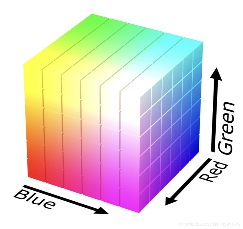
即每一个(R,G,B)都有一个一一对应的目标颜色,那么一个完整的RGB颜色查找表总共有 256×256×256 = 2^24 条。
显然 2^24 这个数字有点太大了,存储它需要至少16Mb的空间,加载到内存也至少需要吃掉16Mb的内存
(问题1:这里可以先思考一下为什么是16Mb?后面会给出解释)
因此我们在实际查找表应用中一般使用 64×64×64 的查找表,RGB每个通道都将 [连续的4个坐标] 映射成 [1个目标坐标]
例如:
1 |
(0,X,X) ---> (34,X,X) |
但显然这样会导致原始图片颜色精度的丢失(例如上面的0~3的亮度映射后都变成了无差别的34),那么就需要想办法降低这种精度丢失的问题
(问题2:这里可以先思考一下有哪些补偿精度的方法?后面会给出解答)
有了颜色映射表,接下来需要考虑如何去表达这些映射关系了。有一个笨办法是用文本去存储这 64×64×64 这么多条 (old R,old G,old B) —> (new R,new G,new B)这样的映射关系。聪明的你肯定意识到了这个文本的大小会是一个天文数字。那么有没有更好的表达方法呢?优秀的前辈们发现可以用一个图片去表示这个映射关系,这就是LUT图:
这个LUT图的尺寸是 512×512 ,正好等于 64×64×64(查找表的数量),也就是刚好每一个像素可以表示一条 (old R,old G,old B) —> (new R,new G,new B)这样的映射关系!
我们可以用 [图片的像素坐标] 表示(old R,old G,old B),用这个坐标所在的 [像素的颜色] 表示(new R,new G,new B),这样就实现了映射表的一一对应关系。
我们可以先从比较简单的开始看,为什么用这个坐标所在的 [像素的颜色] 表示(new R,new G,new B)?因为图片本身每个像素就是由(R,G,B)组成,并且都是0~255,刚好可以完美表示一个(new R,new G,new B)。
再来看看比较复杂一丁点的,如何用 [图片的像素坐标] 表示(old R,old G,old B)?因为一个图片的坐标是二维坐标(x,y),要如何表示一个三维的(old R,old G,old B)呢?
可以看到这个图片每一行有8个小正方形,每一列也有8个小正方形,总共有64个小正方形。每个小正方形都是一张 64×64的图片。
我们先从一个小正方形开始看。其实每一个小正方形都代表了完整的(old R,old G) —> (new R,new G)的映射。其中像素Target坐标(x,y)代表(old R,old G),像素Target的颜色的RG值就代表(new R,new G)。
例如下面这张图片:
1.假设(old R,old G) = (100,150),那么Target的坐标就是(100 / 4,150 / 4)= (25,37)
2.如果这个图片里坐标是(25,37)的Target的像素值是(213, 88),那么(new R,new G)=(213, 88)
2.即完成了(old R,old G) = (100,150) —> (new R,new G)=(213, 88) 的映射关系!
至此已经完成了R通道和G通道的映射,那么如何确定B通道的映射关系呢?前面说到一个完整LUT图有8×8=64个小正方形,这64个小正方形就是用来确定B通道的映射关系的。
我们把这64个小正方形按从左到右从上到下排列,编号0~63,我们就可以把(old B)映射到其中的某个小正方形格子。
拿下面这个示例图比较能说明过程:
假如(old B) = (50),那么最终的颜色落在第(50 / 4)=(12)个格子上。
但注意,这里的(12)并不是(new B),(12)仍然只是图片的 [坐标],因此它代表的其实还是(old B),仅仅 / 4 了而已。
我们回到上面一步的步骤,确定了在是哪个小正方形,就可以在这个小正方形里根据(old R,old G)确定最终的Target。那么(new B)就等于 像素Target颜色的B值!
聪明的你也许已经意识到了,在这64个小正方形里,每个小正方形相同(x,y)坐标所对应Target像素颜色的(R,G)都是一样的,仅仅只有B不一样。这也就是为什么B颜色最终是根据计算 [在哪个小正方形里] 来确定的。
1.假如一个像素点原始的颜色是 (old R,old G,old B)=(38,201,88)
2.根据(old B)确定在哪个小正方形:88 / 4 = 22
3.在第22个小正方形里,根据(old R,old G)确定最终Target的坐标:(38 / 4,201 / 4)=(9,50)
4.假如第22个小正方形中,(9,50)所对应的Target像素的颜色是(50,3,126)
5.那么最终的颜色(new R,new G,new B)=(50,3,126),至此完成一个像素点颜色的映射。
6.遍历原始图片的每一个像素,都走一遍1~5的过程,完成对整张图片的滤镜效果。
因为映射关系都用LUT图表示,每个像素代表一条映射,那么64×64×64 = 2^18,一张 2^18 个像素的无损图片(一般是.png)大小至少是256Kb,而 256×256×256 = 2^24 个像素的无损图片大小至少是16Mb。
注意到上面精度的丢失是因为像素颜色从 256 –> 64,我们上面在做除法的时候丢失了小数点,例如(38 / 4,201 / 4)=(9,50),但其实应该是(38 / 4,201 / 4)=(9.5,50.25),在实际运用的时候我们并不会抛弃小数点。
在计算的时候,如果计算得到的坐标不是位于一个像素的正中心,那么在取色时,会对相邻的几个像素进行加权平均,更靠近的像素权重越大。直观地说就是,理谁越靠近,那么谁就对最终的颜色有更重要的影响。
例如下面这个图,在最终确定颜色时,会考虑相邻的4个像素点的颜色。这就是双线性插值法,除此之外也有单线性插值法,有兴趣的朋友欢迎交流。
双线性插值法示意图:
什么是原始LUT图:就是经过这个LUT颜色变化之后,还是原来的颜色,也就是 [什么颜色都不变]
它的映射关系:
1 |
(0,0,0) ---> (0,0,0) |
至此一张LUT滤镜图就做好了:
我的理解是,我们对图片进行 [调色的一系列操作],再 [作用在原始LUT图上],就相当于让这张原始LUT图记录下了 [这一系列操作],记下来之后就可以拿去对任意的图片进行滤镜效果了。

据不完全统计,全世界每隔3秒就有一个人上传自己的自拍照,甚至不少人在P图上所花的时间都超过了化妆时间。
从十多年前“美图秀秀”的横空出世,再到近年来的实时美颜。到今天,美颜功能已经嵌入到各类手机系统当中,帮助大家实现完美自拍。有玩笑说,中国的P图术、韩国的整容术和日本的化妆术瓜三分天下。此秘术自诞生以来教众不断,但受用者,可瞬间变成天仙下凡,号称“传说中的3大东方神秘力量”。由此可见,随着朋友圈、微博等自拍社交越来越盛行,拍个美美的照片已经是人们的刚需了。
其实磨皮算法最底层的本质就是一种降噪算法,也可以说是模糊算法。即通过对脸部的模糊,把各种面部瑕疵模糊掉,以达到磨皮的效果。
本文很简单地介绍几种很基础的模糊算法以及磨皮后的边缘和细节还原。
模糊算法也可以说是降噪算法,把清晰可见的东西变得模糊。磨皮的原理就是把脸部变“模糊”,把各种瑕疵、皱纹、痘印等变模糊,使得整个脸看起来很光滑平整。模糊算法就是这样,可以隐去很多细节,也可以说是可以用更少的图像信息量去表达一幅图,因此许多细节就在模糊的过程中被抹去。
如何使一张图片变模糊呢,我们不妨从微观看起。
我们来看一张3*3的图:
假设上面的数字都代表当前位置的像素值。
假如正中央的像素”9”代表一个瑕疵点,那么我们如何把这个”9”模糊掉呢?
对核心及周围的像素值排序,取中间值作为新的像素值。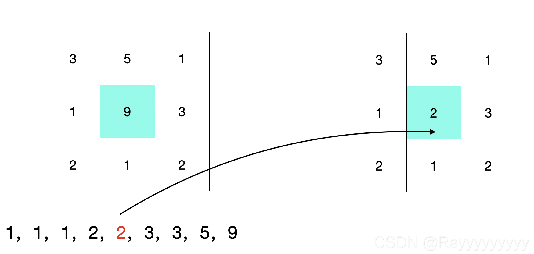
将核心及周围的像素求和取平均值,作为新的像素值。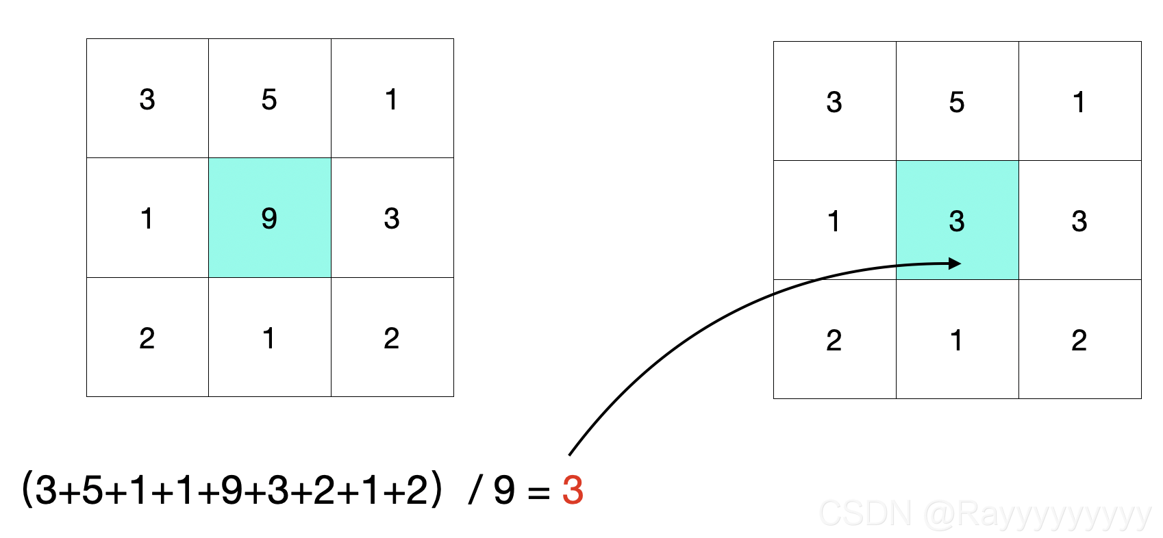
在均值滤波的基础上,对每个像素加上一个权重。这个权重是一个高斯函数。概况地说,距离中心点越近,权重越大;距离中心点越远,权重越小。
一维高斯函数可以这样表示: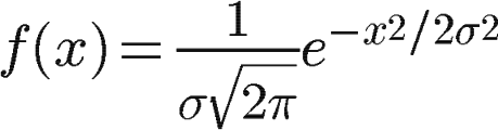
下图分别是一维高斯图像和二维高斯图像: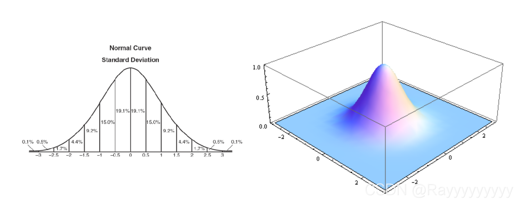
把二维高斯函数放到我们上面的3*3的区域中,并做归一化,就得到了权重: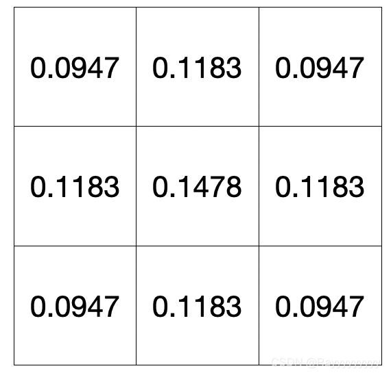
那么最终的颜色这样计算: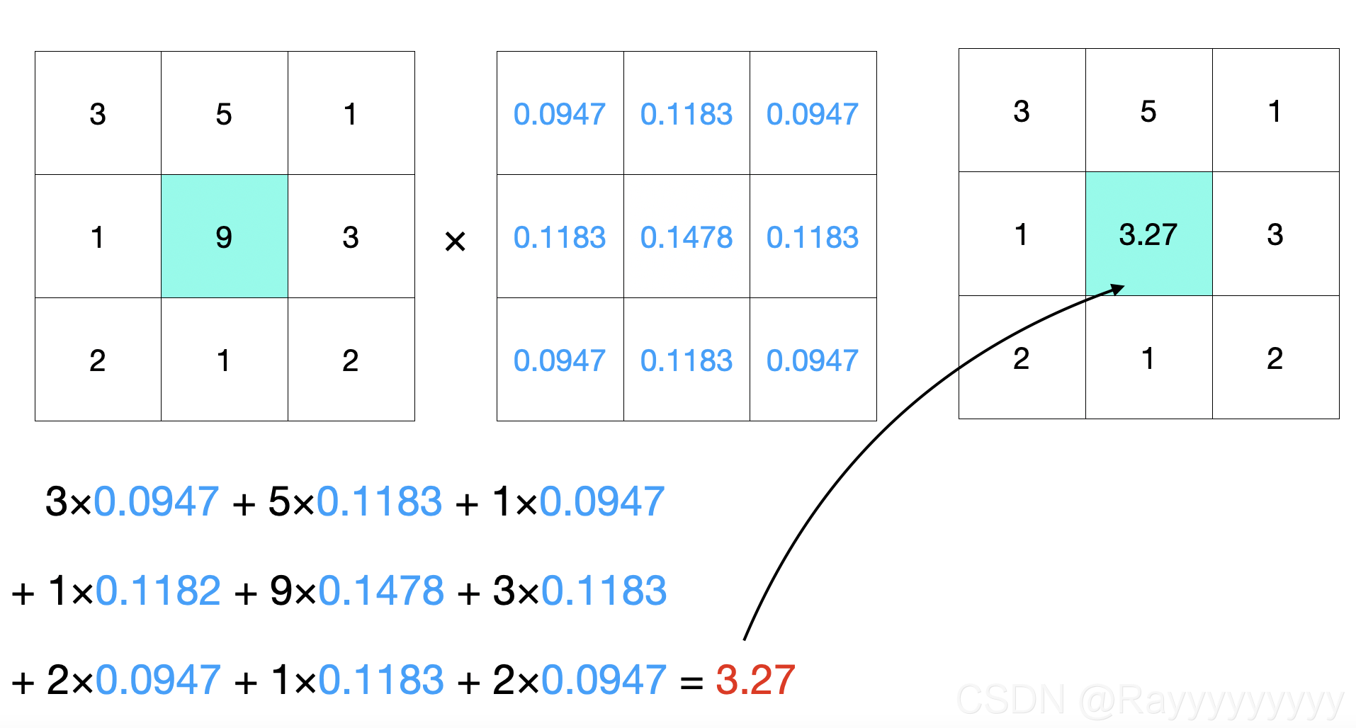
在高斯滤波的基础上,再加上一个[像素差异]的权重:与中心颜色相差越大,权重越低;与中心颜色相差越小,权重越高。
这么做是为了能够在模糊的时候,较好地保护图像的边缘细节信息。这也是磨皮常用的模糊算法,因为磨皮就是需要保留人脸的一些纹路边缘细节,使得磨皮效果看起来更加自然。
可以这么理解:
高斯核是[空间域]上的权重:距离中心的空间距离越远,权重越小。
双边滤波多了一个[值域]上的权重:距离中心的像素差别越大,权重越小。
以下两个图片可以更好理解双边滤波: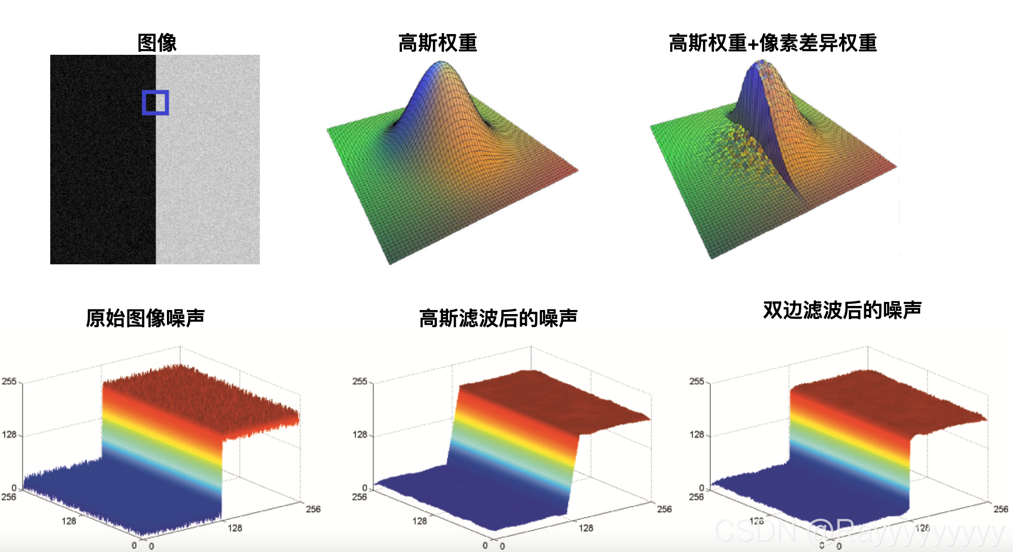
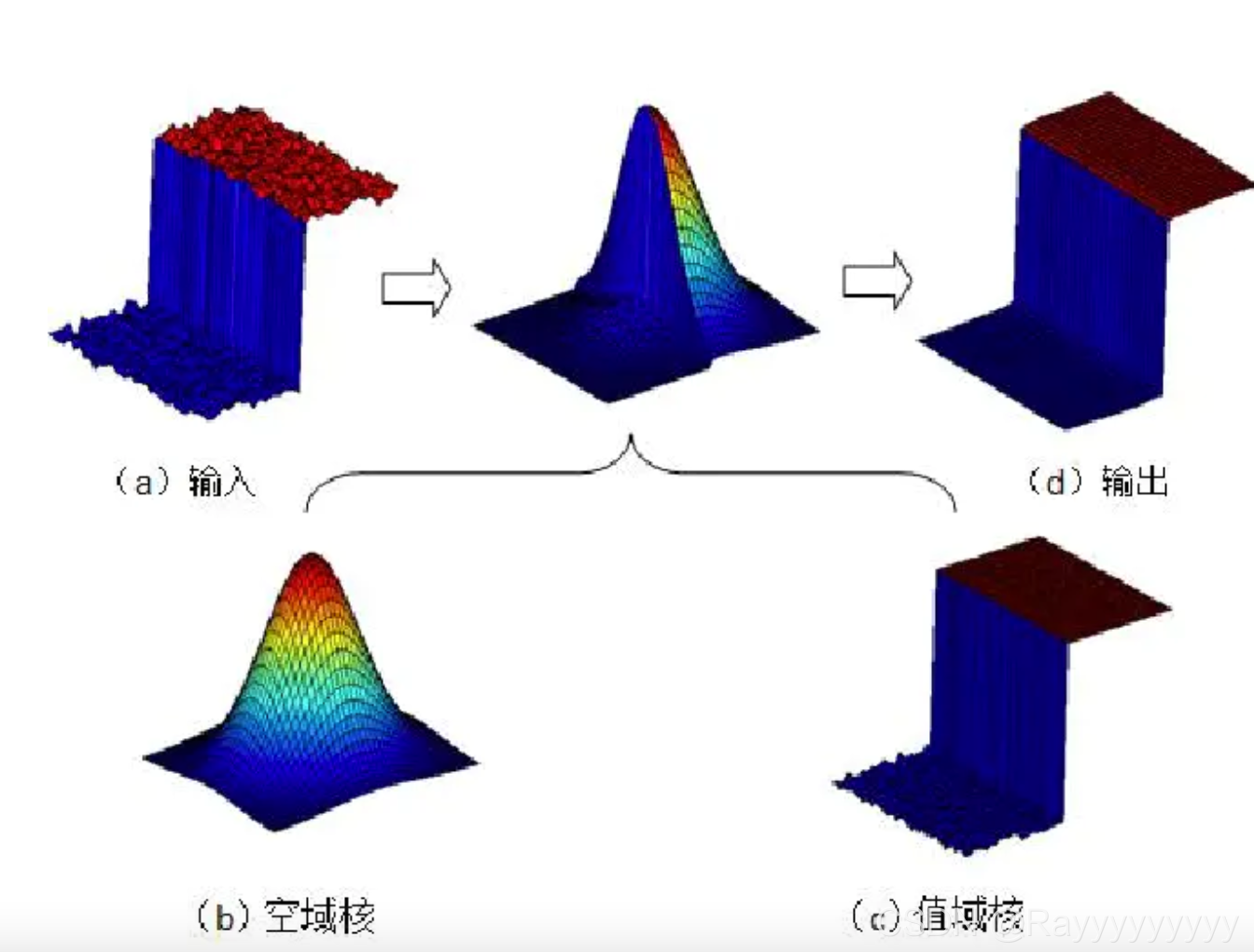
还是拿上面3*3的区域应该这样算: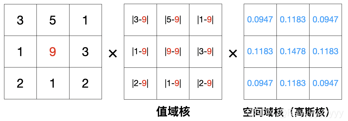
这里的值域核仅为了表达方便,实际应用中也需要做类似归一化的操作
我们可以看一下这几种模糊算法的效果:
原图:
中值滤波:
均值滤波:
高斯滤波: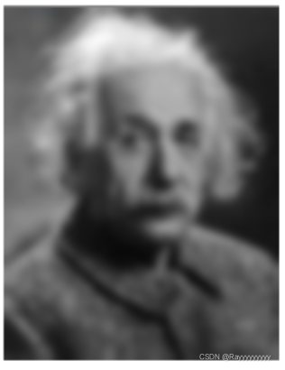
双边滤波:
锐化可以分成2步:第一步,提取边缘;第二步:边缘还原到原图上。第二步其实就是简单的把边缘图叠加到原图上,因此这里重点介绍边缘提取算法。
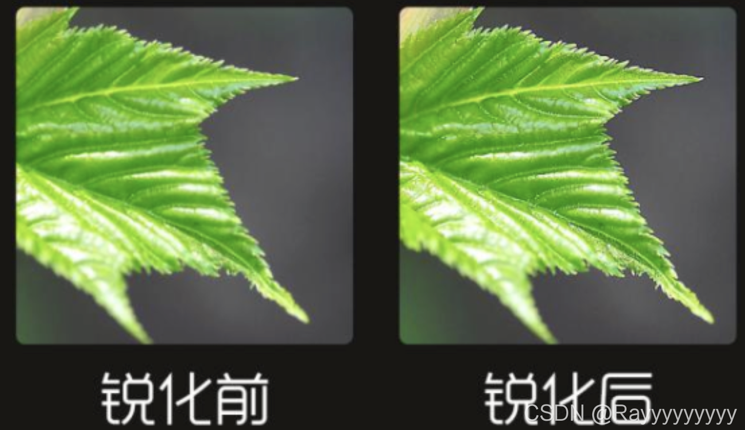
USM锐化是最常见的锐化,其主要利用了模糊图,原理如下: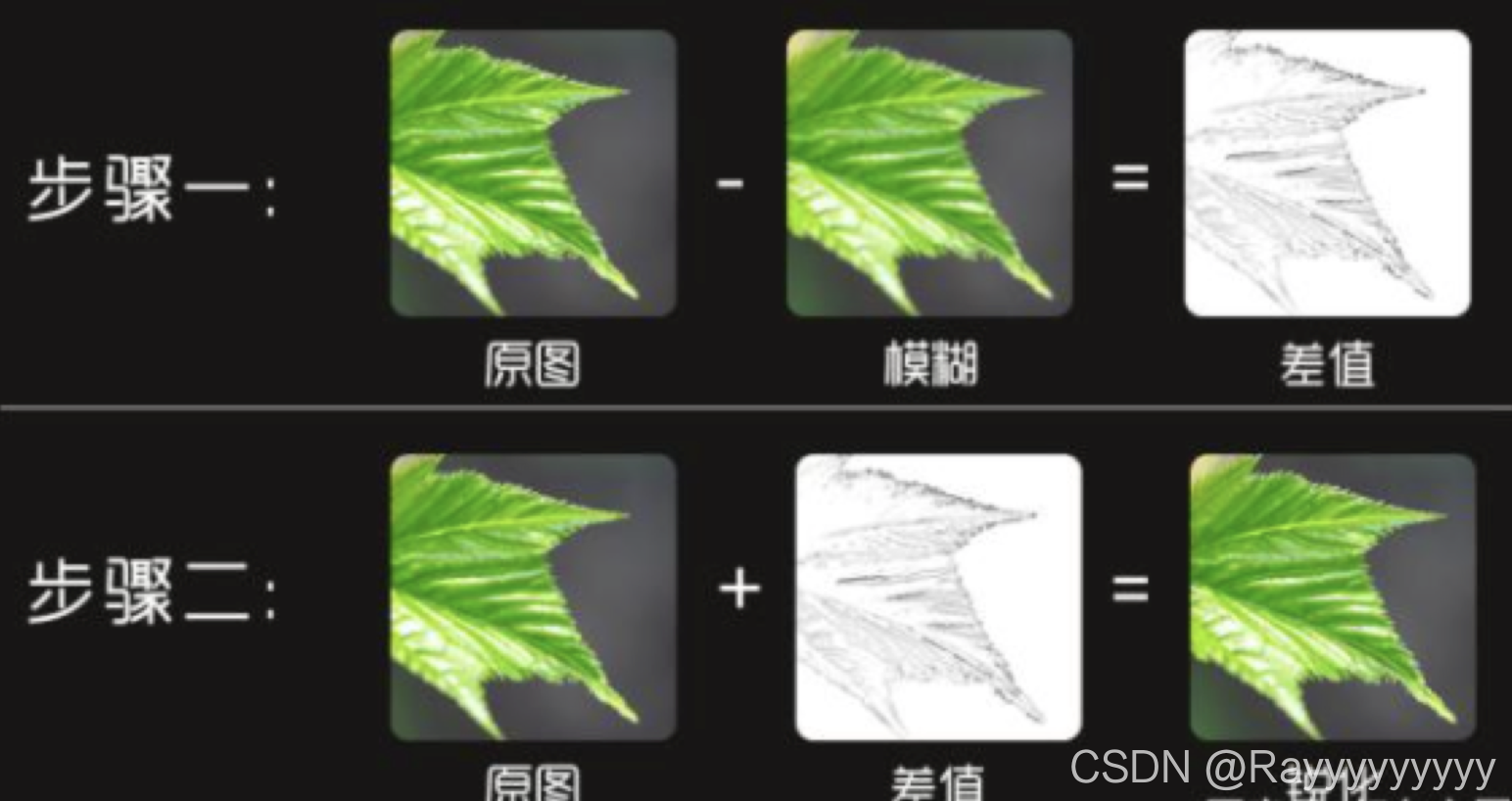
上文说过的模糊算法其实就是把大部分细节抹去,用原图减去模糊图,就得到了这幅图像的边缘和细节了。得到细节之后,叠加回原图,就实现了锐化的效果。
如果想要更大的锐化怎么办呢?那就使用更模糊的图,以得到更大的差值:
拉普拉斯锐化方式是通过对像素进行卷积遍历,以得到边缘。
以4领域卷积核为例:
如果当前像素与上下左右4个像素完全相同,那么计算得的结果为0,即代表当前像素并不是边缘;
反之如果计算结果不为0,说明当前像素与上下左右像素值存在差异,那么这个像素在一定程度上是边缘的一部分。
拉普拉斯锐化效果如下:
sobel锐化也是使用对像素的卷积遍历,不同的是它区分横纵卷积核。
以横向卷积核为例:
如果左边一列和右边一列像素完全相同,那么计算得的结果为0,即代表当前像素并不是边缘;
如果左边一列和右边一列像素值有所差别,那么计算结果不为0,代表当前像素正处在边缘部分。
sobel边缘提取效果如下:
效果图:
这个月我开了个新项目:制作 deep future 的电子版。
之所以做这个事情,是因为我真的很喜欢这个游戏。而过去一年我在构思一个独立游戏的玩法时好像进入了死胡同,我需要一些设计灵感,又需要写点代码保持一下开发状态。思来想去,我确定制作一个成熟桌游的电子版是一个不错的练习。而且这个游戏的单人玩法很接近电子游戏中的 4x 类型,那也是我喜欢的,等还原了原版桌游规则后,我应该可以以此为基础创造一些适合电子游戏特性的东西来。
另一方面,我自以为了解游戏软件从屏幕上每个像素点到最终游戏的技术原理,大部分的过程都亲身实践过。但我总感觉上层的东西,尤其是游戏玩法、交互等部分开发起来没有底层(尤其是引擎部分)顺畅。我也看到很多实际游戏项目的开发周期远大于预期,似乎开发时间被投进了黑洞。
在 GameJam 上两个晚上可以做出的游戏原型,往往又需要花掉 2,3 年时间磨练成成品。我想弄清楚到底遇到了怎样的困难,那些不明不白消耗掉的开发时间到底去了哪里。
这次我选择使用前几个月开发的 soluna 作为引擎。不使用前些年开发的 Ant Engine 的原因 在这个帖子里写得很清楚了。至于为什么不用现成的 unreal/unity/godot 等,原因是:
我明白我要做什么事,该怎么做,并不需要在黑盒引擎的基础上开发。是的,虽然很多流行引擎有源码,但在没有彻底阅读之前,我认为它们对我的大脑还是黑盒。而阅读理解这些引擎代码工程巨大。
我的项目不赶时间,可以慢慢来。我享受开发过程,希望通过开发明白多一些道理,而不是要一个结果。我希望找到答案,可能可以通过使用成熟引擎,了解它们是怎样设计的来获得;但自己做一次会更接近。
自己从更底层开发可以快速迭代:如果一个设计模式不合适,可以修改引擎尝试另一个模式。而不是去追寻某个通用引擎的最佳实践。
我会使用很多成熟的开源模块和方案。但通常都是我已经做过类似的工作,期望可以和那些成熟模块的作者/社区共建。
这个项目几乎没有性能压力。我可以更有弹性的尝试不同的玩法。成熟引擎通常为了提升某些方面的性能,花去大量的资源做优化,并做了许多妥协。这些工作几乎是不可见的。也就是说,如果使用成熟引擎开发,能利用到的部分只是九牛一毛,反而需要花大量精力去学习如何用好它们;而针对具体需求自己开发,花掉的精力反而更有限,执行过程也更为有趣。
这篇 blog 主要想记录一下这大半个月以来,我是怎样迭代引擎和游戏的。我不想讨论下面列举出来的需求的最佳方案,现在已经完成的代码肯定不是,之后大概率也会再迭代掉。我这个月的代码中一直存在这样那样的“临时方案”、“全局状态”、甚至一些复制粘贴。它们可能在下一周就重构掉,也可能到游戏成型也放在那里。
重要的是过程应该被记录下来。
在一开始,我认为以立即模式编写游戏最容易,它最符合人的直觉:即游戏是由一帧帧画面构成的,只需要组帧绘制需要的画面就可以了。立即模式可以减少状态管理的复杂度。这一帧绘制一个精灵,它就出现在屏幕上;不绘制就消失了。
大部分成熟引擎提供的则是保留模式:引擎维护着一组对象集合,使用者创建或删除对象,修改这些对象的视觉属性。这意味着开发者需要做额外的很多状态管理。如果引擎维持的对象集合并非平坦结构,而是树状容器结构,这些状态管理就更复杂了。
之所以引擎喜欢提供保留模式大概是因为这样可以让实现更高效。而且在上层通过恰当的封装,立即模式和保留模式之间也是可以互相转换的。所以开发者并不介意这点:爱用立即模式开发游戏的人做一个浅封装层就可以了。
但我一开始就选择立即模式、又不需要考虑性能的话,一个只对图形 api 做浅封装的引擎直接提供立即模式最为简单。所以一开始,soluna 只提供了把一张图片和一个单独文字显示在屏幕特定位置的 api 。当然,使用现代图形 api ,给绘制指令加上 SRT 变换是举手之劳。(在 30 年前,只有一个 framebuffer 的年代,我还需要用汇编编写大量关于旋转缩放的代码)
在第一天,我从网上找来了几张卡牌的图片,只花了 10 分钟就做好了带动画和非常简单交互的 demo 。看起来还很丝滑,这给我不错的愉悦感,我觉得是个好的开始。
想想小丑牌也是用 Love2D 这种只提供基本 2d 图片渲染 api 的引擎编写出来的,想来这些也够用了。当然,据说小丑牌做了三年。除去游戏设计方面的迭代时间外,想想程序部分怎么也不需要这么长时间,除非里面有某些我察觉不到的困难。
接下来,我考虑搭一些简单的交互界面以及绘制正式的卡牌。
Deep future 的卡牌和一般的卡牌游戏还不一样。它没有什么图形元素,但牌面有很多文字版面设计。固然,我可以在制图设计软件里定下这些版面的位置,然后找个美术帮我填上,如果我的团队有美术的话……这是过去在商业公司的常规做法吧?可是现在我一个人,没有团队。这是一件好事,可以让我重新思考这个任务:我需要减少这件我不擅长的事情的难度。我肯定会大量修改牌面的设计,我得有合适我自己的工作流。
在 Ant 中,我们曾经集成过 RmlUI :它可以用 css 设计界面。css 做排版倒是不错,虽然我也不那么熟悉,但似乎可以完成所有需求。但我不喜欢写 xml ,也不喜欢 css 的语法,以及很多我用不到的东西。所以,我决定保留核心:我需要一个成熟的排版用的结构化描述方案,但不需要它的外表。
所以我集成了 Yoga ,使用 Lua 和我自己设计的 datalist 语言来描述这个版面设计。如果有一天,我想把这个方案推广给其他人用,它的内在结构和 css 是一致的,写一个转换脚本也非常容易。
暂时我并不需要和 Windows 桌面一样复杂的界面功能。大致上有单个固定的界面元素布局作为 HUD (也就是主界面)就够了。当然,用 flexbox 的结构来写,自动适应了不同的分辨率。采用这种类 CSS 的排版方案,实际上又回到了保留模式:在系统中保留一系列的需要排版布局的对象。
当我反思这个问题时,我认为是这样的:如果一个整体大体是不变的,那么把这个整体看作黑盒,其状态管理被封装在内部。使用复杂度并没有提高。这里的整体就是 HUD 。考虑到游戏中分为固定的界面元素和若干可交互的卡片对象,作为卡牌游戏,那些卡牌放在 HUD 中的容器内的。如果还是用同样的方案管理卡片的细节,甚至卡片本身的构图(它也是由更细分的元素构成的)。以保留模式整个管理就又变复杂了。
所以,我在 yoga 的 api 封装层上又做了一层封装。把界面元素分为两类:不变的图片和文字部分,和需要和玩家交互的容器。容器只是由 yoga 排版的一个区域,它用 callback 的形式和开发者互动就可以了。yoga 库做的事情是:按层次结构遍历处理完整个 DOM ,把所有元素平坦成一个序列,每个元素都还原成绝对坐标和尺寸,去掉层次信息,只按序列次序保留绘制的上下层关系。在这个序列中,固定的图片和文字可以直接绘制,而遇到互动区,则调用用户提供的函数。这些函数还是以立即模式使用:每帧都调用图形 API 渲染任意内容。
用下来还是挺舒服的。虽然 callback 的形式我觉得有点芥蒂,但在没找到更好的方式前先这么用着,似乎也没踩到什么坑。
渲染模块中,一开始只提供了文字和图片的渲染。但我留出了扩展材质的余地。文字本身就是一种扩展材质,而图片是默认的基础材质。做到 UI 时,我发现增加一种新的材质“单色矩形”特别有用。
因为我可以在提供给 yoga 的布局数据中对一些 box 标注,让它们呈现出不同颜色。这可以极大的方便我调试布局。尤其是我对 flexbox 布局还不太熟练的阶段,比脑补布局结果好用得多。
另一个有用的材质是对一张图片进行单色渲染,即只保留图片的 alpha 通道,而使用单一颜色。这种 mask 可以用来生成精灵的阴影,也可以对不规则图片做简单遮罩。
在扩展材质的过程中,发现了之前预留的多材质结构有一些考虑不周全的设计,一并做了修改。
到绘制卡牌时,卡牌本身也有一个 DOM ,它本质上和 HUD 的数据结构没什么区别,所以这个数据结构还是嵌套了。一开始,我在 soluna 里只提供了平坦的绘制 api ,并没有层次管理。一开始我做的假设是:这样应该够用。显然需要打破这个假设了。
我给出的解决方案是:在立即模式下,没必要提供场景树管理,但可以给一个分层堆栈。比如将当前的图层做 SRT 变换,随后的绘图指令都会应用这套变换,直到关闭这个图层(弹出堆栈)。这样,我想移动甚至旋转缩放 HUD 中的一个区域,对于这个区域的绘制指令序列来说都是透明的:只需要在开始打开一个新图层,结束时关闭这个图层即可。
另一个需求是图文混排,和文字排版。一开始我假设引擎只提供单一文字渲染的功能就够用,显然是不成立的。Yoga 也只提供 box 的排版,如果把每个单字都作为一个 box 送去 yoga 也不是不行,但直觉告诉我这不但低效,还会增加使用负担。web 上也不是针对每个单字做排版的。用 Lua 在上层做图片和文字排版也可以,但对性能来说太奢侈了。
这是一个非常固定的需求:把一块有不同颜色和尺寸的文字放在一个 box 中排版,中间会插入少许图片。过去我也设计过不少富文本描述方案,再做一次也不难。这次我选择一半在 C 中实现,一半在 Lua 中实现。C 中的数据结构利于程序解析,但书写起来略微繁琐;Lua 部分承担易于人书写的格式到底层富文本结构的转换。Lua 部分并不需要高频运行,可以很方便的 cache 结果(这是 Lua 所擅长的),所以性能不是问题。
至于插入的少许图片,我认为把图片转换为类似表情字体更简单。我顺手在底层增加了对应的支持:用户可以把图片在运行时导入字体模块。这些图片作为单独的字体存在,codepoint 可以和 unicode 重叠。并不需要以 unicode 在文本串中编码这些图片,而将编码方式加入上述富文本的结构。
在绘制文本的环节,我同时想到了本地化模块该如何设计。这并非对需求的未雨绸缪,而是我这些年来一直在维护群星的汉化 mod 。非常青睐 Paradox 的文本方案。这不仅仅是本地化问题,还涉及游戏中的文本如何拼接。尤其是卡牌游戏,关于规则描述的句子并非 RPG 中那样的整句,而是有很多子句根据上下文拼接而来的。
拼句子和本地化其实是同一个问题:不同语言间的语法不同,会导致加入一些上下文的句子结构不同。P 社在这方面下了不少功夫,也经过了多年的迭代。我一直想做一套类似的系统,想必很有意思。这次了了心愿。
我认为代码中不应该直接编码任何会显示出来的文本,而应该统一使用点分割的 ascii 字串。这些字串在本地化模块那里做第一次查表转换。
有很大一部分句子是由子句构成的,因为分成子句和更细分的语素可以大大降低翻译成不同语言的工作量。这和代码中避免复制粘贴的道理是一样的:如果游戏中有一个术语出现在不同语境下,这个术语在本地化文本中只出现在唯一地方肯定最好。所以,对于文本来说,肯定是大量的交叉引用。我使用 $(key.sub.foobar) 的方式来描述这种交叉引用。注:这相当于 P 社语法中的 $key.sub.foobar$ 。我对这种分不清开闭的括号很不感冒。
另一种是对运行环境中输入的文本的引用:例如对象的名字、属性等。我使用了 ${key} 这样的语法,大致相当于 P 社的 [key] 。但我觉得统一使用 $ 前缀更好。至于图标颜色、字体等标注,在 P 社的语法中花样百出,我另可使用一致的语法:用 [] 转义。
这个文本拼接转换的模块迭代了好几次。因为我在使用中总能发现不完善的实现。估计后面还会再改动。好在有前人的经验,应该可以少走不少弯路吧。
和严肃的应用不同,游戏的交互是很活泼的。一开始我并没有打算实现元素的动画表现,因为先实现功能仿佛更重要。但做着做着,如果让画面更活泼一点似乎心情更愉悦一点。
比如发牌。当然可以直接把发好的牌画在屏幕指定区域。但我更希望有一个动态的发牌过程。这不仅仅是视觉感受,更能帮助不熟悉游戏规则的玩家尽快掌控卡牌的流向。对于 Deep Future 来说更是如此:有些牌摸出来是用来产生随机数的、有些看一眼就扔掉了、不同的牌会打在桌面不同的地方。如果缺少运动过程的表现,玩家熟悉玩法的门槛会高出不少。
但在游戏程序实现的逻辑和表现分离,我认为是一个更高原则,应尽可能遵守。这部分需要一点设计才好。为此,我并没有草率给出方案尽快试错,而是想了两天。当然,目前也不是确定方案,依旧在迭代。
css 中提供了一些关于动画的属性,我并没有照搬采用。暂时我只需要的运动轨迹,固然轨迹是对坐标这个属性的抽象,但一开始没必要做高层次的抽象。另外,我还需要保留对对象的直接控制,也就是围绕立即模式设计。所以我并没有太着急实现动画模块,而且结合另一个问题一起考虑。
游戏程序通常是一个状态机。尤其是规则复杂的卡牌游戏更是。在不同阶段,游戏中的对象遵循不同的规则互动。从上层游戏规则来看是一个状态机,从底层的动画表现来看也是,人机交互的界面部分亦然。
从教科书上搬出状态机的数据结构,来看怎么匹配这里的需求,容易走向歧途;所以我觉得应该先从基本需求入手,不去理会状态机的数据结构,先搭建一个可用的模块,再来改进。
Lua 有 first class 的 coroutine ,非常适合干这个:每个游戏状态是一个过程(相对一帧画面),有过程就有过程本身的上下文,天然适合用 coroutine 表示。而底层是基于帧的,显然就适合和游戏的过程分离开。
以发牌为例:在玩家行动阶段,需要从抽牌堆发 5 张牌到手牌中。最直接的做法是在逻辑上从牌堆取出 5 张牌,然后显示在手牌区。
我需要一个发牌的视觉表现,卡牌从抽牌堆移动到手牌区,让玩家明白这些牌是从哪里来的。同时玩家也可以自然注意到在主操作区(手牌区)之外还有一个可供交互的牌堆。
用立即模式驱动这个运动轨迹,对于单张牌来说最为简单。每帧计算牌的坐标,然后绘制它就可以了。但同时发多张牌就没那么直接了。
要么一开始就同时记录五张牌的目的地,每帧计算这五张牌的位置。这样其实是把五张牌视为整体;要么等第一张牌运动到位,然后开始发下一张牌。这样虽然比较符合现实,但作为电子游戏玩,交互又太啰嗦。
通常我们要的行为是:这五张牌连续发出,但又不是同时(同一帧)。牌的运动过程中,并非需要逐帧关注轨迹,而只需要关注开始、中途、抵达目的地三个状态。其轨迹可以一开始就确定。所以,卡牌的运动过程其实处于保留模式中,状态由系统保持(无需上层干涉),而启动的时机则交由开发者精确控制更好。至于中间状态及抵达目的地的时机,在这种对性能没太大要求的场景,以立即模式逐帧轮询应无大碍(必须采用 callback 模式)。
也就是,直观的书写回合开始的发牌流程是这样的:
for i = 1, 5 do
  draw_card() -- 发一张牌
  sleep(0.1)  -- 等待 0,1 秒
end
这段代码作为状态机逻辑的一部分天然适合放在单独的 coroutine 中。它可以和底层的界面交互以及图形渲染和并行处理。
而发牌过程,则应该是由三个步骤构成:1. 把牌设置于出发区域。2. 设定目的地,发起移动请求。3. 轮询牌是否运动到位,到位后将牌设置到目的地区域。
其中步骤 1,2 在 draw_card 函数中完成最为直观,因为它们会在同一帧完成。而步骤 3 的轮询应该放在上述循环的后续代码。采用轮询可以避免回调模式带来的难以管理的状态:同样符合直观感受,玩家需要等牌都发好了(通常在半秒之内)再做后续操作。
我以这样的模式开发了一个基于 coroutine 的简单状态机模块。用了几天觉得还挺舒适。只不过发现还是有一点点过度设计。一开始我预留了一些 api 供使用者临时切出当前状态,进入一个子状态(另一个 coroutine),完成后再返回;还有从一个过程中途跳出,不再返回等等。使用一段时间以后,发现这些功能是多余的。后续又简化掉一半。
至于动画模块,起初我认为一切都围绕卡牌来做就可以了。可以运动的基本元素就是不同的卡片。后来发现其实我还需要一些不同于卡片的对象。运动也不仅仅是位移,还包括旋转和缩放,以及颜色的渐变。
至于对象运动的起点和终点,都是针对的前面所述的“区域”这个概念。一开始“区域”只是一个回调函数;从这里开始它被重构成一个对象,有名字和更多的方法。“区域”也不再属于同一个界面对象,下面会谈到:我一开始的假设,所有界面元素在唯一 DOM 上,感觉是不够用的。我最终还是需要管理不同的 DOM ,但我依旧需要区域这个概念可以平坦化,这样可以简化对象可以在不同的 DOM 间运动的 API。
运动过程本身,藏在较低的层次。它是一个独立模块,本质上是以保留模式管理的。在运动管理模块中,保留的状态仅仅是时间轴。也就是逐帧驱动每个运动对象的时间轴(一个数字)。逐帧处理部分还是立即模式的,传入对象的起点和终点,通过时间进度立即计算出当前的状态,并渲染出来。
从状态管理的角度看,每帧的画面和动画管理其实并不是难题。和输入相关的交互管理更难一些,尤其是鼠标操作。对于键盘或手柄,可以使用比较直观的方式处理:每帧检查当下的输入内容和输入状态,根据它们做出反应即可。而鼠标操作天生就是事件驱动的,直到鼠标移动到特定位置,这个位置关联到一个可交互对象,鼠标的点击等操作才有了特别的含义。
ImGUI 用了一种立即模式的直观写法解决这个问题。从使用者角度看,它每帧轮询了所有可交互对象,在绘制这些对象的同时,也依次检查了这些对象是否有交互事件。我比较青睐这样的用法,但依然需要做一些改变。毕竟 ImGUI 模式不关注界面的外观布局,也不擅长处理运动的元素。
我单独实现了一个焦点管理模块。它内部以保留模式驱动界面模块的焦点响应。和渲染部分一样,处理焦点的 API 也使用了一些 callback 注入。这个模块仅管理哪个区域接收到了鼠标焦点,每个区域通过 callback 函数再以立即模式(轮询的方式)查询焦点落在区域内部的哪个对象上。
在使用层面,开发者依然用立即模式,通过轮询获取当前的鼠标焦点再哪个区域哪个对象上;并可查询当前帧在焦点对象上是否发生了交互事件(通常是点击)。这可以避免用 callback 方式接收交互事件,对于复杂的状态机,事件的 callback 要难管理的多。
一开始我认为,单一 HUD 控制所有界面元素就够了。只需要通过隐藏部分暂时不用的界面元素就可以实现不同游戏状态下不同的功能。在这个约束条件下,代码可以实现的非常简单。但这几天发现不太够用。比如,我希望用鼠标右键点击任何一处界面元素,都会对它的功能做一番解说。这个解说界面明显是可以和主界面分离的。我也有很大意愿把两块隔离开,可以分别独立开发测试。解说界面是帮助玩家理解游戏规则和交互的,和游戏的主流程关系不大。把它和游戏主流程放在一起增加了整体的管理难度。但分离又有悖于我希望尽可能将对象管理平坦化的初衷,我并不希望引入树状的对象层次结构。
最近的设计灵感和前面绘制模块的图层设计类似,我给界面也加入了图层的概念。永远只有一个操作层,但层次之间用栈管理。在每个状态看到的当下,界面的 DOM 都是唯一的。状态切换时则可以将界面压栈和出栈。如果后续不出现像桌面操作系统那样复杂的多窗口结构的话,我想这种栈结构分层的界面模式还可以继续用下去。
另一个变动是关于“区域”。之前我认为需要参与交互的界面元素仅有“区域”,“区域”以立即模式自理,逐帧渲染自身、轮询焦点状态处理焦点事件。最近发现,额外提供一种叫“按钮”的对象会更方便一些。“按钮”固然可以通过“区域”来实现,但实践中,处理“按钮”的不是“按钮”本身,而是容纳“按钮”的容器,通常也是最外层的游戏过程。给“按钮”加上类似 onclick 的 callback 是很不直观的;更直观的做法是在游戏过程中,根据对应的上下文,检查是否有关心的按钮被点击。
所有的按钮的交互管理可以放在一个平坦的集合中,给它们起上名字。查询时用 buttons.click() == "我关心的按钮名字" 做查询条件,比用 button_object.click() 做查询条件要舒服一点。
以上便是最近一个月的部分开发记录。虽然,代码依旧在不断修改,方案也无法确定,下个月可能还会推翻目前的想法。但我感觉找到了让自己舒适的节奏。
不需要太着急去尽快试错。每天动手之前多想想,少做一点,可以节省很多实作耗掉的精力;也不要过于执著于先想清楚再动手,毕竟把代码敲出带来的情绪价值也很大。虽然知道流畅的画面背后有不少草率的实现决定,但离可以玩的游戏更进一步的心理感受还是很愉悦的。
日拱一卒,功不唐捐。
Swift 6 不是一次“小步快跑”,而是 Apple 在并发安全、泛型系统、跨平台一致性与嵌入式场景四大方向的“集中爆发”。
| Swift 版本 | 发布时间 | 关键特性 | 对 Swift 6.0 的影响 |
|---|---|---|---|
| 5.1 | 2019.09 | Opaque Return Type(不透明返回类型)、Module Stability(模块稳定性) | 为 SwiftUI 的声明式 DSL(领域特定语言)提供基础支持 |
| 5.5 | 2021.09 | Async/Await(异步/等待)、Actors(Actor模型)、Sendable(可发送类型) | 并发模型的雏形,为 6.0 全并发检查机制奠定基础 |
| 5.9 | 2023.09 | Macro(宏)、Parameter Pack(参数包) | 元编程能力大幅提升,间接推动 6.0 编译期检查优化 |
| 5.10 | 2024.03 | Strict Concurrency for Globals(全局变量的严格并发检查) | 为 6.0 默认启用全并发检查(如全局变量的线程安全验证)铺路 |
let logs = ["info", "warning", "error:404", "error:500"]
let errorCount = logs.count { $0.hasPrefix("error") }
// 无需创建临时 Array,O(n) 一次遍历
适用所有 Sequence,包括 Dictionary、Set。
enum NetworkError: Error { case timeout, notFound }

func fetch(_ url: String) throws(NetworkError) -> Data {
    if url.isEmpty { throw .notFound }
    return Data()
}

do {
    let data = try fetch("")
} catch NetworkError.notFound {
    print("404")
}
注意:
throws(any Error) 保持旧语义。Swift 5.9 引入了值/类型参数包,但无法遍历。Swift 6 补齐:
func == <each T: Equatable>(lhs: (repeat each T),
                            rhs: (repeat each T)) -> Bool {
    for (l, r) in repeat (each lhs, each rhs) {
        if l != r { return false }
    }
    return true
}
从此告别手写 2-6 个元素的 == 重载。
let huge: Int128 = 170_141_183_460_469_231_731_687_303_715_884_105_727
let bigger = huge &+ 1   // 不会溢出
标准库完全集成:*, /, Codable, Comparable 全部支持。
// 仅在当前文件可见
private import CompressionKit

// 防止把内部依赖泄漏到公共 API
internal import ImageProcessingKit
默认从 public 改为 internal,更好地封装层次化架构。
let books = [Book(title: "A", rating: 90),
             Book(title: "B", rating: 70),
             Book(title: "C", rating: 95)]
let highRated = books.indices { $0.rating > 85 }
for b in books[highRated] { print(b.title) }   // A, C
RangeSet 支持 union, intersection, isSuperset(of:) 等集合运算。
| SE 编号 | 能力 | 示例 |
|---|---|---|
| 0427 | 泛型 & 协议支持 | struct Box<T: ~Copyable> |
| 0429 | 部分消费 |
consuming func open() { notification.display()}只消费 notification
|
| 0432 | switch 支持 | switch consume item { ... } |
struct Token: ~Copyable {
    let id: UUID
    consuming func invalidate() { /* 只可使用一次 */ }
}
防止“忘记释放文件句柄/密钥”一类资源泄露。
编译器自动为平凡类型(无引用计数、无自定义 copy)合成:
@frozen
public enum LogLevel: ~BitwiseCopyable { case debug, error }
禁止推断时使用 ~BitwiseCopyable,避免 ABI 锁定。
struct SWIFT_NONCOPYABLE Buffer { void* ptr; };
Swift 侧视为 ~Copyable。
  class SWIFT_SHARED_REFERENCE Renderer {
  public:
      virtual void draw();
  };
Swift 可直接 renderer.draw(),支持多态。
STL 容器
std::optional<Int>, std::map<String, Int> 已开箱即用。
swiftc -target armv7em-none-none-eabi \
       -O -embedded \
       -o firmware.elf main.swift
限制:
Swift.Shims 中的裸指针与寄存器 API。适合 Cortex-M, RISC-V 32/64。
@DebugDescription
@DebugDescription
struct User: CustomDebugStringConvertible {
    let id: Int
    var debugDescription: String { "User #\(id)" }
}
LLDB 中 p user 直接打印 User #42。
显式模块加速 LLDB
开启 -explicit-module-build 后,调试器不再即时编译 Clang 模块,首条 po 提速 5-10 倍。
Foundation 跨平台
FoundationEssentials 精简包去掉 i18n,裁剪 30% 体积。Swift Testing 示例
import Testing

@Test("emoji count", arguments: ["🐶", "🐶🐱"])
func countEmojis(_ s: String) {
    #expect(s.count == s.unicodeScalars.count)
}
Sendable。let、被 actor 隔离,或 nonisolated(unsafe)。@MainActor 冗余。| 维度 | 建议 |
|---|---|
| 语言层面 | 优先启用 -swift-version 6,利用 typed throws、count(where:)精简代码。 |
| 并发 | 立即修复 Global is not concurrency-safe警告;将可变全局状态封装到 actor。 |
| 库作者 | 评估 public API 是否暴露 internal import依赖;谨慎使用 typed throws。 |
| 嵌入式 | 使用 -embedded构建 Demo,观察二进制大小;注意移除 Swift runtime 符号。 |
| 测试 | 新项目直接采用 Swift Testing;旧项目可并行运行 XCTest 逐步迁移。 |
原文:Swift Basics: The Real Difference Between let and var Explained with Examples
很多初学 Swift 的同学会把 let 和 var 的区别简单记忆成“常量 vs 变量”。
但在实际工程中,这条规则只是起点。选择 let 还是 var 会直接影响代码的安全性、可读性,甚至运行时性能。
var:可变变量。值在生命周期内可以被重新赋值或修改。let:不可变绑定。一旦赋值,就不能再指向别的值。// var 可以改
var score = 10
score += 5 // ✅ 11
// let 不能改
let pi = 3.14
pi = 3.1415 // ❌ Cannot assign to value: 'pi' is a 'let' constant
官方社区的最佳实践:“先写 let,必要时再改成 var。”
这条规则背后的逻辑是:
| 场景 | 推荐关键字 |
|---|---|
| 用户 ID、出生日期、API 返回的只读模型 | let |
| 计分器、计时器、用户输入框内容 | var |
SwiftUI 的 @State包装属性 |
var(因为框架会重新赋值) |
示例:
let identityNumber = "12345678900"   // 一辈子不会变
var currentCity      = "Erzurum"     // 用户可能搬家
答案是:取决于类型是值类型(Value Type)还是引用类型(Reference Type)。
class Person {
    var name: String
    init(name: String) { self.name = name }
}

let person = Person(name: "Turabi")
person.name = "Muhammed"   // ✅ 合法!
person 这个“变量名”不能指向别的对象;struct Book {
let title: String
}
let book = Book(title: "1984")
book.title = "The Art of War" // ❌ Cannot assign to property: 'book' is a 'let' constant
let 修饰后,整个实例及其所有属性都不可变;var,或者把属性声明为 var。let,除非编译器报错提示你需要可变性。let,除非后端明确会推送增量更新。@State 属性)用 var。let。// 1. 值类型:struct
struct Point {
let x: Int
let y: Int
}
let p = Point(x: 0, y: 0)
// p.x = 10 // ❌
// 2. 引用类型:class
class Counter {
var value: Int = 0
}
let counter = Counter()
counter.value += 1 // ✅
// counter = Counter() // ❌
选择
let或var不仅是语法风格问题,更是设计决策。
当你写下 let 的那一刻,就向未来的维护者传递了“这里不会被意外修改”的承诺。
作为SwiftUI框架的核心概念之一,视图修改器(ViewModifier)为我们提供了一种优雅的方式来封装和重用视图的样式和行为。
这是视图修改器的源码
@available(iOS 13.0, macOS 10.15, tvOS 13.0, watchOS 6.0, *)
extension View {
/// Applies a modifier to a view and returns a new view.
///
/// Use this modifier to combine a ``View`` and a ``ViewModifier``, to
/// create a new view. For example, if you create a view modifier for
/// a new kind of caption with blue text surrounded by a rounded rectangle:
///
/// struct BorderedCaption: ViewModifier {
/// func body(content: Content) -> some View {
/// content
/// .font(.caption2)
/// .padding(10)
/// .overlay(
/// RoundedRectangle(cornerRadius: 15)
/// .stroke(lineWidth: 1)
/// )
/// .foregroundColor(Color.blue)
/// }
/// }
///
/// You can use ``modifier(_:)`` to extend ``View`` to create new modifier
/// for applying the `BorderedCaption` defined above:
///
/// extension View {
/// func borderedCaption() -> some View {
/// modifier(BorderedCaption())
/// }
/// }
///
/// Then you can apply the bordered caption to any view:
///
/// Image(systemName: "bus")
/// .resizable()
/// .frame(width:50, height:50)
/// Text("Downtown Bus")
/// .borderedCaption()
///
/// 
///
/// - Parameter modifier: The modifier to apply to this view.
@inlinable nonisolated public func modifier<T>(_ modifier: T) -> ModifiedContent<Self, T>
}
首先要明确ViewModifier协议
@MainActor @preconcurrency
public protocol ViewModifier {
    associatedtype Body : View

    @ViewBuilder
    func body(content: Self.Content) -> Self.Body

    typealias Content
}
可以看出,必须有一个要修改的视图和修改的方法。
下面是一个推荐的示例
struct BorderedCaption: ViewModifier {
    func body(content: Content) -> some View {
        content
            .font(.caption2)
            .padding(10)
            .overlay(
                RoundedRectangle(cornerRadius: 15)
                    .stroke(lineWidth: 1)
            )
            .foregroundColor(Color.blue)
    }
}
这样应用中的所有视图都可以像普通样式一样添加
extension View {
    func borderedCaption() -> some View {
        modifier(BorderedCaption())
    }
}
Image(systemName: "bus")
    .resizable()
    .frame(width:50, height:50)
Text("Downtown Bus")
    .borderedCaption()
如果你需要传递参数:
struct CustomPadding: ViewModifier {
    let amount: CGFloat

    func body(content: Content) -> some View {
        content.padding(amount)
    }
}

extension View {
    func customPadding(_ amount: CGFloat) -> some View {
        modifier(CustomPadding(amount: amount))
    }
}
其实SwiftUI 中每个 .padding(), .background(), .foregroundColor() 其实都是 视图修饰器 (modifier)
用cocoapods管理的iOS项目中需要限制 release 分支直接push
经过一番Google,找到了git hooks限制的方法,但是看了很多文章,发现废话一堆,不能快速的解决我的问题
在这里记录一下
可以看到很多sample后缀文件,根据文件名,你可以猜到是控制git操作哪一步的,例如我要控制push,那么我就是修改pre-push那个文件
#!/bin/sh

remote="$1"
url="$2"

# Block pushing directly to release branches (e.g., release or release/*)
block_pattern='^refs/heads/release($|/)'

while read local_ref local_sha remote_ref remote_sha
do
if echo "$remote_ref" | grep -Eq "$block_pattern"; then
echo >&2 "检测到目标分支为受保护分支:$remote_ref"
echo >&2 "禁止直接 push 到 release 分支。请通过 Pull Request 或受保护流程合并。"
exit 1
fi
done

exit 0
.sample去掉,就会变成一个shell程序因为hooks是放在.git下面的,但是.git不能上传到远端,想要同步给其他人,还需要做以下操作
hooks文件夹到项目的根目录,文件夹名称为 .hooks
system("git config core.hooksPath .hooks"),在执行pod更新的时候,就会自动配置git config